- Agency: Ata Berkol
- Client: Résidée
- Category: Packaging
- Location: Chicago, Illinois, United States
- Project Brief: Create a refined packaging system that expresses elegance, clarity, and cohesive brand identity while elevating product presence through minimalist design and thoughtful structural execution.
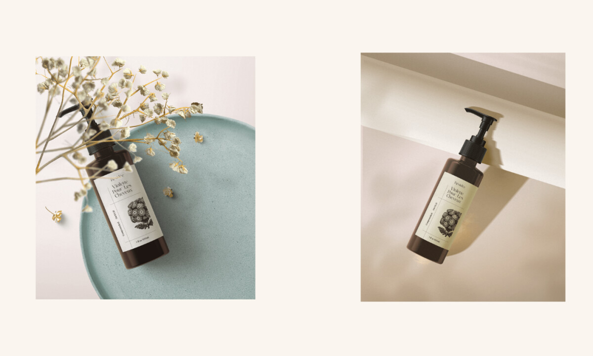
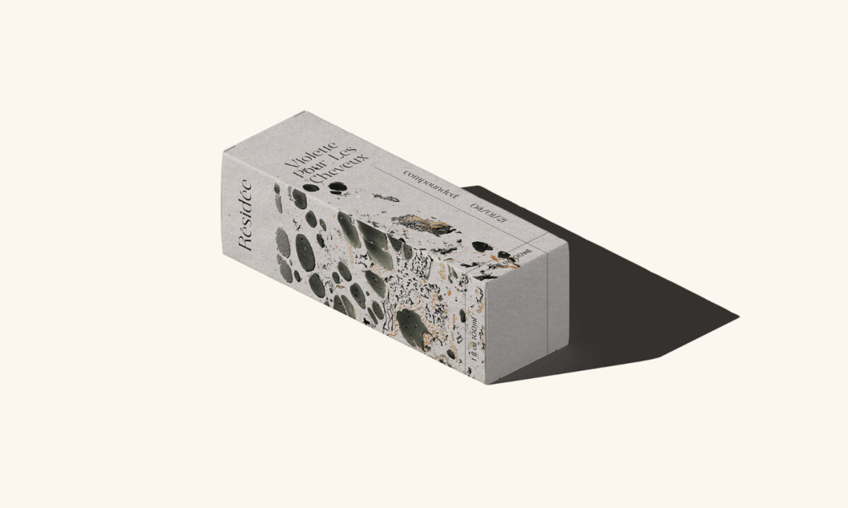
Fashion and beauty packaging depends on restraint, proportion, and material honesty to communicate value without excess. Résidée succeeds by pairing classical typographic structure with minimalist layouts, allowing texture, spacing, and contrast to carry the brand’s refined, cohesive identity.
Why This Is A Winning Design
- Botanical Storytelling: Detailed botanical illustrations sit at the center of the packaging. Their engraving style ties the products to plant ingredients and gives the brand a sense of craft and authenticity.
- Typography as a Luxury Signal: A high-contrast serif typeface introduces an editorial tone. Vertical label layouts and generous spacing keep the typography refined while avoiding heavy decoration.
- Material-Driven Aesthetic: Earth-toned palettes and dark glass containers reference raw natural materials. The restrained colors strengthen the sense of purity and keep the product line visually consistent.
- Balance Between Minimalism and Detail: The packaging stays minimal, though small elements—terrazzo-style textures and fine line illustrations — add texture and visual interest without crowding the layout.
- Brand Positioning: The design places Résidée within the modern luxury wellness space. Its calm, understated look aligns with skincare brands that focus on natural ingredients and thoughtful presentation.
‘’Lovely, elegant brand – everything feels really considered and it all marries up beautifully across the range. The botanical illustrations are a gorgeous touch, and the positioning comes through consistently on every touchpoint, from the box to the hang tags. Very well executed.
- Kitty Lai, DesignRush Juror