- Agency: Affogato
- Client: Rude Olive
- Category: Packaging Design — Food & Beverage
- Location: Mumbai, India
- Project Brief: Design food packaging that transforms grab-and-go olives into a collectible lifestyle product through bold branding, nostalgic metal tins, and reusable packaging that extends the brand experience beyond the purchase.
Buy a snack, toss the pack. Rude Olive fights that reflex in a food packaging design that gives you a tin worth keeping long after the last olive is gone.
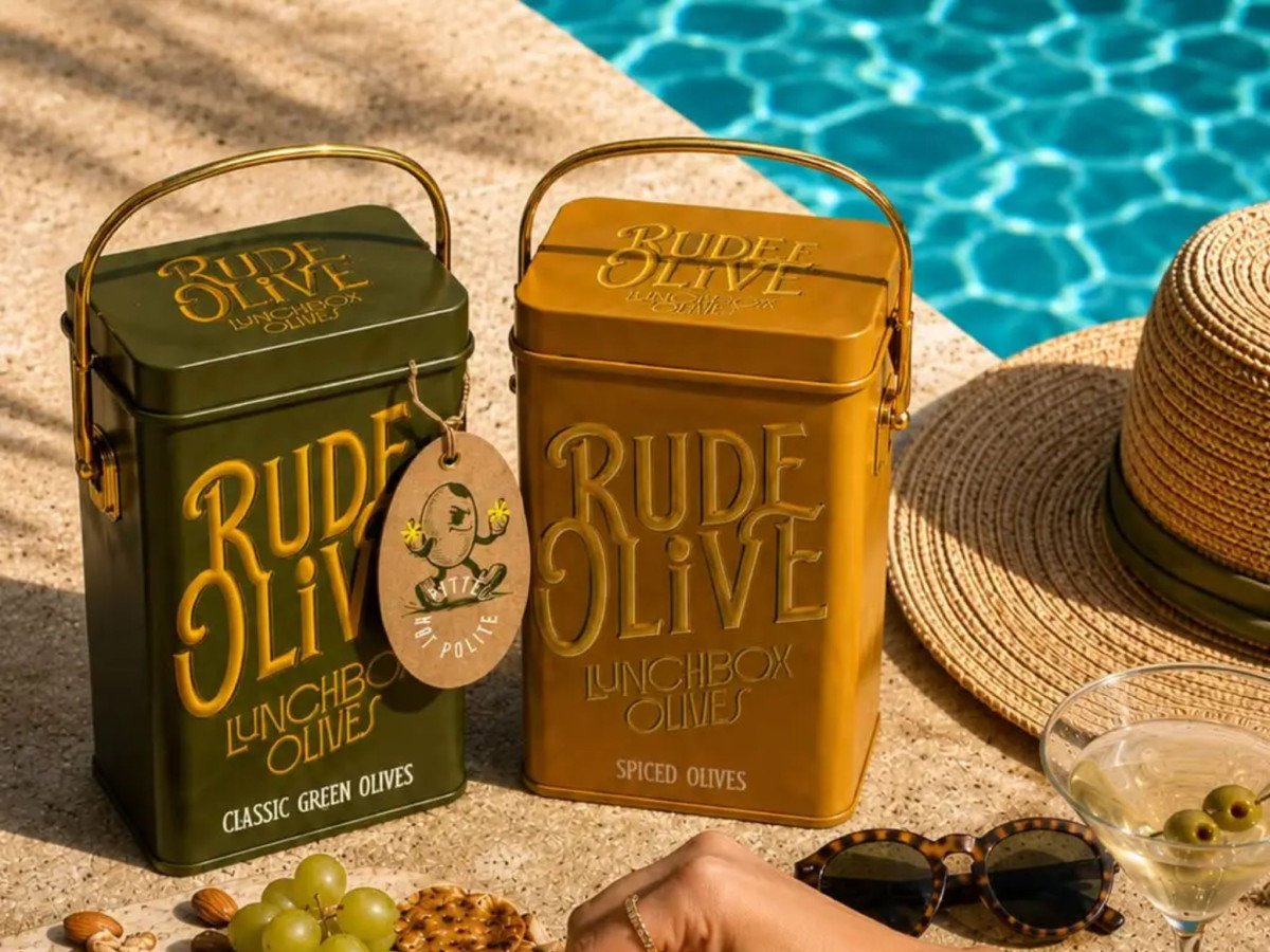
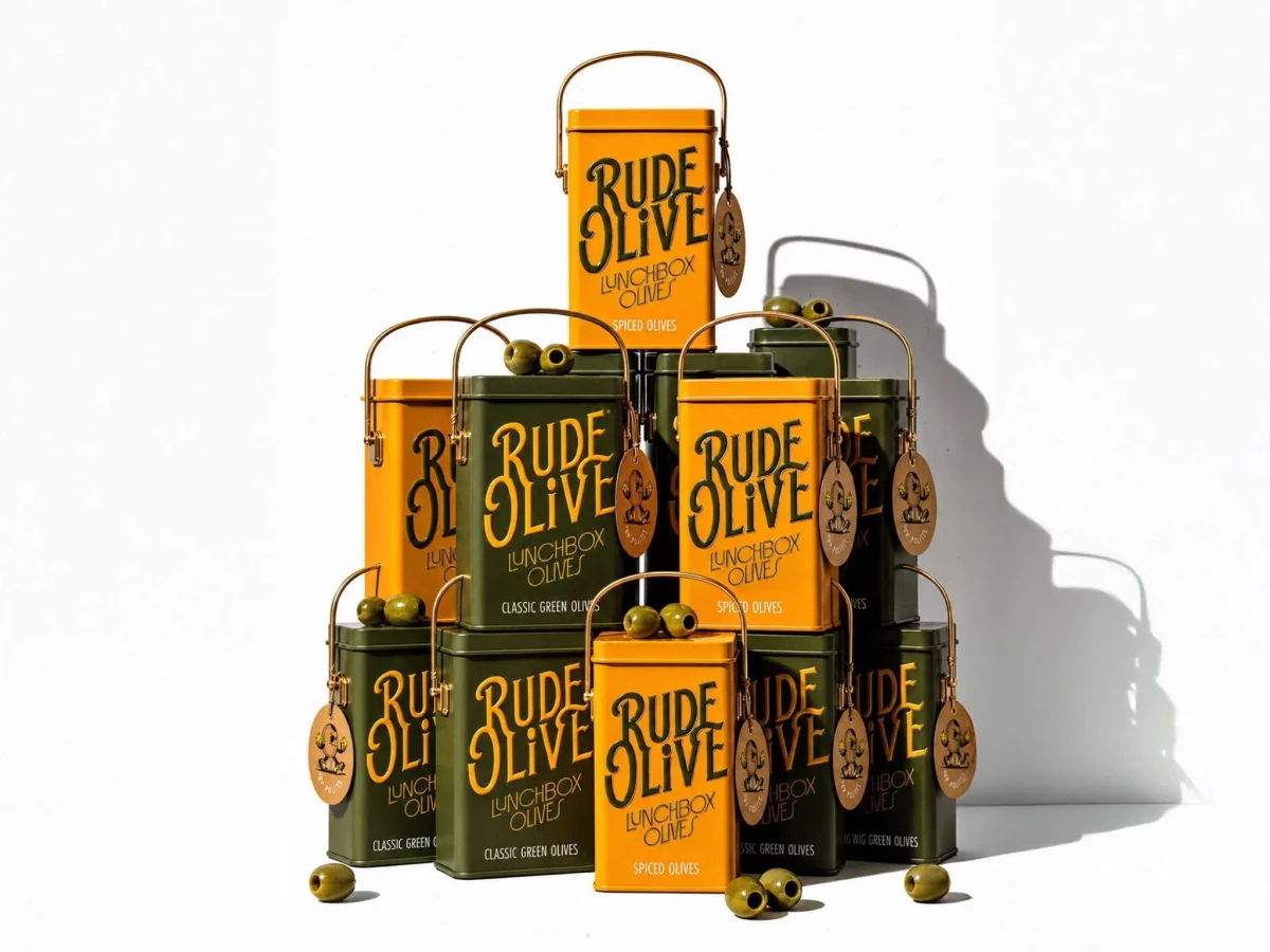
The tin borrows from an old-school lunchbox, down to the embossed lettering, the wire handle, and a hinged lid on solid metal. It takes a cheap grab-and-go snack and makes it feel like something you keep, which is the whole point.
The branding runs with the product's salty, briny streak. A hand-drawn wordmark and a cheeky olive mascot give the tin real character on the shelf and back up the "rude" name instead of playing it safe like most deli labels.
The colors run rich olive green and mustard yellow, split across the two flavors so they read as a pair you want to own together. Affogato mixed the nostalgic cues with cleaner modern type, so the tin still looks good sitting out at home once the olives are gone.