A Warm and Expressive Packaging Design Establishes Sugar Crush's Brand Identity
Sugar Crush aims to stand out and establish a brand identity that resonates with consumers in a market brimming with competition.
To create an out-of-the-box presentation for its ice cream flavors, the company partnered with Orange Tribe, a creative agency known for its innovative approach to branding and packaging. This collaboration resulted in a visual language that captures the essence of Sugar Crush's delectable frozen treats.
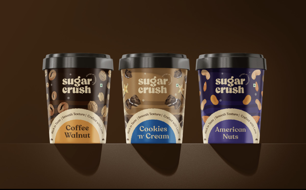
One striking aspect is the strategic use of flavor-matching colors. Each ice cream flavor is paired with a corresponding color palette, creating an immediate connection between the product and the consumer's senses. This clever approach enhances brand recognition and appeals to the target audience's desire for a multi-sensory experience.
Sugar Crush's packaging design is an inviting combination of warmth and expressiveness. Soft, rounded shapes and playful illustrations evoke joy and nostalgia, while bold typography and vibrant colors add a modern touch. This unique pairing effectively entices consumers to indulge in Sugar Crush's creamy goodness.
Custom Typography Infuses Personality into Sugar Crush's Packages
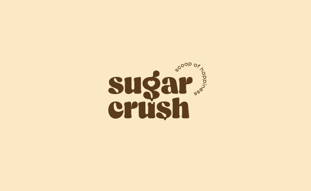
Sugar Crush's fun and light-hearted identity extends to its custom typography, a key element in excellent packaging designs.
The playful typeface features a heart illustration within the letter G, ensuring legibility while enhancing brand recall. The strong lines and well-defined letterforms make the brand name instantly recognizable, which showcases the subtle yet intricate details of the packaging.
Each typographic detail conveys the brand's passion for ice cream and its commitment to quality. The heart-shaped details perfectly tie into the Sugar Crush branding and its themes of love and indulgence.
Furthermore, this carefully crafted typeface elevates the packaging's aesthetic appeal and strengthens the brand's emotional connection with its consumers.
Check out some of the best confectionery packaging designs here.
The Design's Vibrant Ingredient Illustrations Differentiate Flavorful Options
Sugar Crush's packaging design is a visual feast that celebrates the brand's diverse flavors. Each pint features an illustrative focus on key ingredients, transforming nuts, cookies, coffee beans, and more into vibrant artistic representations.
The style rendering is playful and energetic, with bold lines and fun shapes. This approach makes each variant noticeable and showcases the creativity and passion that Sugar Crush pours into its flavors.
Moreover, the color palette is equally lively, matching the illustrations with color bursts that mirror the richness and variety of tastes. Each color choice, from deep chocolate browns to sunny mango yellows, creates a visually distinct identity for each flavor.
This integration of colors and product variations reinforces the brand's commitment to top-notch quality and market appeal.
By visually showcasing the key ingredients, Sugar Crush invites consumers to connect with the product and quickly discern options. This approach sets the ice cream brand apart from its competitors and creates a lasting impression.
Indulge in our collection of the best dairy packaging designs.
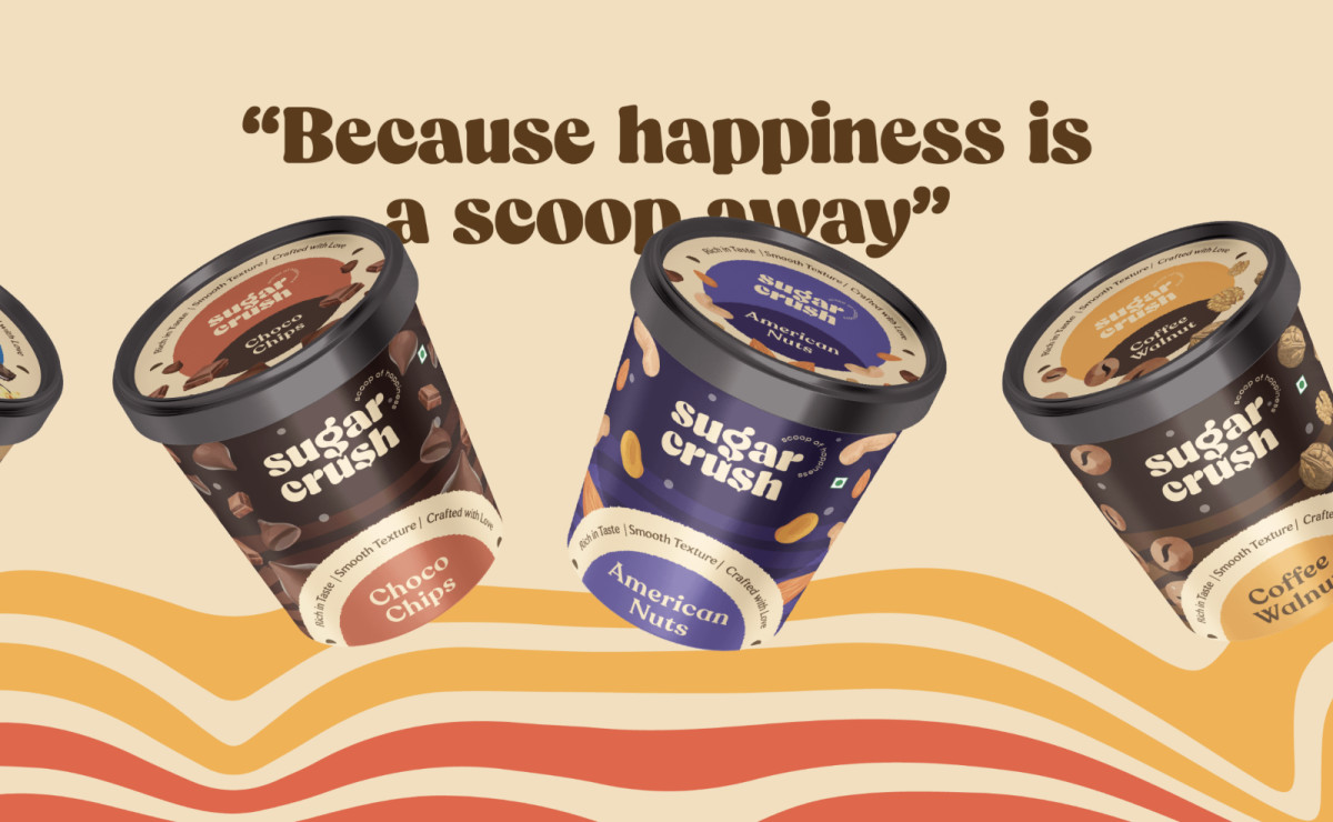
The Cohesive and Engaging Pint Packaging Shines With Circular Motifs
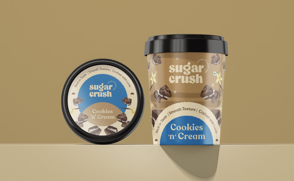
Sugar Crush's pint packaging maximizes design space to create a delightful and memorable product experience.
Many packaging designers employ this cylindrical shape to showcase vibrant illustrations from every angle, and Sugar Crush's container exemplifies that. The accompanying circular motifs enhance visual appeal and frame key product details.
With its cohesive design, eye-catching visuals, and strategic use of elements, Sugar Crush's packaging stands out among many ice cream options, making it a worthy recipient of the Best Designs Award for July.
It's a sweet victory that reflects the brand's dedication to quality, creativity, and consumer engagement.
Explore other examples of ice cream packaging designs to get inspired.


