Standout Features:
- Dripping visuals
- Italian culture references
- Clean, consistent design
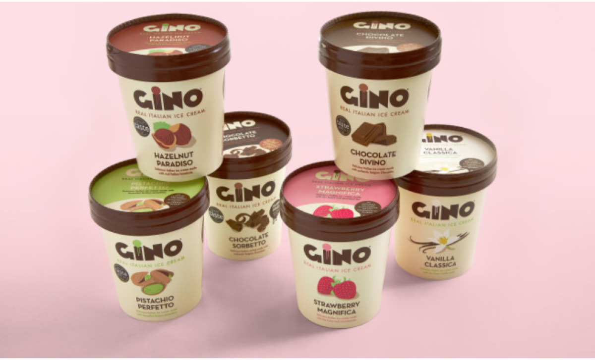
As Gino Gelato expanded from wholesale to retail, they needed a new packaging design. So, Alex Deamon created a premium-looking packaging design for the brand, with visuals communicating its affordability, especially for casual consumers.
The clean, consistent design features a beige background with the product flavor illustrated at the container's front center. The brand name is printed in a heavy font style with a stylized “I” containing a dripping ice cream visual.
Moreover, these dripping visuals extend to the back panel. They are utilized in two rounded frames: one lists the product ingredients, and the other contains information about the brand.
Another standout feature of this packaging design is its homage to Italian culture, featuring Italian references like famous artwork or iconic landmarks.

-preview.jpg)