Packaging Designed by
Jo Cutri Studio Jo Cutri Studio

Sundae Body Mist

Sundae Body Mist Packaging Design by Jo Cutri Studio
Sundae Body Mist extends the brand into fragrance through a playful, expressive packaging concept. The design introduces a distinctive bottle design that reinforces brand identity while creating a cohesive and recognizable product range.
Three vertical panels showing pink perfume bottles alongside flowers and a garden scene
Floral photography pairing soft-touch packaging with botanicals
Technical drawings and hand-drawn sketches of the pebble-shaped bottle design
Design process showing technical sketches and mood boards
This website uses a colour palette of 4 colours
  • #FFB8CA
  • #FFDDB7
  • #BBF6E0
  • #FFB860
Technologies & Tools
Description
Team Behind the Design
  • Agency: Jo Cutri Studio
  • Client: Sundae
  • Category: Packaging Design — Fashion & Beauty
  • Location: Melbourne, Australia
  • Project Brief: Design packaging that enhances shelf appeal and expands the brand into fragrance through a playful, recognizable system.

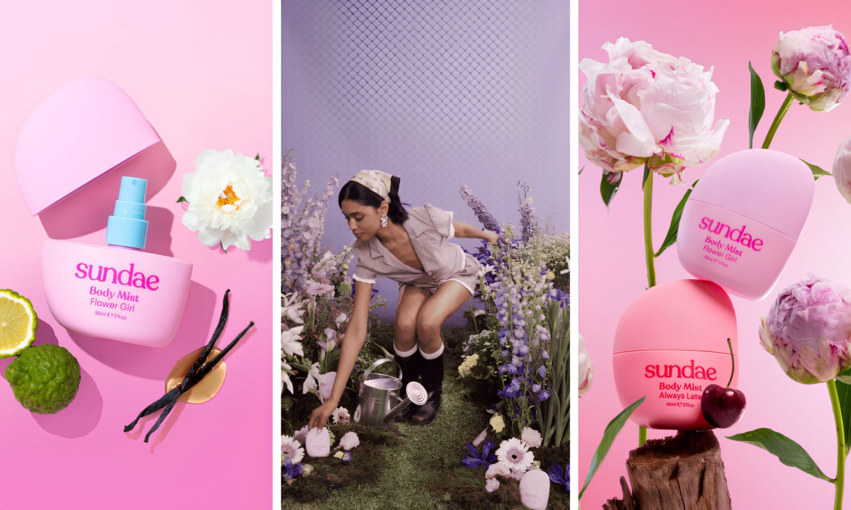
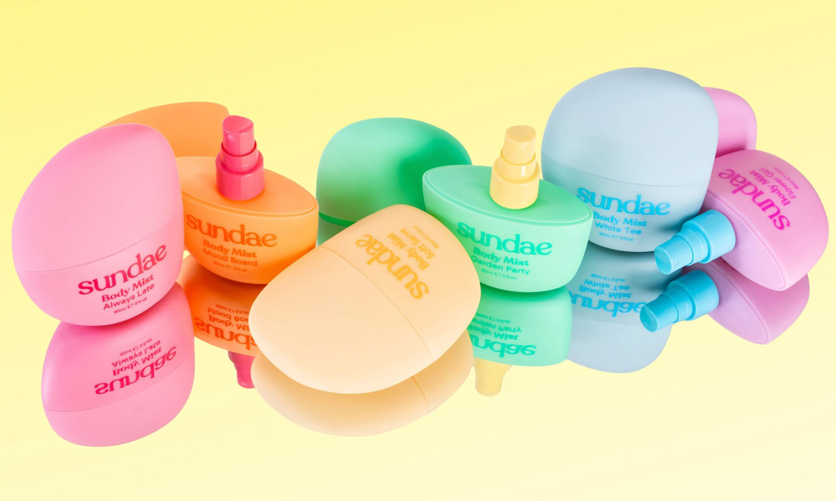
A fashion and beauty packaging collection stands out when the bottle itself becomes the reason someone picks it up. Jo Cutri Studio takes that seriously for Sundae Body Mist, pushing a jellybean-inspired form and Y2K color sensibility into the fragrance category with enough conviction that the design stops looking like a trend and starts looking like a signature.

Soft, pebble-like shapes and candy-coated palettes give each scent a distinct personality while the underlying visual system keeps the collection readable as a family. Nothing here looks like it wandered in from a different brief.

3D-developed curves make the bottles satisfying to hold, and that tactile quality is built into the design rather than left to the material. High-contrast typography sits against the rounded forms without fighting them, and the result handles like a considered object rather than a container.

The studio turns a body mist into something a person puts on a shelf on purpose. Nostalgic silhouettes and high-end finishes pull in the same direction, and the collection lands as a piece of a larger aesthetic rather than a standalone product.

Discover more from Jo Cutri Studio

Denada Packaging Design

Denada

Explore this year's Design Awards finalists and see the projects selected for top recognition. These entries are now in the finalist stage, moving forward for jury evaluation across categories like web, branding, product, and digital design.
Maison Thierry Bornier Packaging by Studio Matte
Maison Thierry Bornier
Designed byStudio Matte
SOZ Packaging Design by Daniela Barrio de Mendoza
SOZ
Lumere Packaging Design by Cromia Design
Lumere
Designed byCromia Design
Tomatier Snack packaging design by Meteorito Estudio.
Tomatier Snack
Eight & Bob packaging design by Lavernia & Cienfuegos.
Eight & Bob
Maison Protéine packaging design by Bolden Branding.
Maison Protéine
Designed byBolden Branding
View All BestPackaging Designs

Ready to elevate your designs?