Standout Features:
- Appetizing visuals of its ingredients
- Ingredient-based color coding
- Consistent design across multiple formats
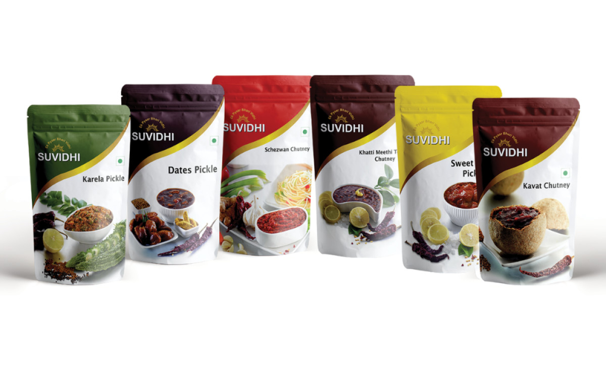
Suvidhi's whole brand identity is deeply rooted in using traditional Indian recipes and high-quality, natural ingredients. Le Dessein Studio, therefore, designed its complete packaging system to communicate the authenticity and quality that goes behind every Suvidhi pouch, bottle, and jar, manifested in a few ways:
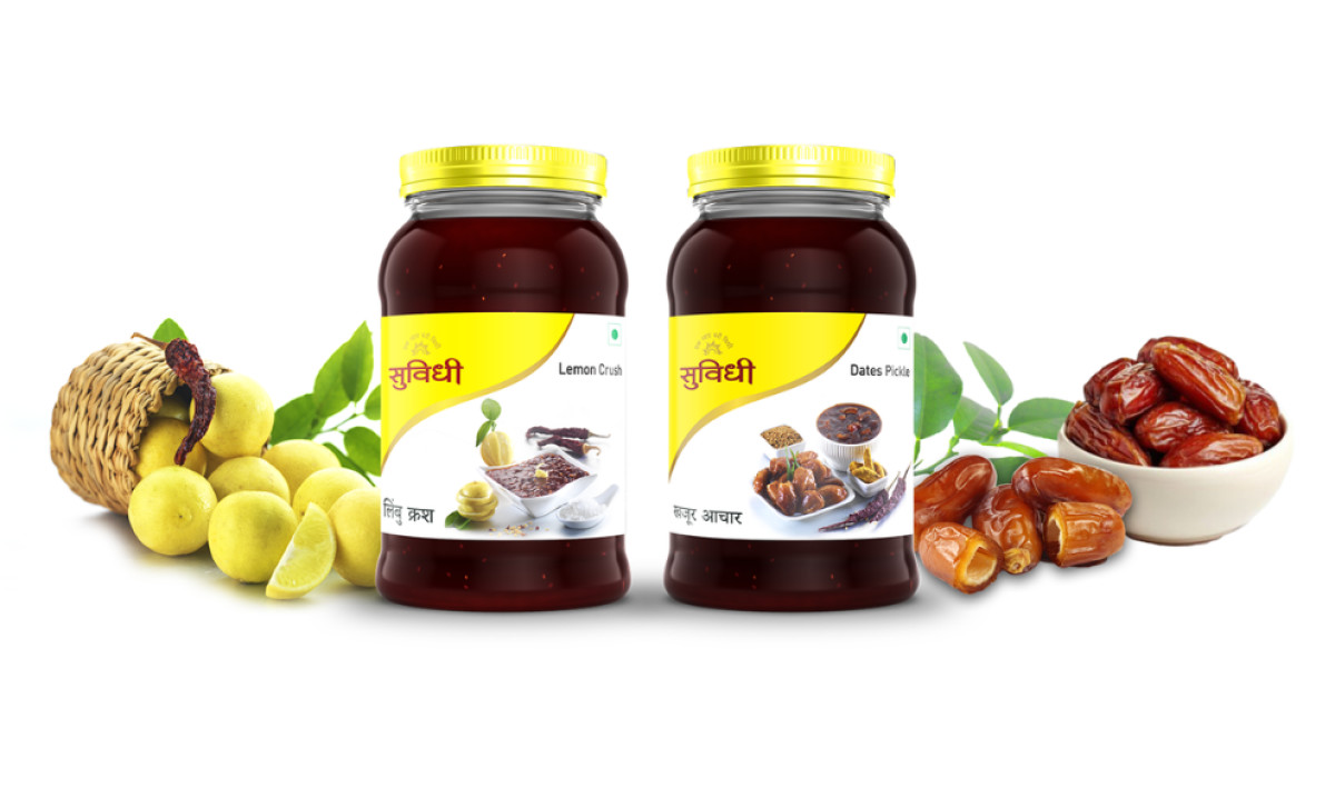
Firstly, what stands out immediately is the packaging's high-quality visuals displaying both the prepared item alongside key ingredients like fresh mangoes. This "show, don't just tell" approach looks appetizing and clearly signals the contents and flavor profile, leaving no room for error.
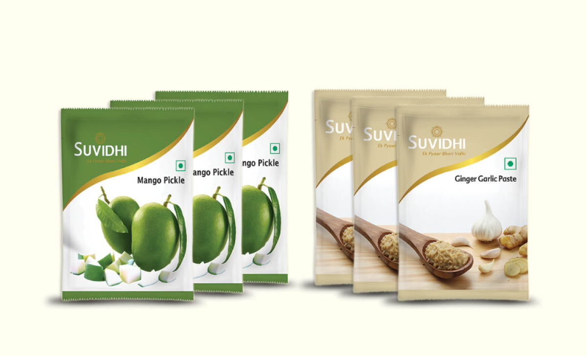
Next, it uses intuitive color coding really well across the range, utilizing different background colors usually derived from the main ingredient — yellow for lemon, green for mango, and so on. This provides a logical method for telling products apart, helping shoppers easily find flavors based on those common ingredient color connections.
Finally, what's also great is how the core design elements adapt so well across different packaging structures. You see the same cohesive look on stand-up pouches, flat sachets, or glass jars, ensuring the identity remains recognizable. Strategies like this are what keeps your brand top of mind for consumers.
Suvidhi wanted packaging that conveyed authentic flavor, and they got it by doing more than just making claims. Their packaging proves that showing the product's quality with great visuals of food and ingredients works wonders. That's a key piece of advice for creating food packaging design that people find truly convincing.

-preview.jpg)

-preview.jpg)