Team Behind the Design
Packaging Design Analysis
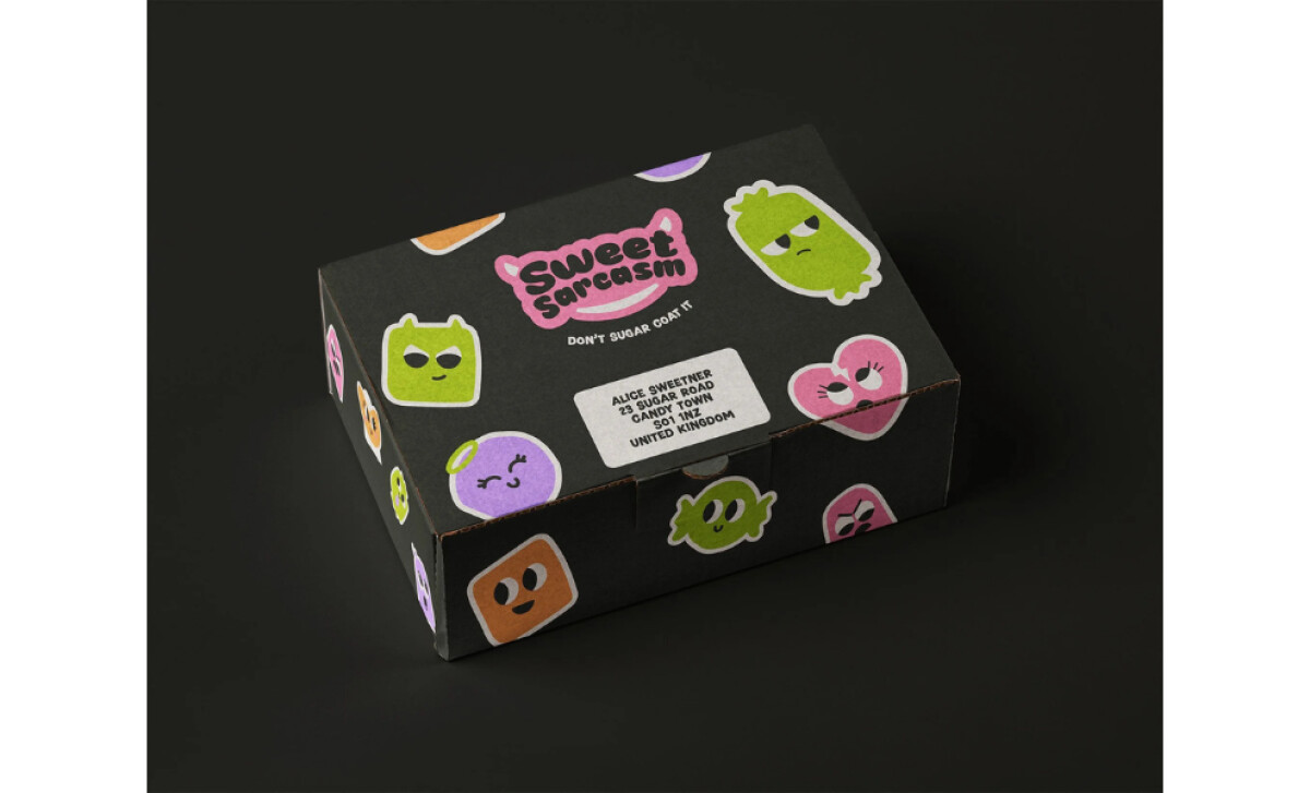
In reviewing food packaging, I look for how design choices express a brand’s voice and connect with its audience.
Sweet Sarcasm is a great example of packaging that speaks exactly like the people who buy it: confident, cheeky, and full of personality.
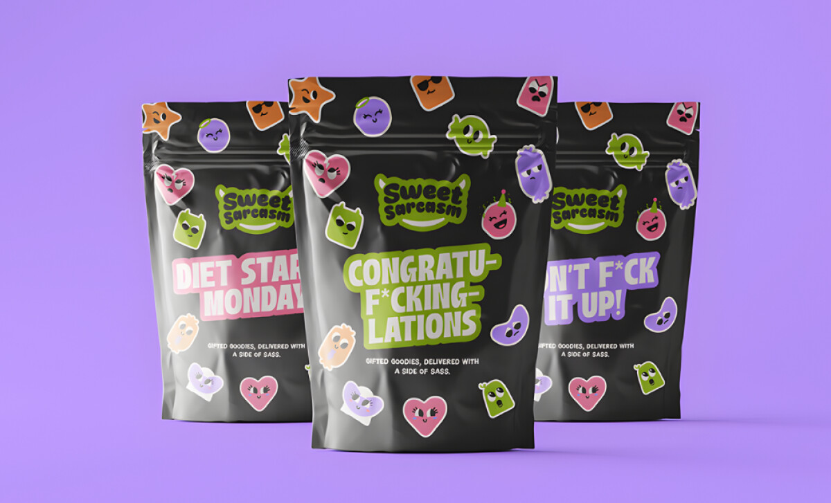
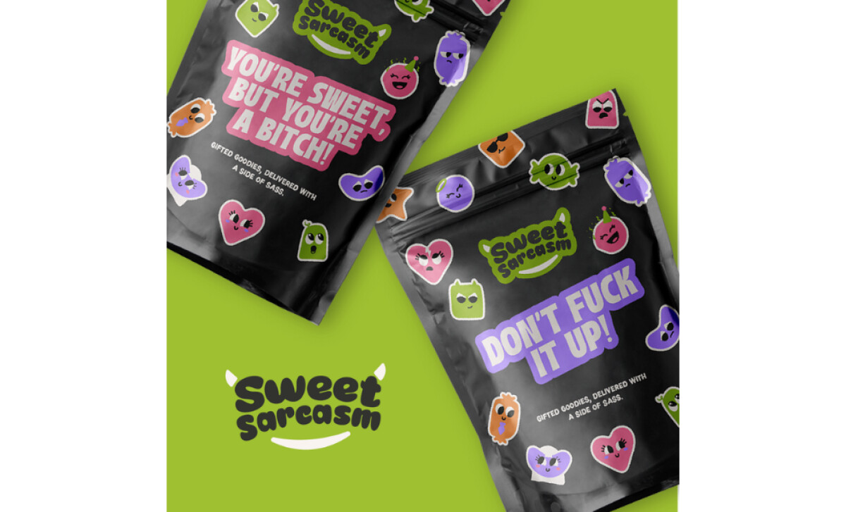
- Structure & Form: The matte black pouches and boxes feel sturdy and practical. Their clean form keeps attention on the bold text and expressive characters.
- Visual Direction: I really enjoy how the bright candy icons pop against the dark background. Each face carries a little attitude, which makes the design feel alive and instantly recognizable.
- Typography & Messaging: The thick, uppercase lettering delivers each message with perfect timing. I find the tone refreshingly direct, like a quick joke between friends that sticks with you.
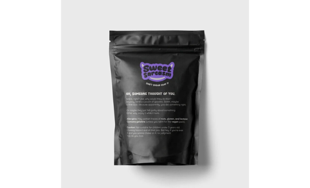
- Information & Detail: Even the back panel stays in character while delivering the essentials clearly. The humor never distracts from the practical information, which keeps the design balanced.
- Material & Finish: The matte texture feels soft and contemporary, while the glossy stickers add a playful shine. It’s packaging that invites touch and looks great on display.
What Brands & Agencies Can Learn from Sweet Sarcasm
Sweet Sarcasm’s packaging shows how humor, structure, and visual confidence can turn a snack brand into a personality people remember.
1. Use Tone as a Design Tool
Let the brand’s voice shape the visuals. When humor carries through typography, color, and copy, packaging becomes a conversation starter instead of background noise on a shelf.
2. Build Energy Through Contrast
Pair a dark base with bright accents to create instant recognition. Color contrasts can set the stage for expressive details and help playful brands stand out in crowded categories.
3. Keep Function and Personality Aligned
Make sure practicality supports expression. Resealable forms, clear labeling, and tactile finishes can work alongside witty design choices to deliver packaging that feels as smart as it looks.
About DesignRush Featured Designs
At DesignRush, we review hundreds of agency projects each month.
The featured designs stand out for creativity, relevance, and execution. Many go on to be recognized as winners of our Monthly Design Awards.
Explore more creative work here:
- Best Packaging Designs
- Best Website Designs
- Best App Designs
- Best Logo Designs
- Best Print Designs
- Best Video Designs
For a full list of design agencies and related services, see our Agency Directory.