Standout Features:
- Cartoonish illustrations
- Pastel green as an accent color
- Playful and charming
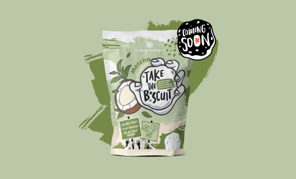
Take the Biscuit’s charming and dynamic packaging design features cartoonish illustrations, a pastel green color scheme, and sketch-style sans-serif typography. Designed by Hexa6ram, the quirky illustrations of fruits, plants, and a big hand clutching a biscuit add personality and energy to the design.
Utilizing a soft pastel color palette, the packaging mirrors the brand’s ethos of sustainability and eco-friendliness. Moreover, a gentle shade of green is used as an accent color, matching Take the Biscuit’s natural, healthy, and vegan products.
The hand-written sketch-style typography with rounded edges adds to the design’s playfulness and character. Conversely, the sans-serif font ensures clarity and readability, round out the overall composition.
-preview.jpg)

-preview.jpg)