Tambor y Caracol, a specialty coffee brand out of Colorado, teamed up with designer Gabriel Tarin to build a packaging system that is as much about heritage as it is about function.
By blending expressive illustrations with a clean layout, they created a look that tells a deep cultural story while remaining sharp and easy to navigate. The final design delivers a premium, recognizable presence that holds its own on a crowded retail shelf.
Industry Insight: Product packaging directly shapes buying habits. Research shows, 72% of American consumers say that packaging design influences their purchase decisions, proving its power at the point of sale.
Tambor y Caracol Packaging Design: Key Findings
Structured Layouts Balance Storytelling and Function
The layout utilizes smart paneling to balance heritage-focused art with essential product data. This organization guides the eye from the brand identity down to the specific roast details in a clean, logical flow.
"Great initiative supported by strong graphics. A compelling brand story, with the merchandise adding another engaging touch."— Kitty Lai, DesignRush Awards Jury
By organizing information this way, the brand reduces friction for the shopper. This is vital since nearly three quarters of consumers credit packaging design as a top influence on their final purchase.
Explore the best packaging designs to see how other brands use structure to win over retail shoppers.
Contrast and Cultural Character Enhance Shelf Impact
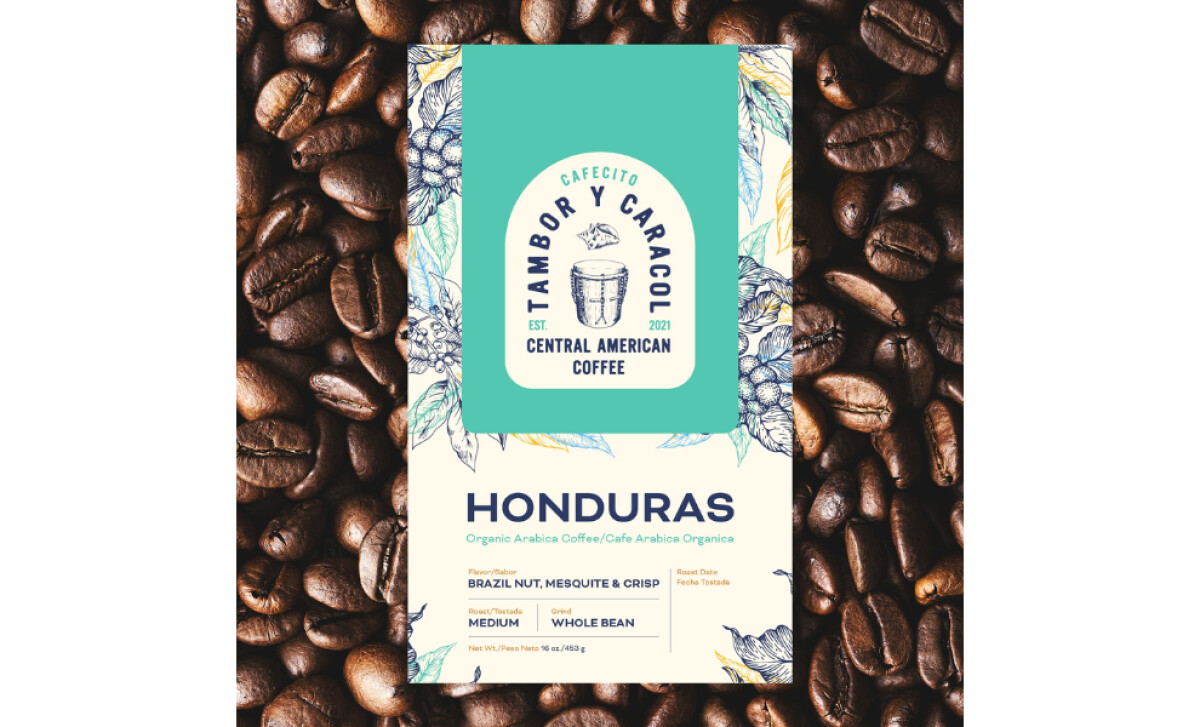
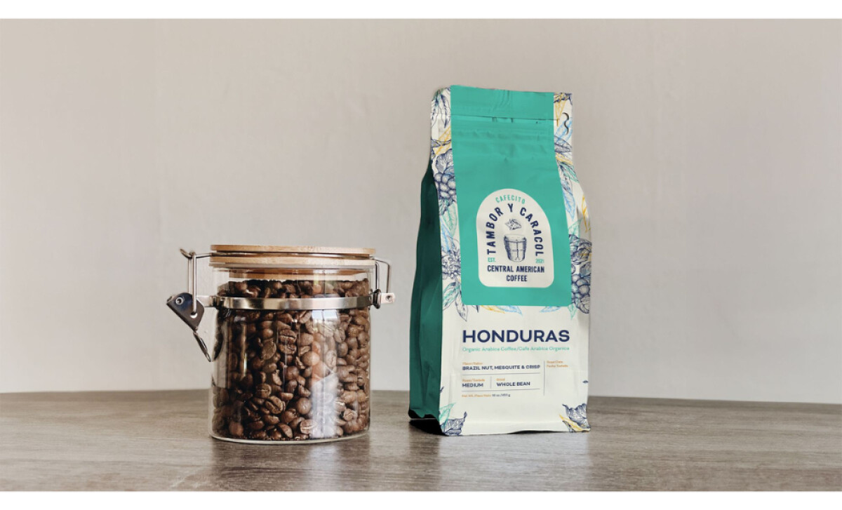
The teal front panel creates a striking contrast against the illustrated borders, helping the bag catch the eye from a distance. This bold use of color ensures a "dignified" look that feels both warm and upscale.
"A lovely design that incorporates local artists to express cultural character. It’s unique and really stands out."— Kitty Lai, DesignRush Awards Jury
This visual distinction is key to a premium perception. Data shows that 45% of shoppers prefer buying from brands that offer high-end packaging, as they associate the exterior quality with the quality of the product inside.
Intentional Hierarchy Supports Quick Decision Making
Critical details like roast level, flavor notes, and grind type are anchored at the bottom of the bag. For a coffee packaging design, this placement allows customers to scan the most important variables in seconds while standing in a grocery aisle.
"Creating a cultural connection using dignified, stunning visuals elevate the brand and resealable packaging adds to the storytelling and impact."— Andrea Owsinek-Brucker, DesignRush Awards Jury
This transparency builds long-term loyalty. Research indicates that 94% of consumers are more likely to stay loyal to brands that provide clear and honest labeling, proving that good information design is a trust-building tool.
Artisanal Illustrations Signal Sustainability and Craft
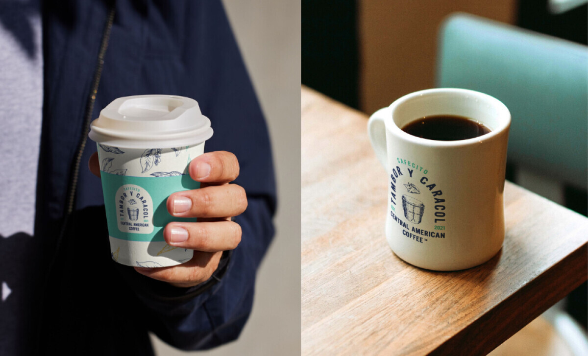
The hand-drawn illustrations provide a "crafted" texture that signals authenticity and artisanal quality. These visual cues celebrate the brand's roots while subtly aligning with the values of eco-conscious consumers.
"Luxurious execution that elevates product perception."— Andrea Owsinek-Brucker, DesignRush Awards Jury
With 50% of U.S. consumers willing to pay a premium for packaging that feels sustainable or high-quality, these artistic choices drive real business value. For Tambor y Caracol, the artisanal look transforms a simple coffee bag into a piece of cultural storytelling.
Collaborator Input
Word from the Agency
"Our strategy was to design a visual identity that celebrated the cultural roots of CTC while also preparing the brand for long-term growth. The identity needed to carry the vibrancy of Honduras through color and imagery, highlight the instruments that inspired the name, and communicate authenticity in every detail. At the same time, the system needed flexibility to expand into new roasts, packaging, and future collaborations."— Gabriel Tarin
What Brands & Agencies Can Learn from Tambor y Caracol
Gabriel Tarin’s packaging for Tambor y Caracol shows how cultural storytelling and practical clarity can coexist beautifully. The design proves that heritage-driven visuals can stand out on shelves without overwhelming function.
1. Let Cultural Elements Guide the Story, Not Complicate It
The hand-drawn illustrations add authenticity and emotion without crowding the layout. This approach shows how brands can honor heritage through carefully framed artwork rather than visual overload.
2. Use Color Contrast to Anchor Shelf Presence
The bold teal front panel creates instant recognition. When paired with warm illustrated borders, it strikes a balance between standout appeal and approachability, showing how smart color choices can drive visibility.
3. Keep Product Details Easy to Scan for Faster Decisions
Clear placement of roast level, flavor notes, and grind type makes the packaging both beautiful and practical. This reinforces the importance of structuring information so customers can navigate options quickly.
About DesignRush Featured Designs
At DesignRush, we review hundreds of agency projects each month. The featured designs stand out for creativity, relevance, and execution.
Many go on to be recognized as winners of our Monthly Design Awards.
Explore more creative work here:
- Best Packaging Designs
- Best Website Designs
- Best App Designs
- Best Logo Designs
- Best Print Designs
- Best Video Designs
For a full list of design agencies and related services, see our Agency Directory.