Team Behind the Design
Nonfiction Protein Bar wanted packaging that reflects exactly what the brand stands for: clean fuel made from real ingredients. The design system needed to express honesty and quality while giving active consumers a quick way to understand what is inside each bar.
Coastlines created a visual language that is simple, bold, and unmistakably real.
Packaging Design Analysis
A successful food packaging design must help customers trust the product while making flavors easy to spot.
As I reviewed the Nonfiction system, I noticed how intentional each design choice is in supporting clarity and strong shelf presence.
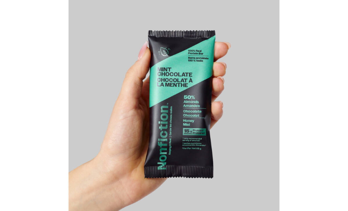
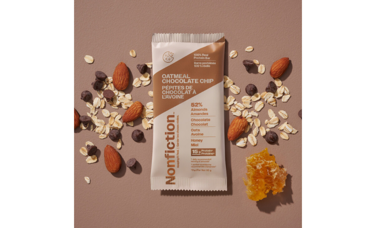
- Visual Architecture and Layout: I appreciate how the clean geometric layout delivers information in an orderly and easy to scan structure. The angled flavor panels guide the eye from top to bottom, and I find that this gives the packaging a sense of movement and energy that fits the active lifestyle audience.
- Typography and Brand Voice: The vertical Nonfiction wordmark stands out immediately and reinforces the brand’s direct and honest personality. As I explored the type system, I noticed how bold weights for key details like flavor names and ingredient percentages improve readability and make the product feel confident.
- Color System and Flavor Differentiation: The color palette is one of the strongest elements in the system. Each flavor uses a distinct, vibrant tone paired with natural neutrals, and I find that this creates instant recognition on shelves. The colors convey freshness while remaining grounded and balanced.
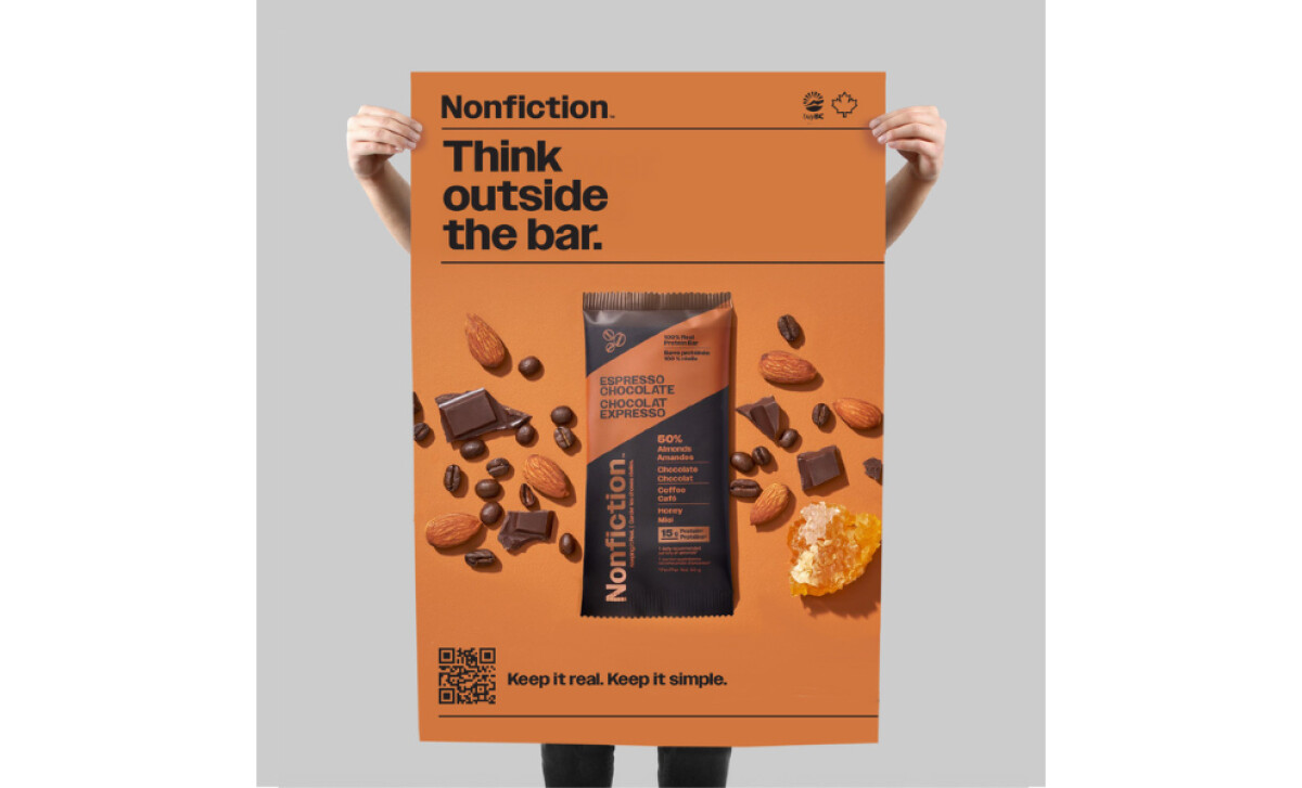
- Photography and Ingredient Storytelling: The supporting photography plays an important role. I like how real ingredients are arranged around the bar to reinforce transparency and naturalness. These visuals make the bar feel tangible and honest, helping customers see exactly what they are choosing.
What Brands and Agencies Can Learn from Nonfiction’s Packaging
Coastlines’ work for Nonfiction shows how clarity, structure, and ingredient honesty can create real impact in a crowded category. The system feels confident, clean, and purposeful, which makes the product easier to trust and quicker to choose.
1. Lead with Structure That Guides the Eye
The angled flavor panel and geometric layout give the design a clear visual path. This approach helps shoppers scan the bar quickly and understand the essentials at a glance.
2. Use Typography to Communicate Personality
The vertical wordmark and bold flavor names reinforce the brand’s straightforward nature. This type strategy gives the bars a recognizable presence even from a distance.
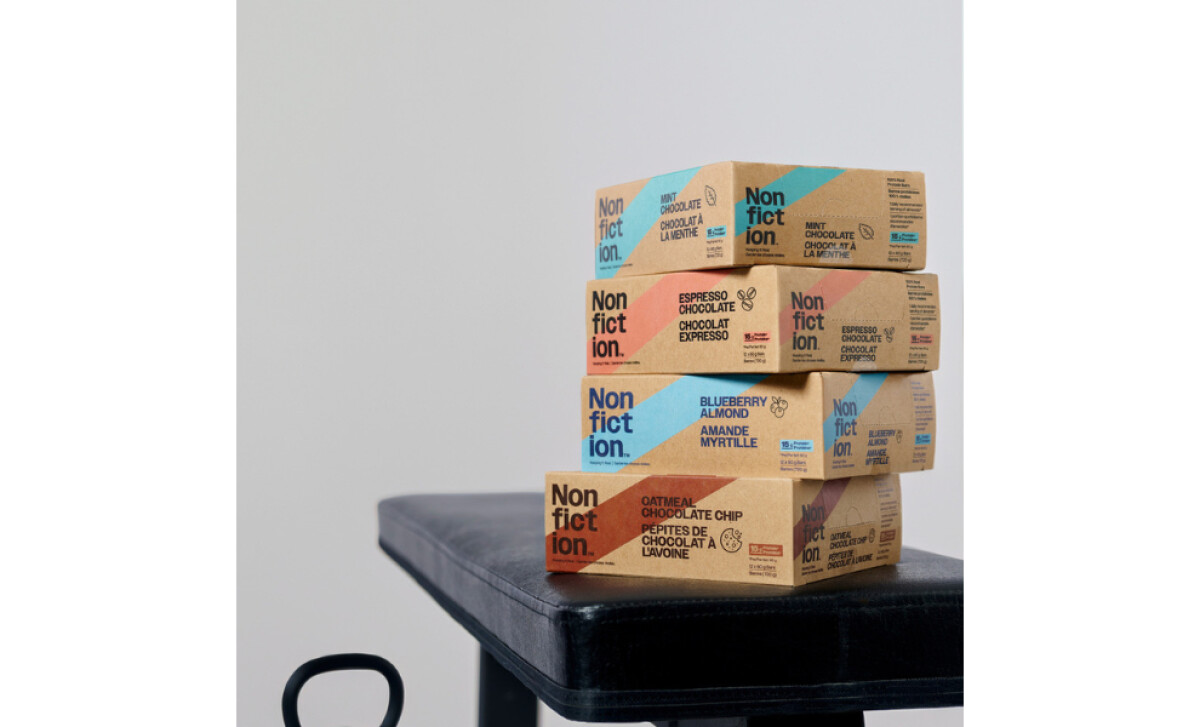
3. Build a Color System That Works Hard on the Shelf
Each flavor has its own bright color supported by neutral tones. This creates strong differentiation while keeping the brand unified and easy to spot in a crowded aisle.
Client Testimonial
The client shared their experience working with Coastlines and offered insight into why the partnership was successful.
"The Coastlines team helped us with brand design and packaging and we could not be happier with their work. Having worked with three other agencies previously, Coastlines’ approach was a breath of fresh air and I was impressed with their speed, responsiveness, and creativity."
Their feedback reflects the clarity and collaboration that shaped the Nonfiction brand from concept to shelf.
About DesignRush Featured Designs
At DesignRush, we review hundreds of agency projects each month. The featured designs stand out for creativity, relevance, and execution.
Many go on to be recognized as winners of our Monthly Design Awards.
Explore more creative work here:
- Best Packaging Designs
- Best Website Designs
- Best App Designs
- Best Logo Designs
- Best Print Designs
- Best Video Designs
For a full list of design agencies and related services, see our Agency Directory.