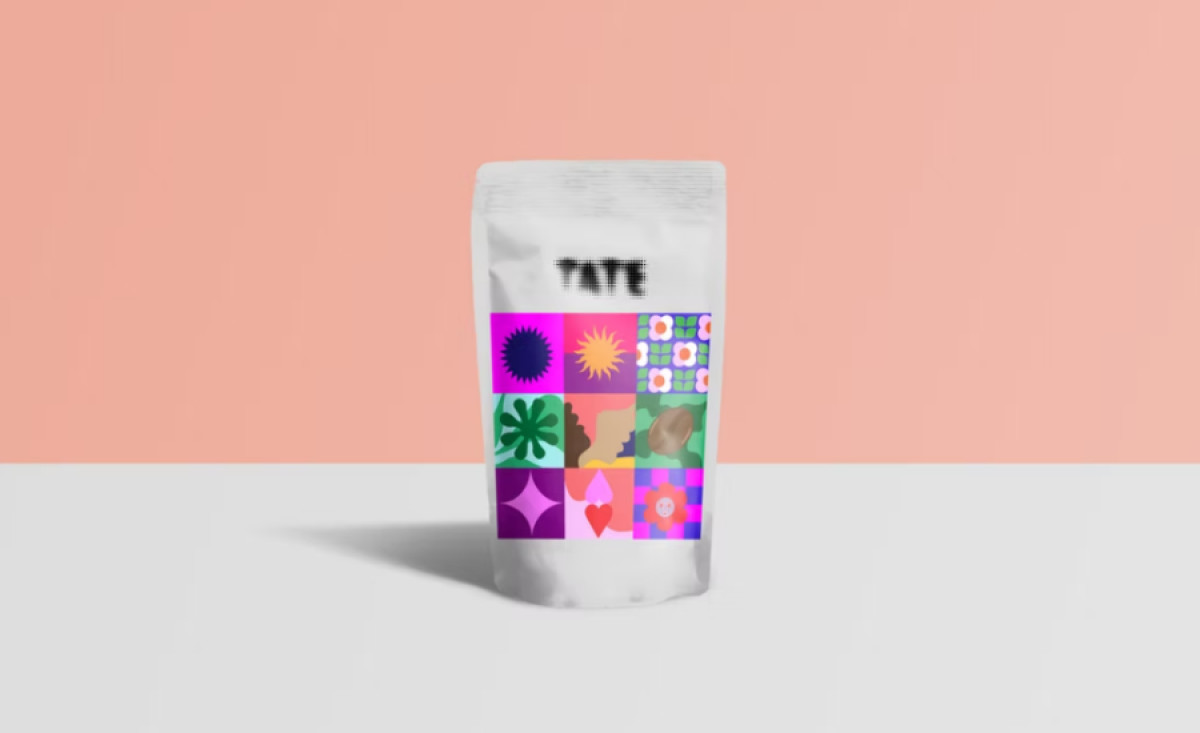
Standout Features:
- Colorful, dynamic illustration style
- Contemporary art-inspired mosaic pattern
- Retro-modern vibe
Tate Coffee’s Funky Brew packaging, designed by VIVIDsgns, uses vibrant visuals to capture the energy and vibrancy of the brand. Known for its commitment to quality coffee, Tate wanted a design that would communicate both its dynamic product and its global community of coffee drinkers. The result is a lively, fun design.
The colorful illustration style is central to the Funky Brew packaging. A playful mosaic of bold, abstract shapes and patterns creates a sense of movement and energy. This lively composition reflects the brand's mission to energize and connect with coffee lovers worldwide, providing a visual metaphor for the coffee's invigorating effects.

The contemporary art-inspired mosaic pattern further enhances the packaging's unique appeal. With its blend of geometric shapes and vibrant colors, the design evokes the modern-retro aesthetic popular among emerging coffee and organic food brands. This approach helps Tate stand out in a crowded market.
Incorporating a retro-modern vibe, the design feels both nostalgic and forward-thinking, appealing to a broad audience. The pattern's modern interpretation of vintage visual identities aligns with the growing trend of organic and artisanal products that combine style with substance.
In conclusion, Tate Coffee's Funky Brew packaging by VIVIDsgns perfectly encapsulates the energy, creativity, and global community of the brand. Its dynamic illustrations, art-inspired patterns, and retro-modern vibe make it one of the best food and beverage packaging designs in the market today.
-preview.jpg)
-preview.jpg)
