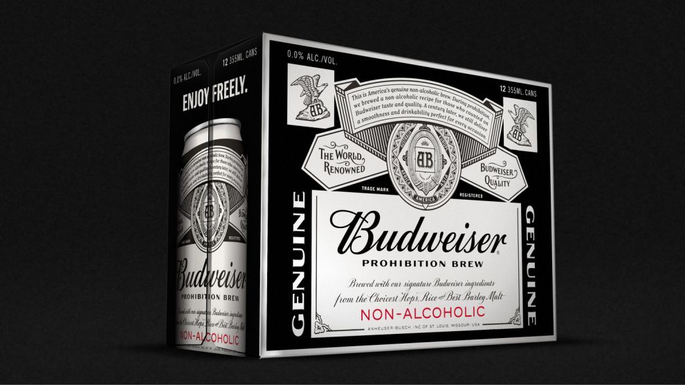
A beer company choosing to make a non-alcoholic beer is a bold decision. Why not have jones knowles ritchie create a bold design to match? Budweiser Prohibition Brew is not your average non-alcoholic beer.
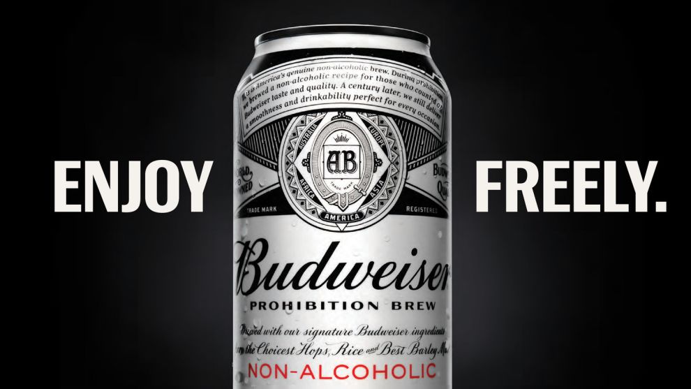
The can uses many of the same design cues as the Budweiser beer that customers know and love. However, the company also needed to clearly differentiate their non-alcoholic beer from their existing product. The result is a bold, black and white packaging design. The only color is the clean, sans serif text that says, “Non-alcoholic.”

One of the biggest challenges for a non-alcoholic beer is to kick the notion that non-alcoholic beer is for someone weak or inferior. This bold design accomplishes that. Everything about Budweiser’s new design feels strong and masculine. Some might even argue that the black and white design is even more attractive than Budweiser’s traditional red can and bottle.
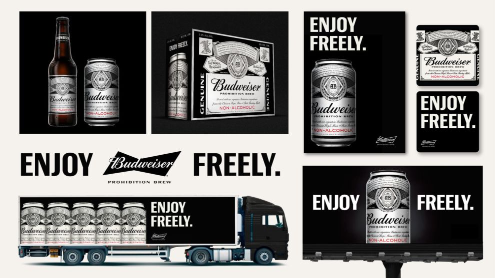
One of the best features of their design is how well it lends itself to other areas of Budweiser marketing. Again, using only black, white, and a tiny bit of red, Budweiser is able to create eye-popping, bold designs for their billboards, trucks, and even coasters.
This clean design is the perfect example of how black and white can be used to create a bold form that stands out as well as any combination of color possibly could.
Budweiser Prohibition Brew is an amazing packaging design in the Food & Beverage industry.

-preview.jpg)

