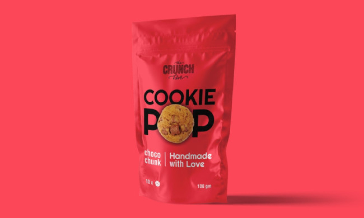
Standout Features:
- Resealable packaging
- Energetic colors
- Bold sans-serif typography
The Crunch Hive's packaging design by Design Quarry embodies a minimalist yet impactful approach. The resealable packaging helps maintain product freshness and allows ease of use for on-the-go consumers. The bright color story aids in product differentiation and creates strong shelf visibility that quickly captures consumer attention.
The bold sans-serif typography ensures the product name is readable and stands out, effectively communicating brand identity. This combination of functionality and aesthetics makes The Crunch Hive's packaging design a solid example of effective snack packaging.
Get a chance to become the next Design Award winner.
SUBMIT YOUR DESIGN-preview.jpg)