
Standout Features
- Memorable two-tone color system
- Flavor-inspired illustrations
- Minimalist structure with premium shelf appeal
Creating standout packaging in the CBD niche isn’t easy, especially with strict design regulations. Haiku Steps Inc. met the challenge with a minimalist yet striking packaging design for Trophy By Leaf.
The first thing that catches the eye is the bold two-tone color palette. Each product uses its own pairing for a unified yet flexible system.
When placed side by side, the products look like they’re part of the same product line while still expressing individual identities. Given that a signature color increases brand recognition by up to 80%, this is a smart design choice.
Beyond color, flavor cues are front and center.
Each variant features clean, illustrated ingredient markers that do not overwhelm the package. Whether it’s mango or citrus, the visuals are modern and restrained; just enough for the customer to understand what they’re getting.
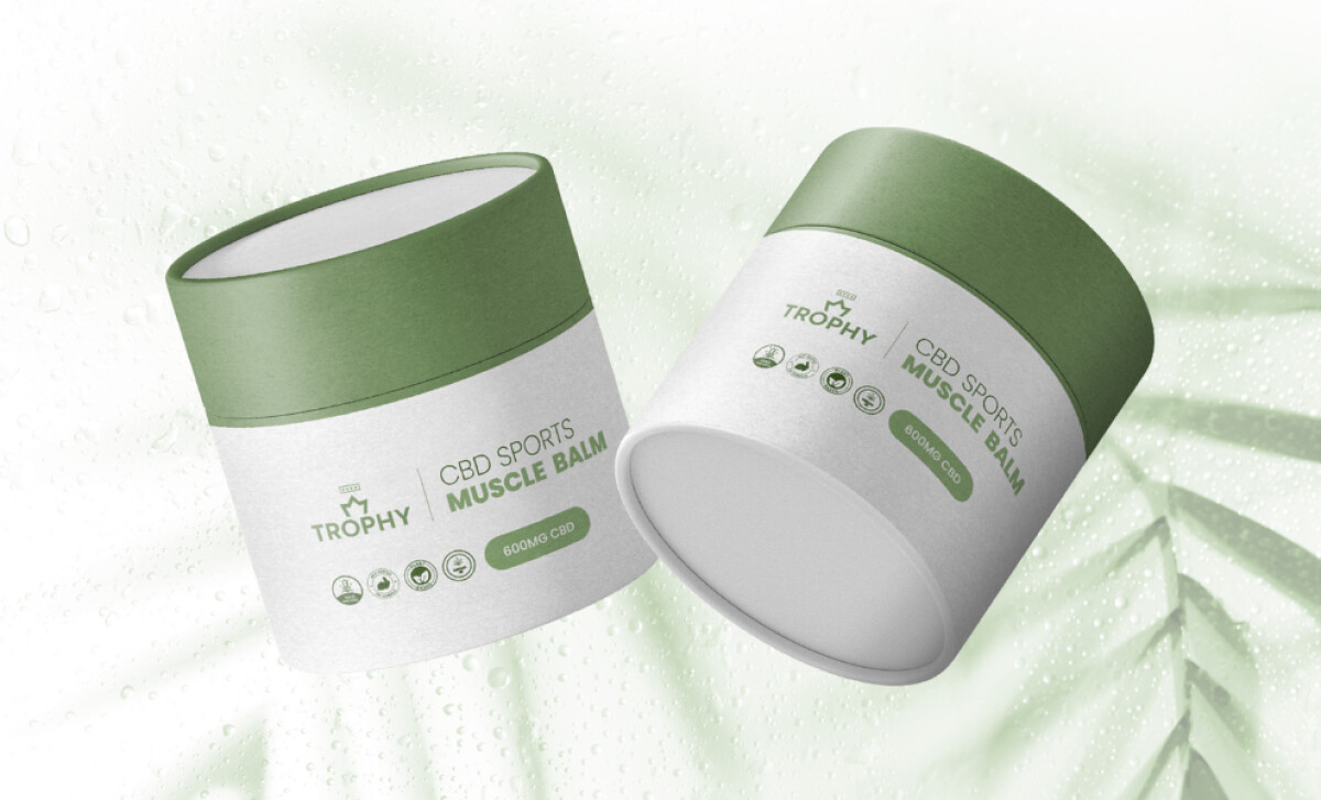
The typography is minimalist and intentional. There’s no overcrowding or excessive claims. Rather, each package displays the information that matters: product type, core ingredients, and use case. Everything is laid out with enough breathing room to feel premium, not clinical.
But what really sets this packaging apart is how well it translates to digital. The same two-tone design system is consistent across Trophy’s website, reinforcing brand cohesion across both physical and digital touchpoints.
This level of alignment not only builds trust but also strengthens recall in a space where branding opportunities are limited by law.

Since the packaging refresh, Trophy By Leaf has seen much higher retail interest and stronger brand presencein dispensary environments.
Buyers have responded well to its clean and confident look, while consumers appreciate the straightforward product communication. The line has also become a design model for other brands under Leaf Infusions that are gearing up for growth.
Clear in its message and refined in form, this top-notch retail packaging design reflects a brand built on trust and superior quality.


