- Designer: Sean Peabody
- Category: Packaging Design – Food & Beverage
- Location: Arlington Heights, Illinois, United States
- Project Brief: Create a bold ice cream packaging concept that stands out in the freezer aisle through expressive illustration, playful typography, and strong color contrast while building a memorable and cohesive brand personality.
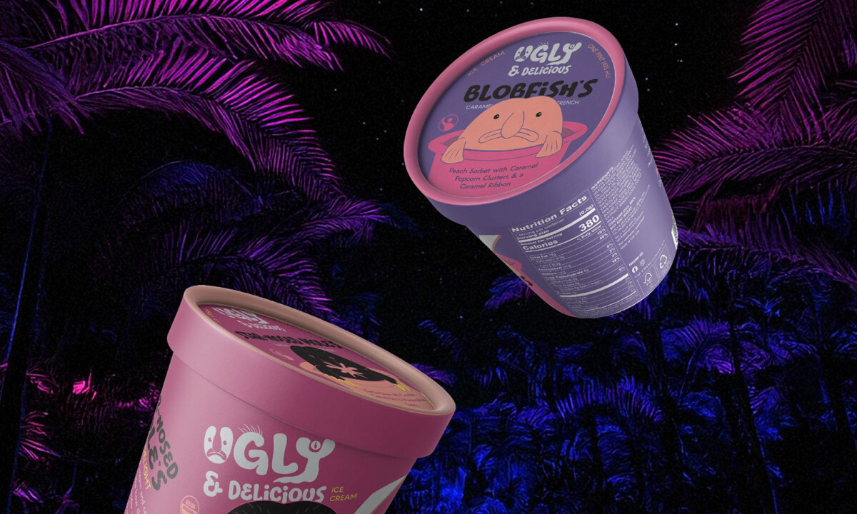
Ice cream packaging design must establish immediate distinction within the visually dense environment of the freezer aisle.
Ugly & Delicious succeeds by leaning fully into character, contrast, and narrative, utilizing expressive illustration and typography to create shelf impact without sacrificing clarity.
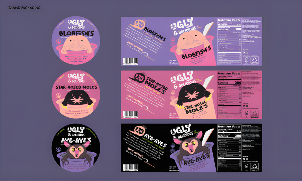
- Illustration & Character System: Each flavor is anchored by a distinctive illustrated character, giving the packaging instant personality. I like how the illustrations feel playful and slightly offbeat, reinforcing the brand’s name while making individual SKUs easy to recognize at a glance.
- Typography & Brand Voice: The chunky, hand-drawn type establishes a confident tone that matches the illustrated world. I find that the lettering feels intentional rather than decorative, supporting readability while amplifying the brand’s fun and unapologetic attitude.
- Color & Shelf Impact: High-contrast color palettes help each flavor pop while maintaining consistency across the lineup. The use of dark backgrounds and saturated accents is especially effective in my eyes for creating visual depth and standing out against typical pastel-heavy competitors.
- Information Hierarchy & Usability: Despite the expressive visuals, product details remain clear and accessible. I believe the well-structured flavor names and nutritional data ensure the packaging balances its bold character with practical retail requirements.
What Brands & Designers Can Learn from the Ugly & Delicious Ice Cream
1. Use Character to Drive Instant Recognition
Distinct illustrated characters give each flavor its own identity while reinforcing the brand’s irreverent tone. Character-led systems make products easy to spot and remember in crowded retail environments.
2. Align Typography with Brand Attitude
Hand-drawn, chunky lettering reinforces confidence and playfulness without sacrificing legibility. When typography carries personality, it strengthens storytelling rather than acting as decoration.
3. Balance Visual Boldness with Clear Hierarchy
High-contrast colors and dark backgrounds create shelf impact, but information remains structured and readable. Strong hierarchy ensures expressive packaging still performs under real retail conditions.