- Article by
- Jermaine Dela Cruz


#000000 #1E4596 #C08949 #FCFCFC
- Agency: The Collected Works
- Client: Sooki
- Category: Packaging Design — Food
- Location: New York, New York, United States
- Project Brief: Design packaging that elevates sesame oil into a modern lifestyle product through storytelling and shelf appeal.
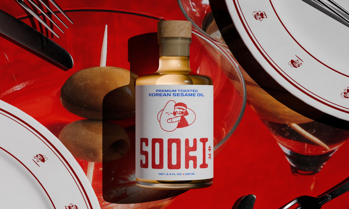
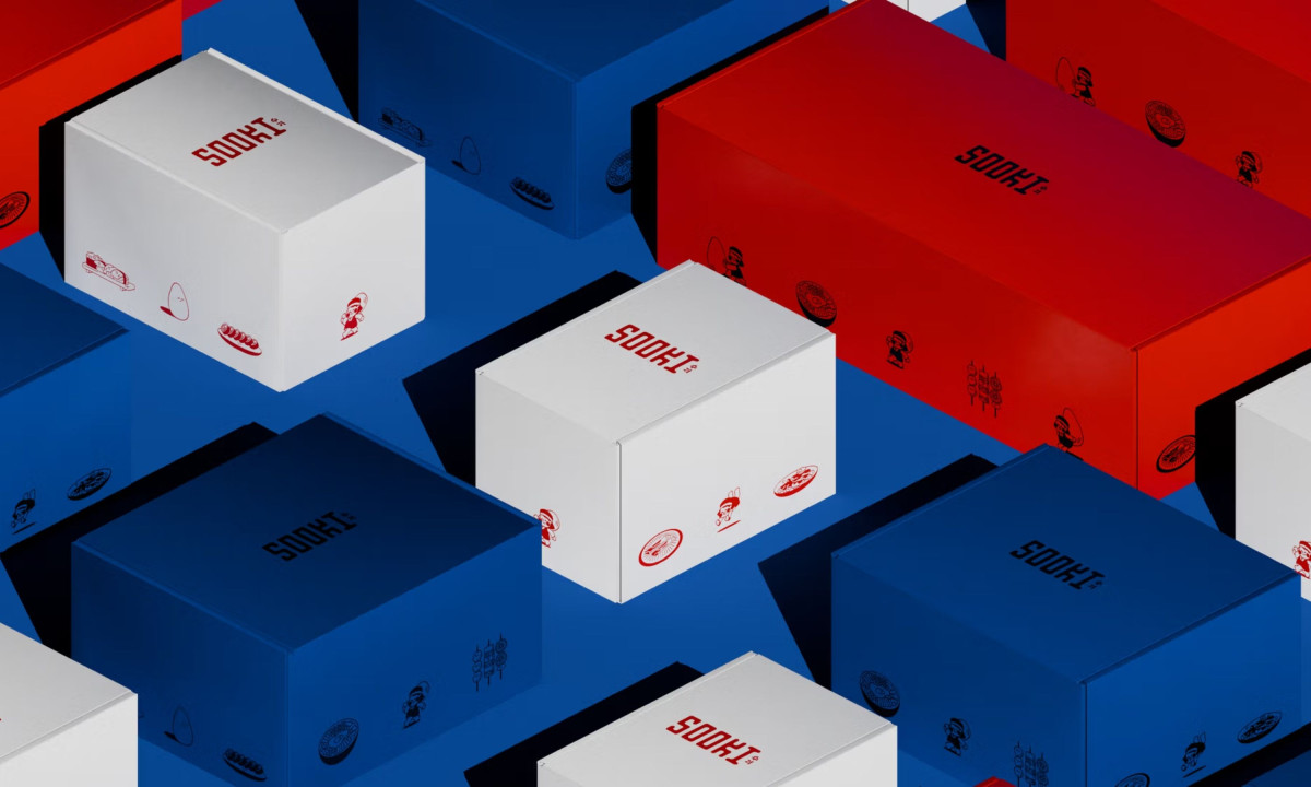
A food packaging concept proves its value when the product moves from the cabinet to the counter and stays there. The Collected Works roots Sooki in something specific: a family nickname and the kind of home cooking that doesn't follow a recipe so much as a memory.
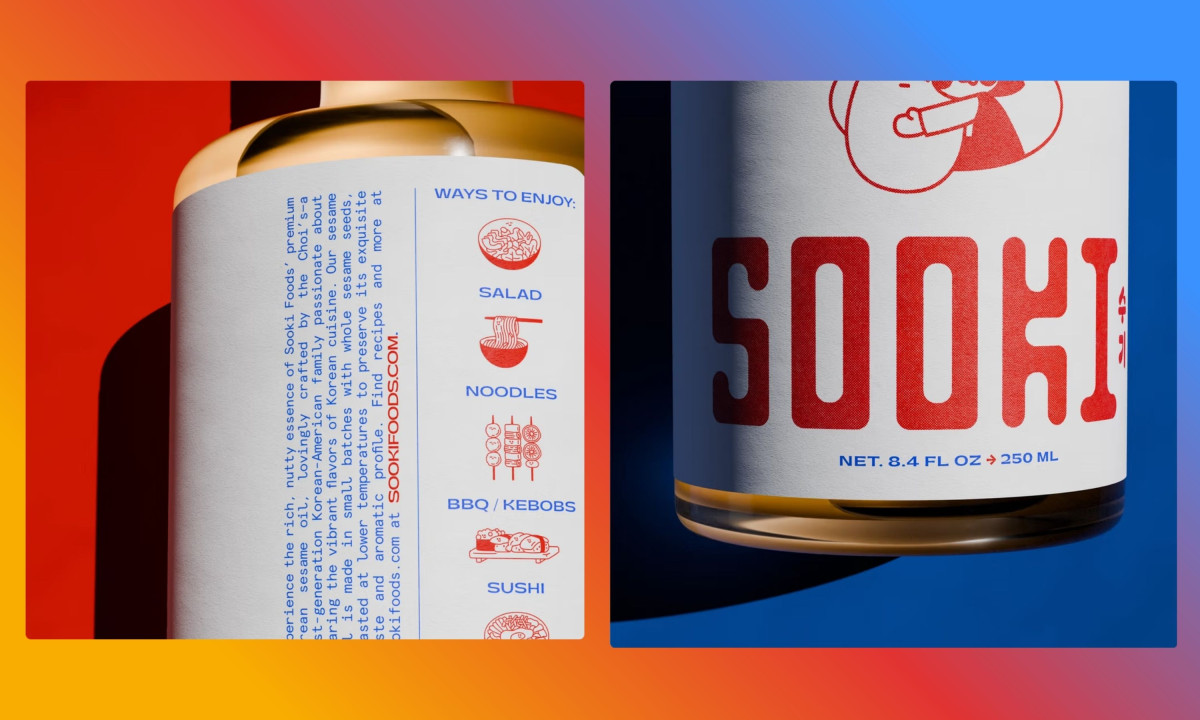
Toasted ambers and clean whites sit together in a palette that feels inherited rather than chosen, and bold expressive serif typography gives the oil a presence on the shelf that most pantry staples never bother to earn. The design is warm enough to carry a family story and composed enough to sit next to something twice the price.
Custom glass silhouettes and a vibrant illustrative seal give Sooki a physical identity distinct enough that the bottle becomes part of the kitchen rather than a visitor in it. Picking it up to pour feels like a considered moment rather than a reflex.
Sooki turns sesame oil into something a person buys because they want it on the counter, not because they need it in a recipe. The Collected Works gets there with art direction specific enough to carry the story and restrained enough to let the product speak first.
Moctezuma
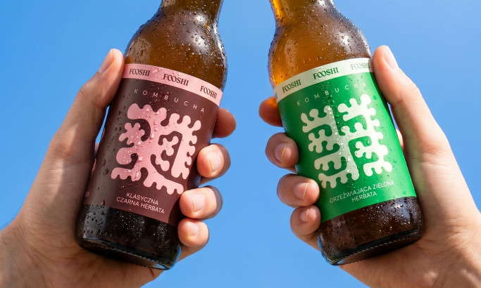
Fooshi
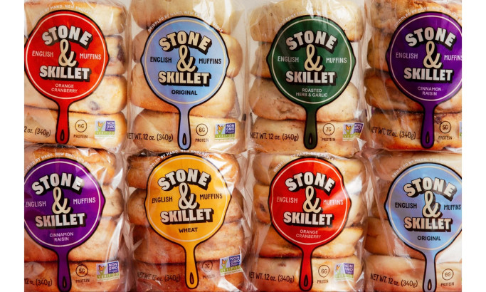
Stone & Skillet
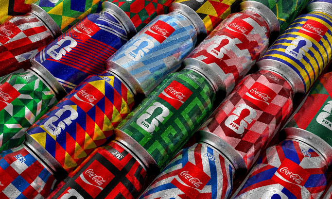
Coca-Cola FIFA World Cup 26 Collectible Country Cans
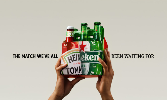
HEINZ x Heineken® Limited Edition Six-Pack
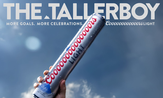
Coors Light Tallerboy
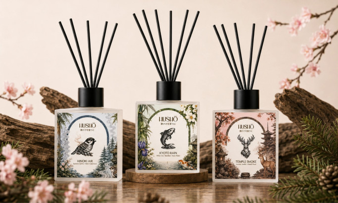
Hushō

Mật Mã Gift Set
