Team Behind the Design
Packaging Design Analysis
In evaluating food and beverage packaging designs, I look closely at whether a brand commits fully to its worldview.
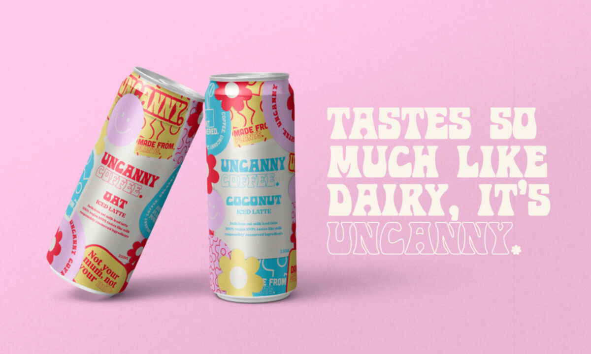
Uncanny Coffee doesn’t hedge its bets. It leans hard into counterculture aesthetics, and that confidence is what makes the design work.
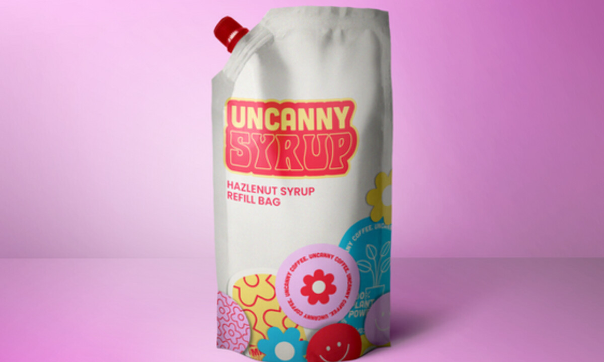
- Concept: The packaging is intentionally excessive, and I appreciate how unapologetic it feels. Drawing from 1960s hippie culture and activist graphics, the brand positions itself as expressive and values-driven rather than polished or wellness-coded. That clarity gives Uncanny a strong, unmistakable point of view on shelf.
- Color: The psychedelic palette of pinks, yellows, blues, reds, and creams creates instant disruption. I like that the colors do not try to blend politely; they clash just enough to feel energetic without becoming exhausting. Against a landscape of beige and oat-toned competitors, this strategy carries real weight.
- Typography: Chunky, retro letterforms act as visual anchors inside the dense compositions. Even with overlapping stickers and slogans, the product name stays easy to read. I find that balance between chaos and legibility especially well handled.
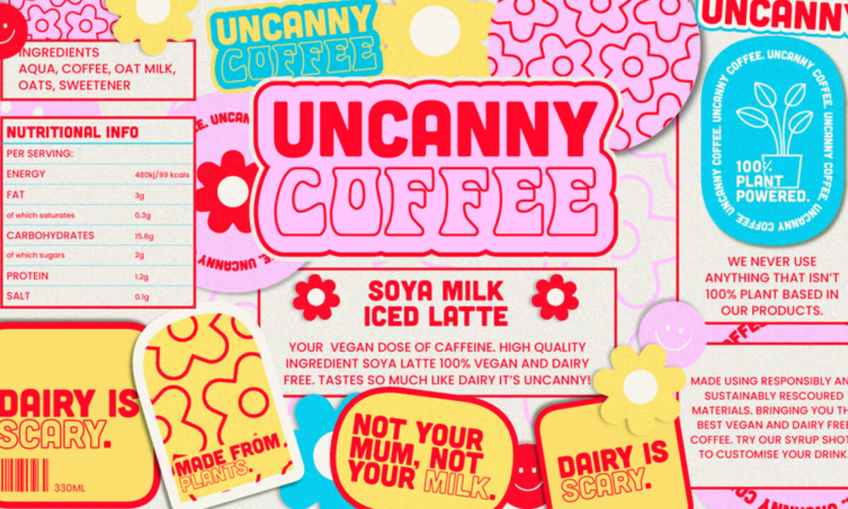
- Graphics & Copy: The sticker-style system is where the personality really comes through. Lines like “DAIRY IS SCARY” and “NOT YOUR MILK” function as core visual elements rather than secondary messaging. I like how this turns opinion into design, making the message impossible to miss.
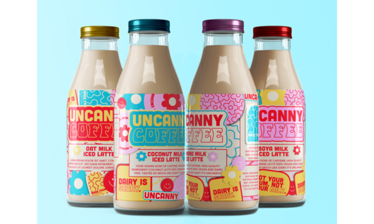
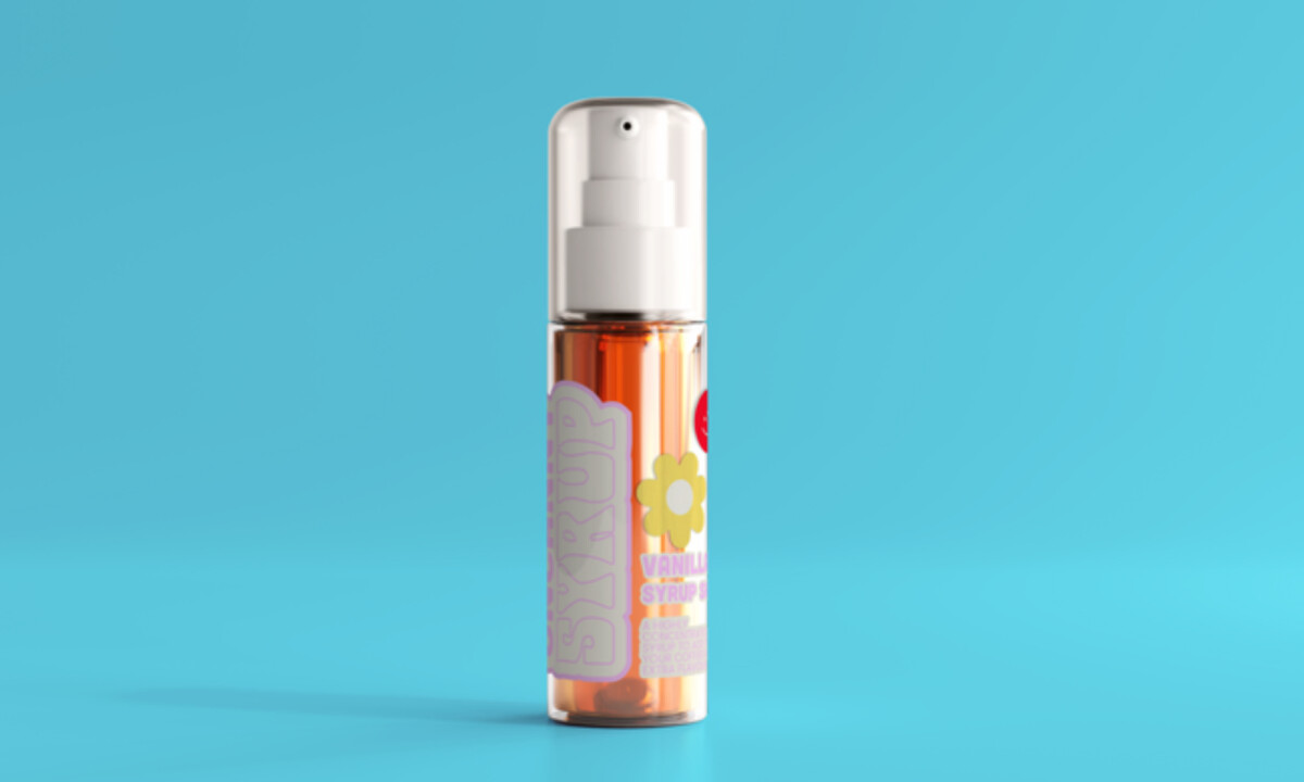
- System & Scalability: The design holds together across cans, bottles, syrup pumps, and refill pouches without losing intensity. I appreciate that even secondary formats carry the same visual confidence, which makes it clear this identity was built as a flexible system rather than a single label.
What Brands & Agencies Can Learn from Uncanny Coffee
1. Commit Fully to a Cultural Reference
Uncanny shows that strong brands come from clear conviction. By leaning fully into its countercultural roots, the packaging feels intentional and unmistakable rather than diluted for broad appeal.
2. Use Visual Density With Purpose
Clarity does not always require restraint. When designed with control, visual density can guide the eye, build energy, and invite closer inspection without losing readability.
3. Let Packaging Do the Talking
Uncanny embeds its values directly into the visual system. By treating messaging as design, the packaging becomes expressive and conversational, not just functional.
About DesignRush Featured Designs
At DesignRush, we review hundreds of agency projects each month. The featured designs stand out for creativity, relevance, and execution.
Many go on to be recognized as winners of our Monthly Design Awards.
Explore more creative work here:
- Best Packaging Designs
- Best Website Designs
- Best App Designs
- Best Logo Designs
- Best Print Designs
- Best Video Designs
For a full list of design agencies and related services, see our Agency Directory.