- Agency: CBX
- Client: Waterloo Sparkling Water
- Category: Packaging Design — Beverage
- Location: New York City, New York, United States
- Project Brief: Refresh Waterloo Sparkling Water packaging with vibrant colors, expressive typography, and bold fruit imagery that gives each flavor a distinct identity.
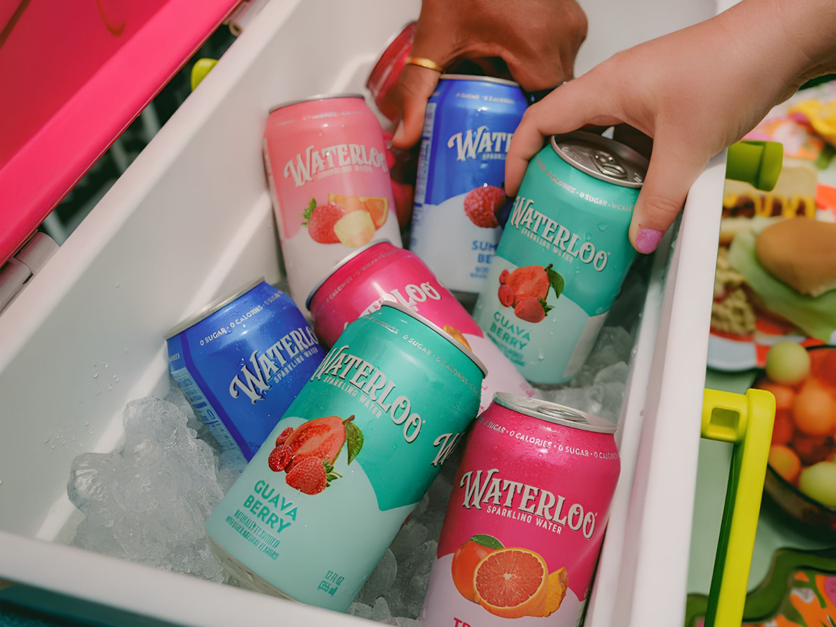
Beverage packaging in the sparkling water aisle has drifted toward quiet minimalism and near-identical pastel cans. CBX pushed Waterloo the other way, giving each flavor a saturated color world and photographic fruit that puts appetite appeal back on the shelf.
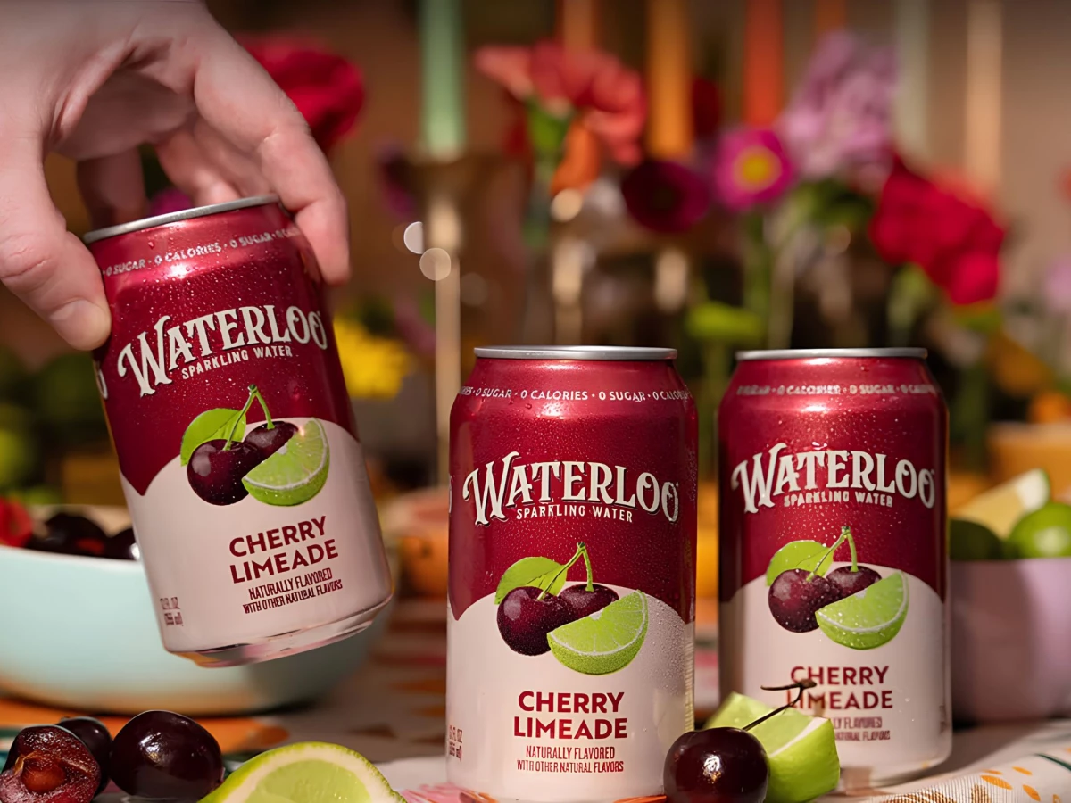
Color does the sorting at a glance. Bright pink, electric blue, citrus green, deep purple, and tropical teal split the flavors apart, while a crisp white script logo runs across every can to keep the lineup reading as one brand.
The fruit imagery plays a deliberate throwback. Ripe cherries, limes, and berries sit large and photographic like old grocery packaging where the ingredient did the selling, but rendered with the clean polish of modern CPG.
The expressive lettering is where Waterloo picks up personality. A slightly theatrical vintage script gives the cans charm that the restrained competition lacks, so the whole set signals joy and flavor rather than blending into the pastel wall.