- Agency: adam&eveDDB
- Client: Marmite
- Category: Packaging Design — Food & Beverage
- Location: London, United Kingdom
- Project Brief: Design a limited-edition packaging campaign that celebrates England’s football journey by transforming Marmite’s iconic identity into a playful, fan-focused collectible.
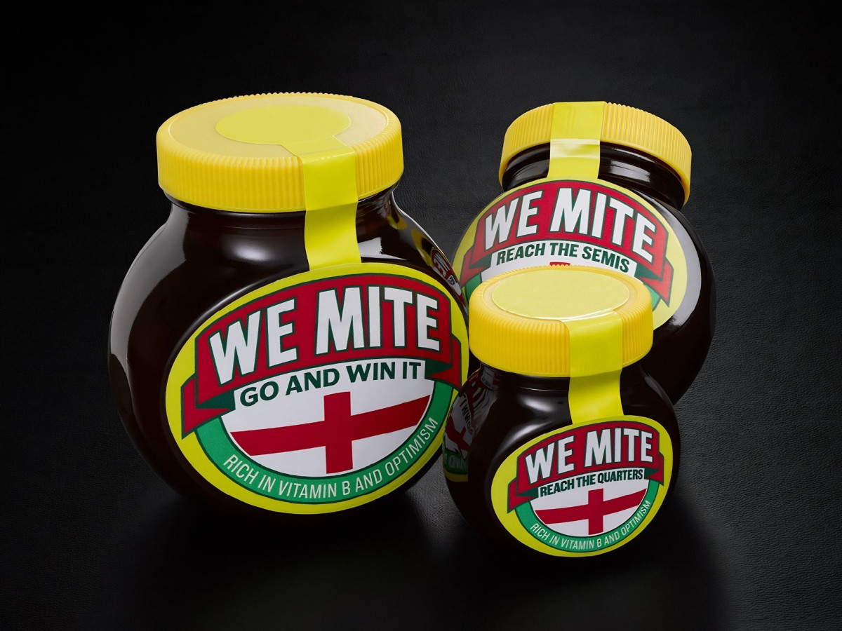
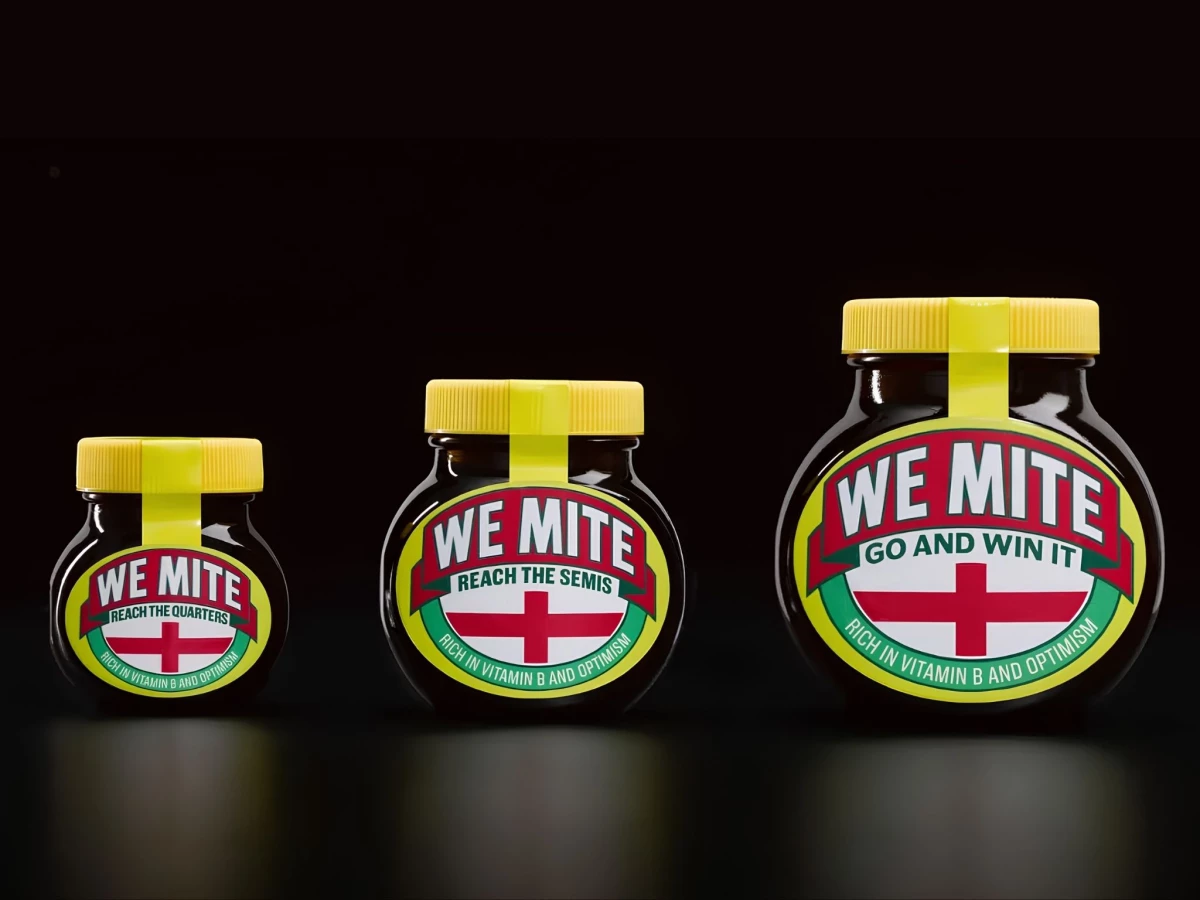
Food and beverage packaging works when it can hijack a cultural moment without losing brand recognition. WeMite does that by swapping Marmite's name for a one-letter pun that turns each jar into a running commentary on England's cup run.
The tiered labels track the tournament as it unfolds. "Reach the quarters," "reach the semis," and "go and win it" each print on a progressively larger jar, so the size of the spread scales with the size of the ambition.
The rest of the trade dress stays deliberately untouched. The yellow lid, the red-green-yellow badge, and the familiar oval all remain in place, with only the tagline shifting to "rich in vitamin B and optimism."
A Scotland variant proves the idea has range beyond one team. A blue saltire and "get out of the group" lower the bar with a self-aware wink, matching Marmite's love-it-or-hate-it personality while keeping the same template.