Standout Features:
- Spirit-themed names for the perfect tea pairing
- Consistent gold foil application
- Rich color palette differentiating tea blends
To make a brand new premium tea brand feel instantly intriguing and genuinely different from countless other options, TL Design Co.'s strategy for WildLane Tea involved taking a risk with a bold, unexpected central theme. This unique concept was then strongly backed up with high-quality packaging materials and design details. Let’s break it down here.
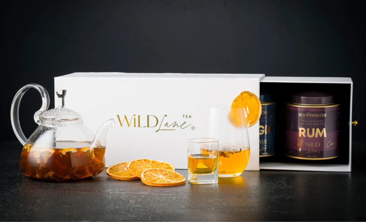
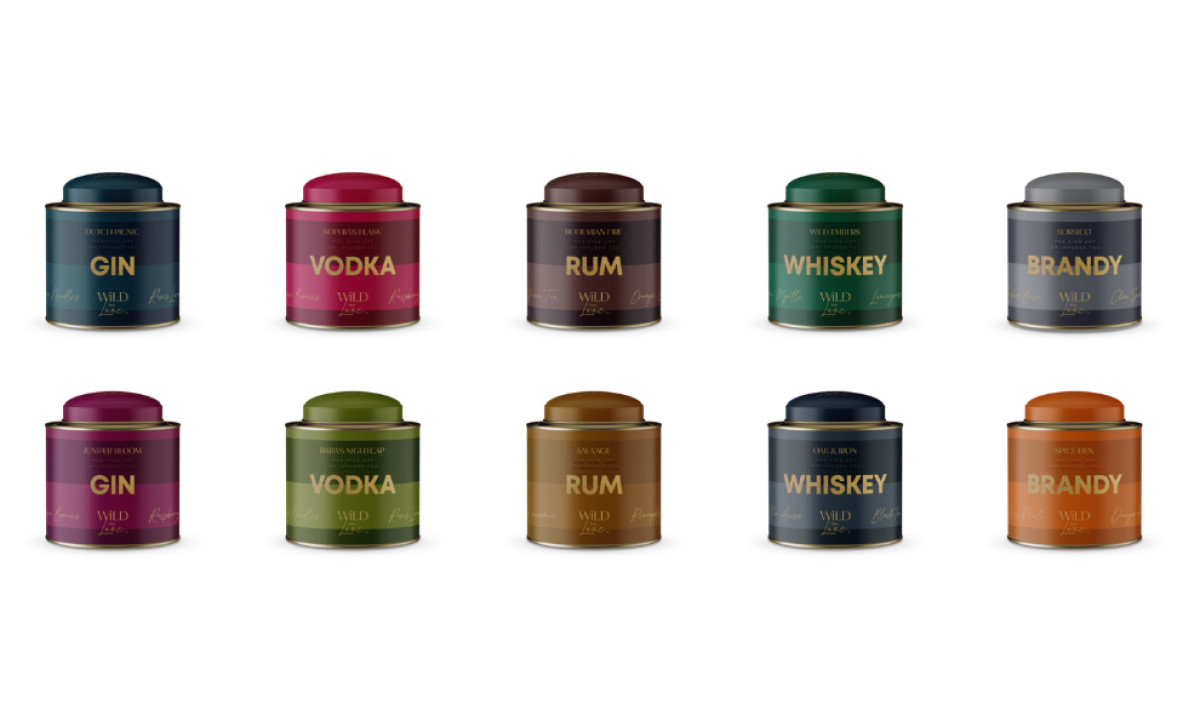
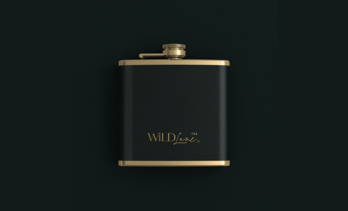
This brand stands out immediately with its unconventional naming — using spirit names like "Gin" or "Rum" for different tea blends, as the product line is meant to suggest ideal tea and alcohol pairings. They even offer a unique flask container option as well as traditional tins! That’s commitment to a concept if we’ve ever seen one.
To provide the products a premium feel, the brand uses gold foil consistently and prominently throughout the packaging designs. You see it clearly on the "WildLane" logo and key text like the blend names on all formats. The foil clearly signals luxury and attention to detail visually. This is complemented by quality materials like sturdy tins.
Plus, the round tea tins use a smart color-coding system to tell them apart easily on the shelf. Each type pairs a rich base color — a rich brown or forest green — with a complementary colored lid. This helps shoppers navigate but keeps the whole line looking mature and definitely upscale when seen together.
A unique tea concept, a flask-inspired packaging design to go alongside it, and all the richness in color palette and packaging finishes — WildLane went all out with this beverage product line design. Ultimately, this entire packaging system excelled at telling a genuinely compelling brand story and a novel concept through visual and even tactile means right on the shelf.
-preview.jpg)


