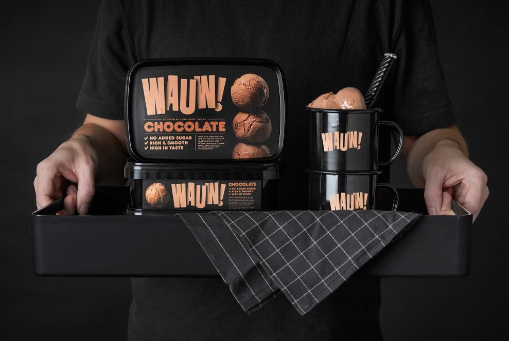
Snaks created the packaging identity for Wauw, a Danish healthy ice cream company. The overall look is unusual, especially with the black background instead of the typical bright colors reserved for summery desserts.
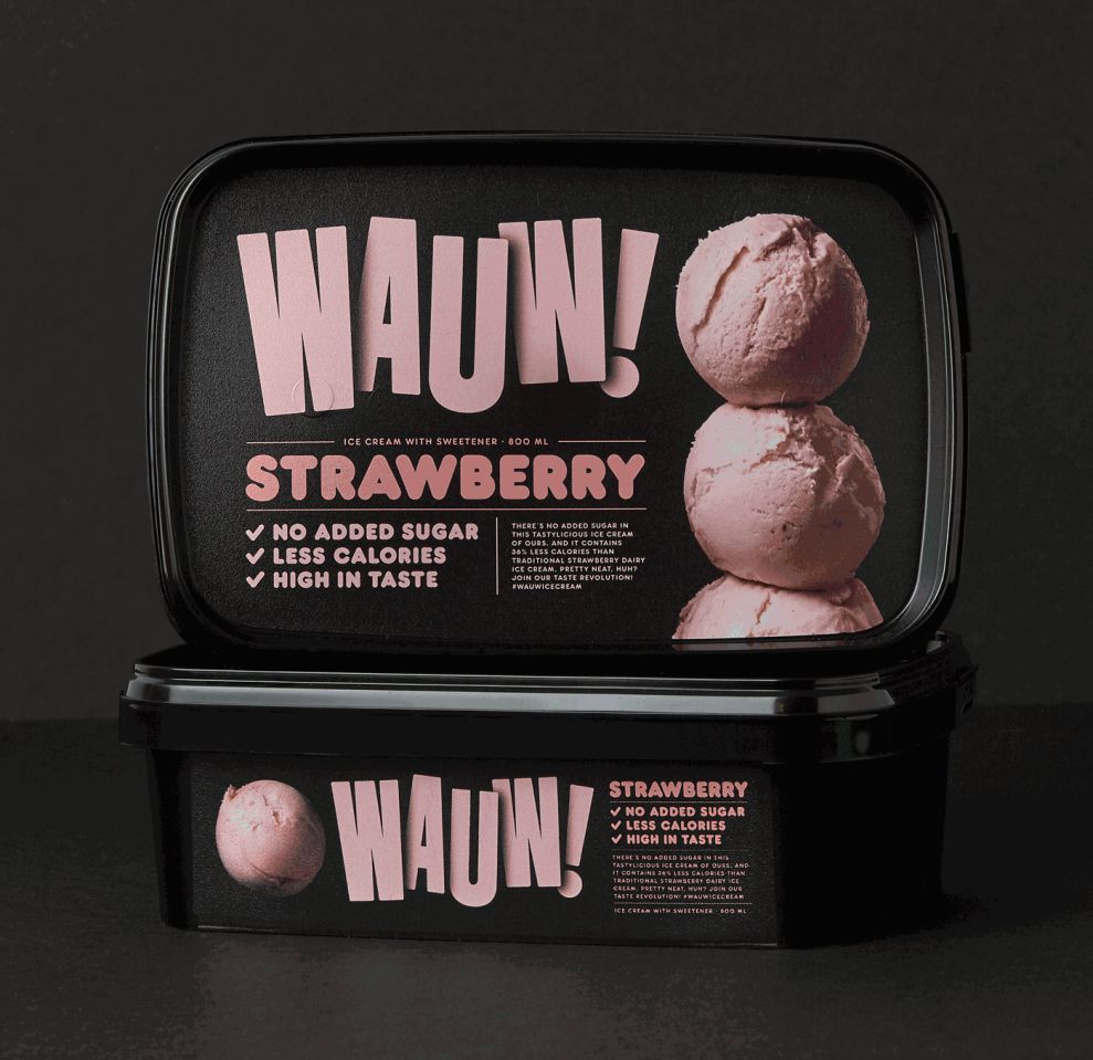
Wauw's friendly approach to design make it feel accessible to everyone. It maintains a pleasant and fun feeling.
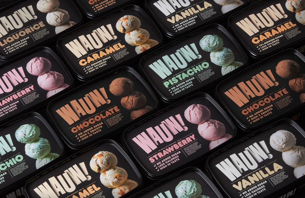
The accent colors differ, depending on the flavor. However, they are all somewhat muted, which keeps them from looking too artificial or bright, and reflects the natural ingredients in the product.
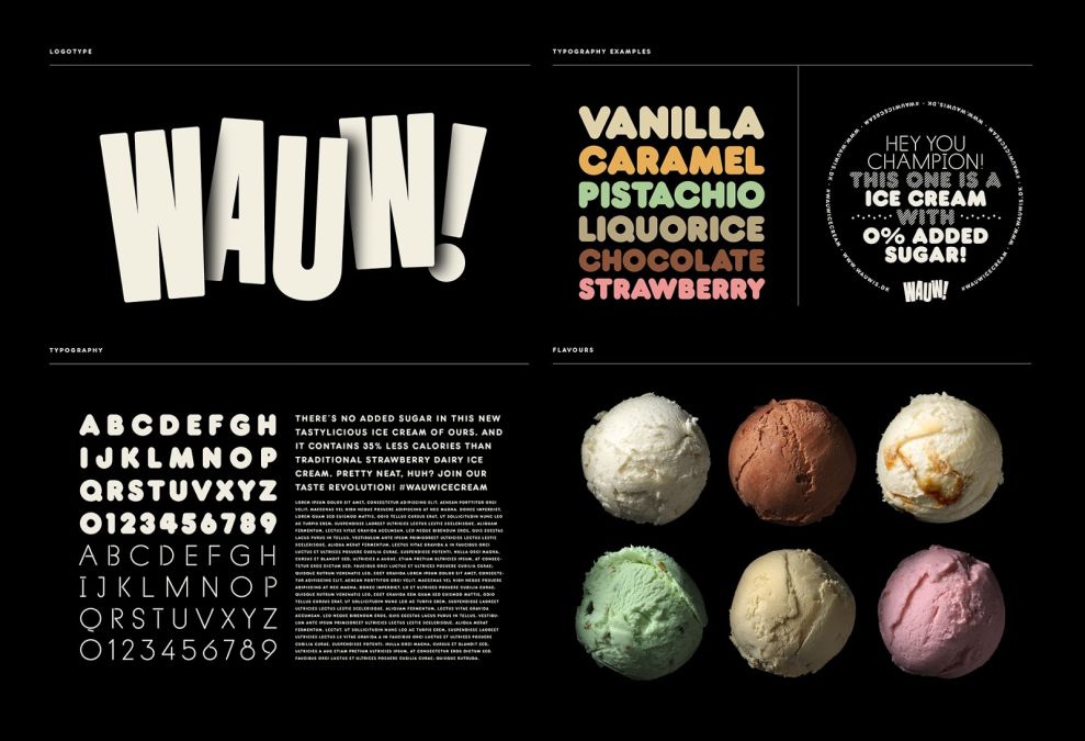
This dark, bold color choice differentiates Wauw from its competitors. This is complimented by this whimsical, unique typography -- they made a wise choice by avoiding classic fonts and keeping the font down-to-earth.
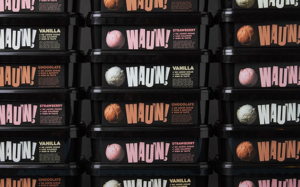
The images of ice cream scoops on the packaging is a nice final touch. It reinforces the pleasant feelings associated with eating ice cream.
Wauw is a great packaging design in the Food & Beverage industry.