Standout Features:
- Bold typography with high contrast
- Clear nutritional focus
- Elegant, minimalist design
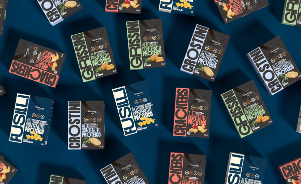
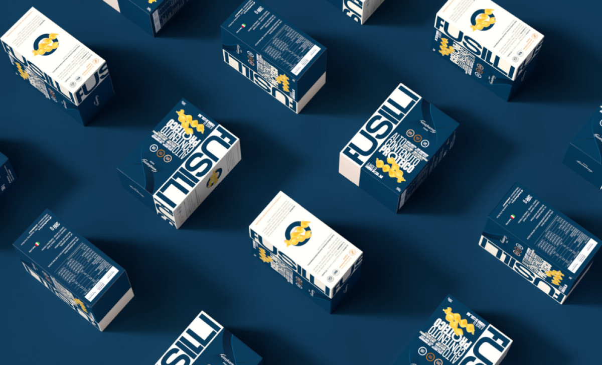
Wirepharma, specializing in high-protein foods, enlisted Lattebianco to design packaging that communicates nutritional value and modernity. The design reflects the brand’s health focus and attracts consumers seeking high-quality, protein-rich snacks, bringing Wirepharma’s message of wellness, energy, and nutrition to life.
Large, impactful fonts for product names create immediate visual impact and brand recognition. Uppercase letters and high-contrast colors give the design a contemporary, professional feel while maintaining readability. This typography emphasizes high-protein content, making nutritional benefits easily identifiable.
A clear nutritional focus is highly evident in this food and beverage packaging design. Prominent display of claims like “28g of protein” and “less than 1g of sugar” strategically communicates key benefits. Placing nutritional benefits at the forefront ensures products are perceived as functional and beneficial for a healthy lifestyle.
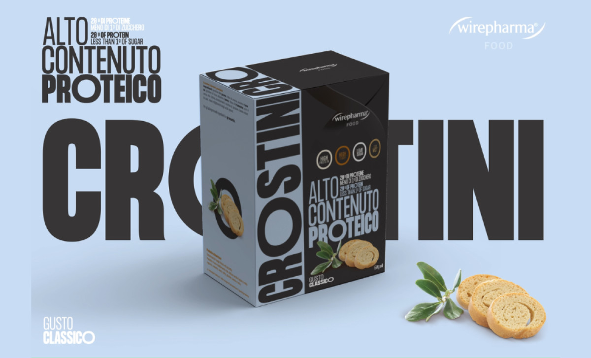
Clean lines, simple palettes, and subtle iconography ensure uncluttered packaging, allowing easy navigation and quick comprehension. This simplicity appeals to consumers seeking high-quality, straightforward products. The minimalism also allows design versatility across packaging formats while maintaining brand consistency.
In conclusion, Wirepharma's packaging successfully combines modern aesthetics with practical communication. This design is visually engaging, user-friendly, and functional — ensuring Wirepharma’s products are easily identifiable and resonate with health-conscious consumers seeking high-protein, nutritious options.


-preview.jpg)
