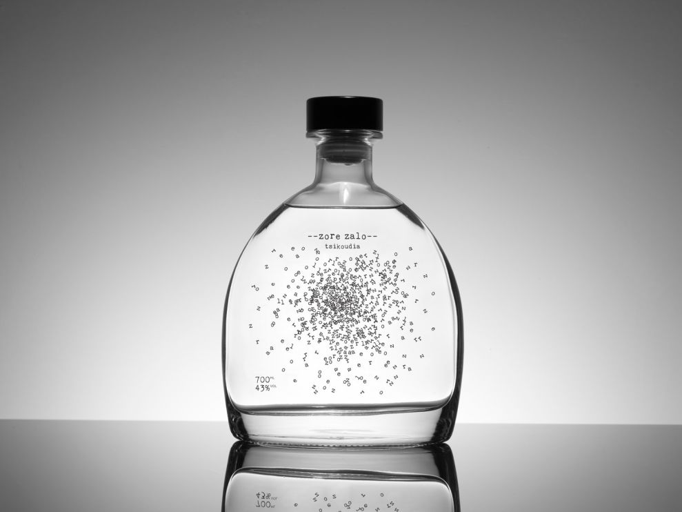
Sometimes, the most minimal designs can be the most impressive. This Zore Zalo bottle is a perfect example of using clever design and a single color to create a package that captures the eye.
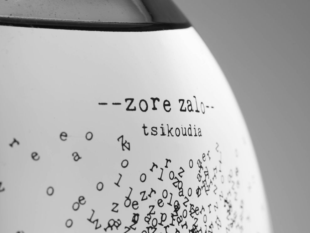
Since tsikoudia is a masculine type of alcohol, Zore Zalo wanted a masculine bottle design to go with it. The clear liquid inside is contrasted by the exploding letters on the bottle. If you think you see Zore Zalo on the label a lot, it’s because your brain is connecting all of the letters to form the brand name you read at the top of the bottle. It’s an interesting visual trick. You may almost feel tempted to shake the bottle to see if the letters will float about aimlessly.
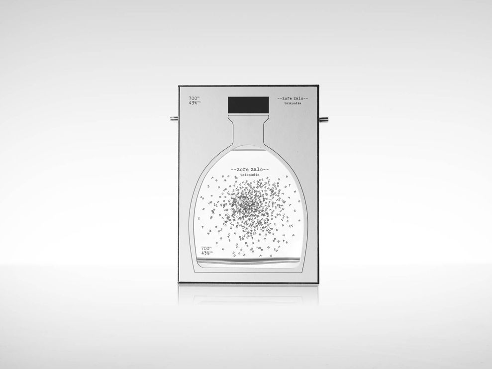
The box that the bottle comes in is also beautifully simple. It’s an illustration of the bottle design on a simple gray background. The design is clean, with an emphasis on the product inside. This is clearly a brand meant for someone who wants to enjoy the product itself. There’s no vibrant colors or wild typography to try and confuse your eye. The design is simple, clean, and masculine—just like the drink inside.
Zore Zalo is a minimalist packaging design in the Food & Beverage industry.


-preview.jpg)