Team Behind the Design
Agency: PixelBranded.Co
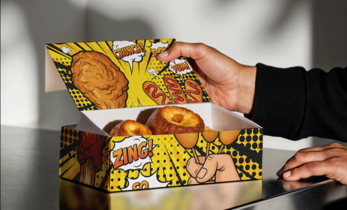
Client: Korean Fried Chicken Restaurant
Category: Packaging Design (Food & Beverage)
Location: Montreal, Canada
Project Brief: Design eye-catching packaging for a Korean fried chicken restaurant to boost brand recognition, stand out in a competitive food market, and enhance the takeout experience for customers.
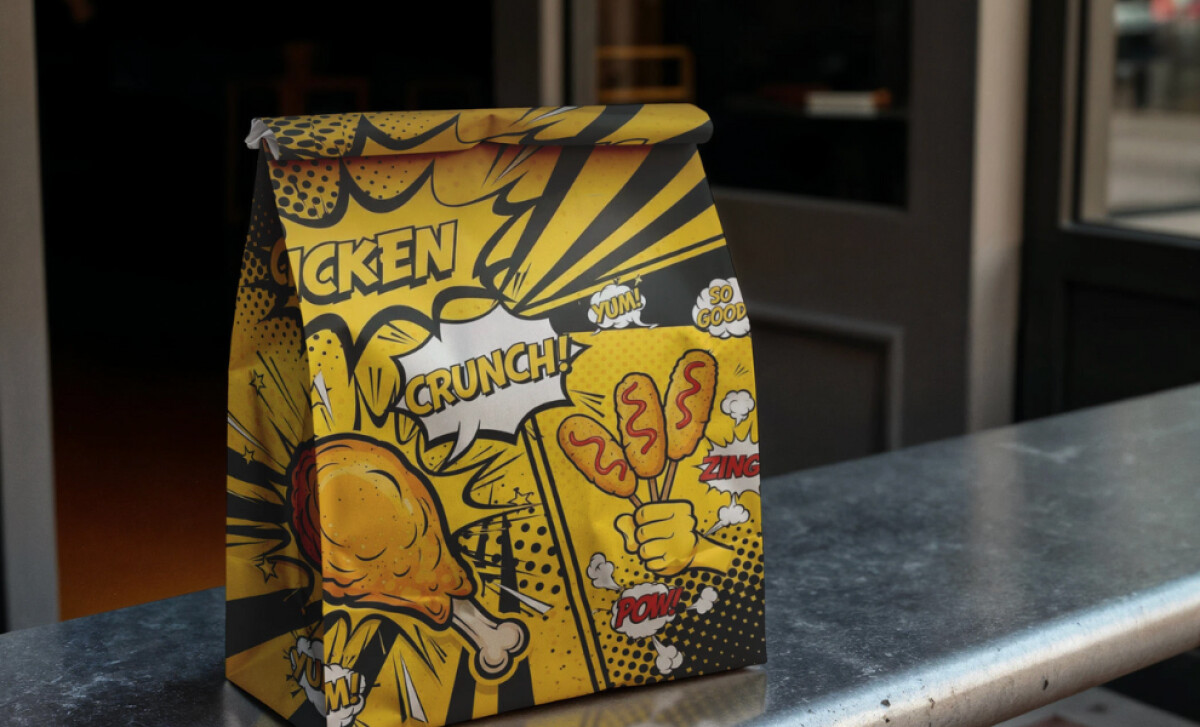
Packaging Design Analysis
When I review packaging like this, I often look at style, shelf impact, usability, and whether it feels true to the brand. Here’s what stood out to me:
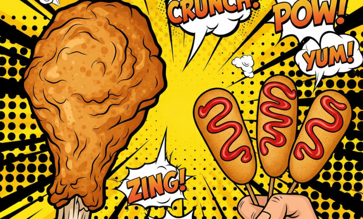
- Pop-Art Style: I like how the bold outlines, halftone dots, and explosive yellow background instantly set an energetic, fun tone. It feels perfect for fried chicken.
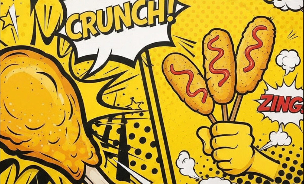
- Dynamic Illustration: The oversized drumstick and corn dogs catch the eye right away. They make the packaging feel alive and delicious, almost like it’s inviting you to dig in.
- Expressive Typography: Seeing words like “CRUNCH!” and “POW!” splashed across the design are playful additions. It adds motion and sound, which makes the whole package feel interactive and playful.
- Flavorful Personality: Overall, I think the bright colors and comic-book style give this brand a big personality. It’s the kind of packaging I’d notice on a shelf, and probably snap a photo of before eating.
What Brands & Agencies Can Learn from Korean Fried Chicken’s Packaging Design
This pop-art packaging shows how bold visuals and playful details can turn a simple takeout box into a share-worthy brand moment.
1. Go All-In on Pop Art
Use bright colors, halftone dots, and comic elements to create instant energy and capture attention on crowded shelves.
2. Illustrate the Craving
Oversized food graphics, like drumsticks and corn dog, make the product irresistible and spark appetite at first glance.
3. Add Playful Typography
Action words such as “CRUNCH!” or “POW!” bring motion and sound to the design, making the packaging feel lively and memorable.
About DesignRush Featured Designs
At DesignRush, we review hundreds of agency projects each month. The featured designs stand out for creativity, brand alignment, and execution quality.
The most remarkable ones advance to our Monthly Design Awards, gaining recognition across the industry.
Discover more impeccable work like this in other key categories:
- Best Packaging Designs
- Best Video Designs
- Best Website Designs
- Best App Designs
- Best Logo Designs
- Best Print Designs
For a full list of design agencies and related services, see our Agency Directory.
-preview.jpg)