Standout Features:
- Dynamic typography and layout
- Visual integration with art movements
- Consistent design across the series
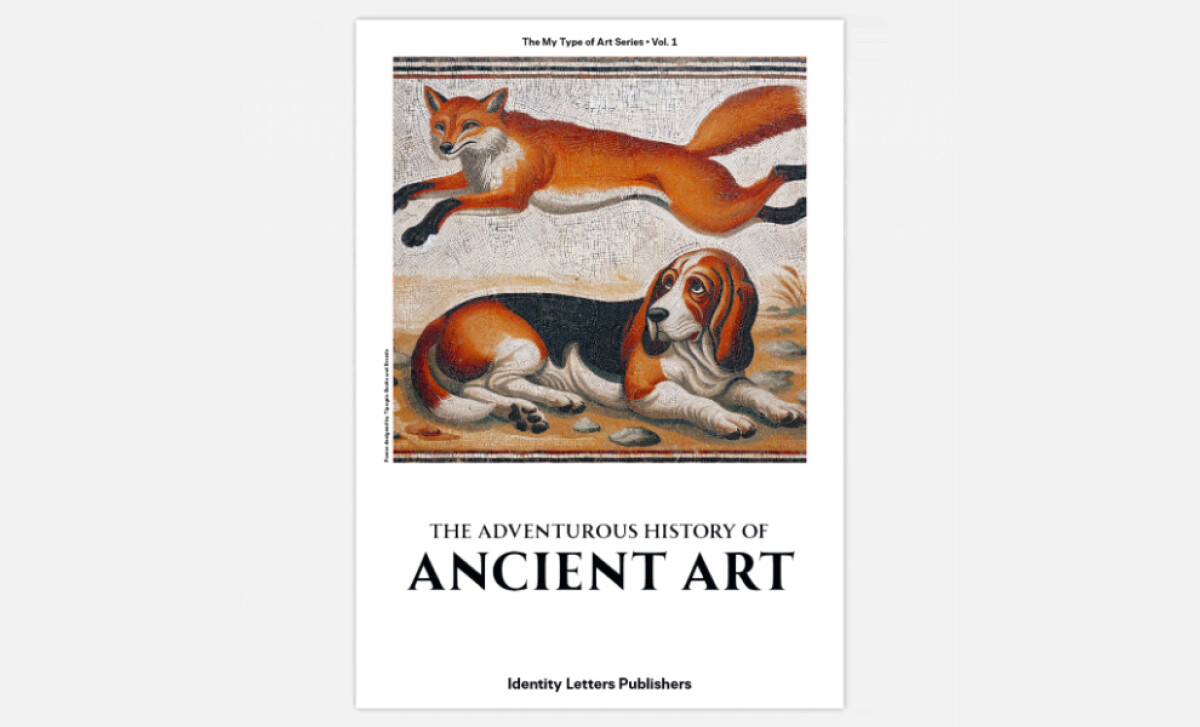
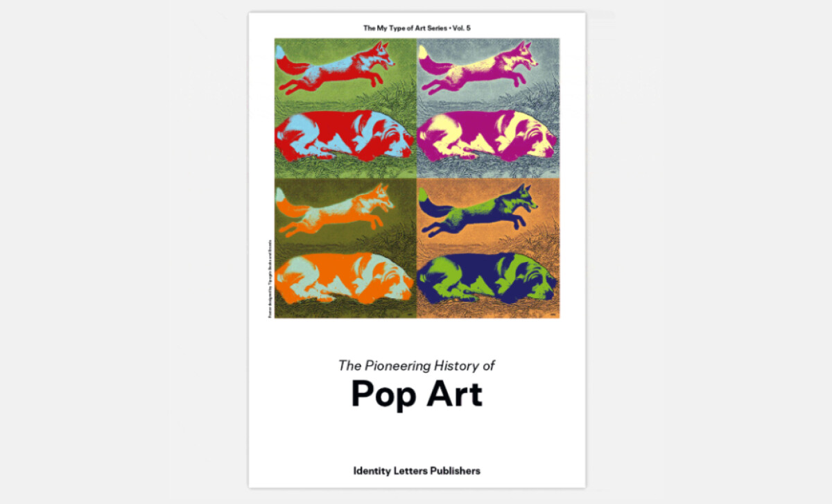
When modern typography meets art history, the result can be captivating, as seen in the Allrounder poster series. Developed by Tipogris Books and Brands for the Allrounder font family, these prints use art movement themes like Baroque and Pop Art. The design highlights the font's unique qualities and its ability to harmonize diverse aesthetics.
You'll immediately notice the dynamic typography and layout, where the Allrounder type family takes center stage. Large, bold letterings for titles like "Baroque Art" command attention. The chosen font, Allrounder itself, is consistently modern, clean, and highly legible across the series, making each poster visually appealing and clear in its message.
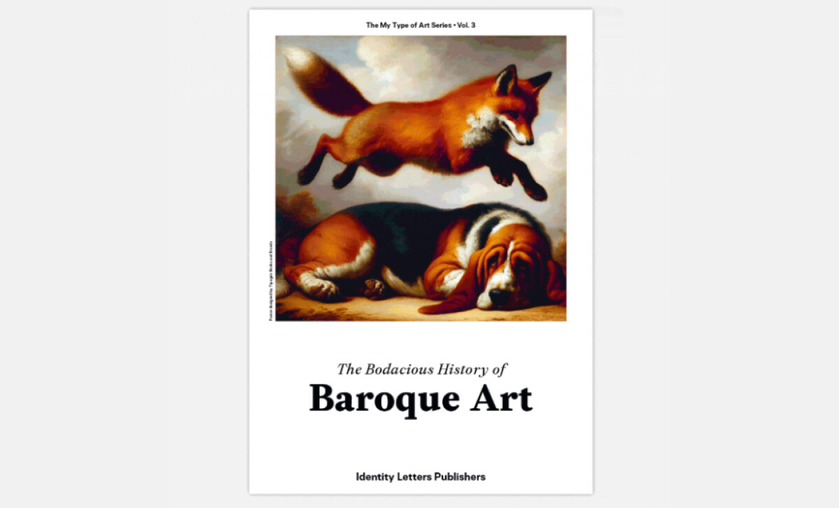
Each poster skillfully integrates visuals representative of its featured art movement — be it the vibrant energy of Pop Art or the classical motifs of Ancient Art. The Allrounder typography is carefully chosen to complement these distinct styles, ensuring the posters don't just inform but evoke the unique emotional and stylistic core of each artistic period.
A strong sense of consistency unites the entire poster series, even as each piece boasts a unique color palette and imagery tied to its specific art movement. The Allrounder type family is the common thread, with similar weights and structures applied throughout. This visual cohesion reinforces the font's remarkable ability to perform seamlessly.
When design truly meets history, as in the Allrounder posters, the impact is memorable. The series successfully showcases the font's strengths by harmonizing it with distinct artistic eras. This teaches us that even a promotional print can become a piece of art itself, especially when it thoughtfully bridges contemporary design with rich historical context.