Standout Features:
- Sophisticated grayscale theme
- Pop of colors to emphasize products
- Readable and well-spaced content
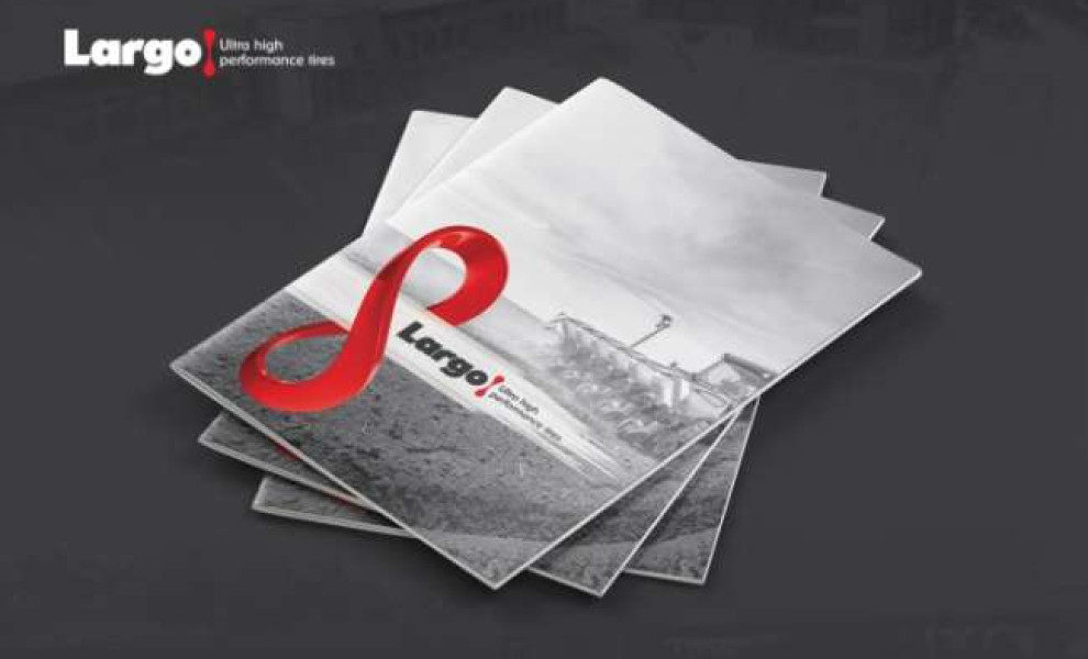
PopArt Studio designed a brochure and catalog for Largo Tires, an agricultural machine tire manufacturer based in Serbia.
Upon unfolding the materials, you’re treated to a polished grayscale theme with a few pops of color here and there. The agency’s decision to keep the tires’ colors in this layout proves to be a smart move. It easily drags the eyes of the viewers towards the product in one look.
Photos of Largo tires in blue, red, black, silver, and yellow are lined up alongside each other. In addition, the brand logo has a prominent red accent in a slightly altered shape of a double-end truck wrench (it looks like the number 8 from afar). This element is present on the cover pages.
The brand also encourages its customers to create personalized tires from their list of 100 tire profiles. This vision is evident in the design through the simple and digestible infographic of a tire’s anatomy on the inside pages.
Despite the information overdrive, the agency managed to add breathing space using relevant photos and ample whitespaces throughout the design.