Standout Features:
- Pixel-woven typography inspired by Bosnian folk textiles
- Folk-inspired symbology with geometric central motifs
- Dual-tone color palette and grid-structured event details
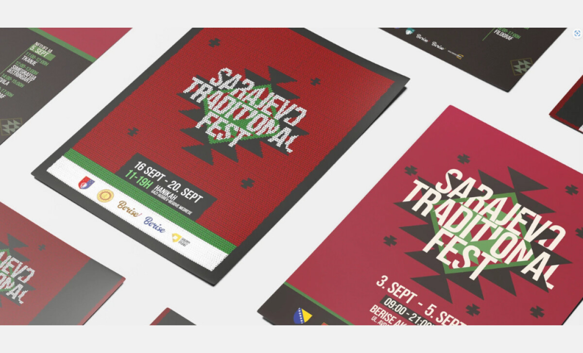
This print campaign by Goldenscreen is for Sarajevo Traditional Fest, a festival that promotes Bosnian and Herzegovinian tradition. The posters and banners employ a bold visual style that is at once regionally specific and designed for broad contemporary appeal.
The "Sarajevo Traditional Fest" logotype is rendered in a distressed, blocky typeface reminiscent of pixelated, handwoven patterns. The irregular white letters on a deep red or burgundy base look like a stitched motif.
At the center of each poster and banner sits a bold, symmetrical symbol made of triangles, chevrons, and directional arrows. These motifs form a radial, star-like shape that recalls carpet patterns or ancient Bosnian tilework.
The green-and-black geometry contrasts strongly against the red backgrounds, anchoring the composition while evoking heritage and symmetry.
This approach is highly effective, as a 2024 ResearchGate study notes the importance of leveraging the psychological and cultural associations of colors to successfully connect with an audience.
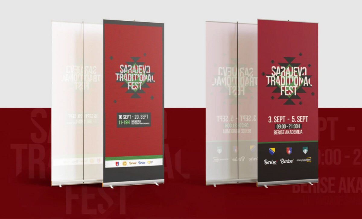
A dual-tone color palette, with dominant red fields and black info blocks, structures the design. Event details are then placed in modular, color-coded containers.
The use of a clean monospace or condensed sans-serif for this text, with green highlights for time slots, ensures clarity without compromising the artistic integrity of the overall piece.
Goldenscreen underscores that a successful cultural event brand is built on a cohesive and meaningful visual system. The result is an identity that is not only visually striking but also deeply aligned with the festival’s mission to celebrate national heritage.


-preview.jpg)