Standout Features:
- Bold and minimal design
- Distinctive color choices
- Clear brand identity representation
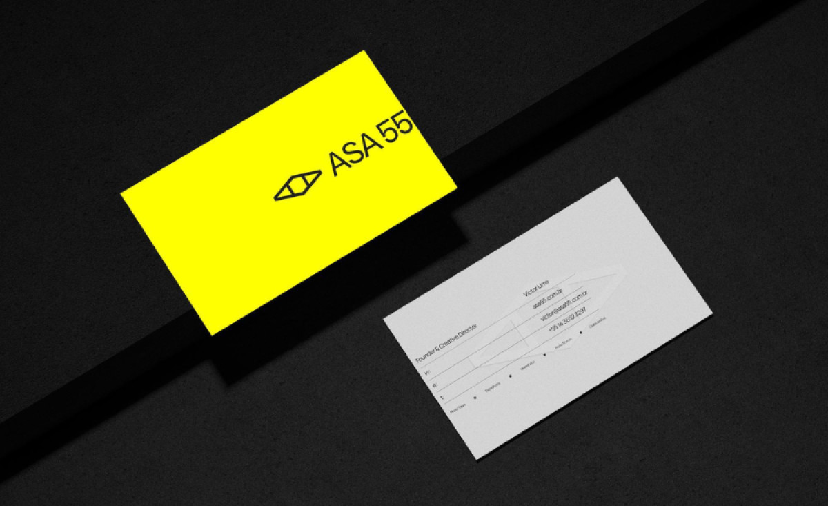
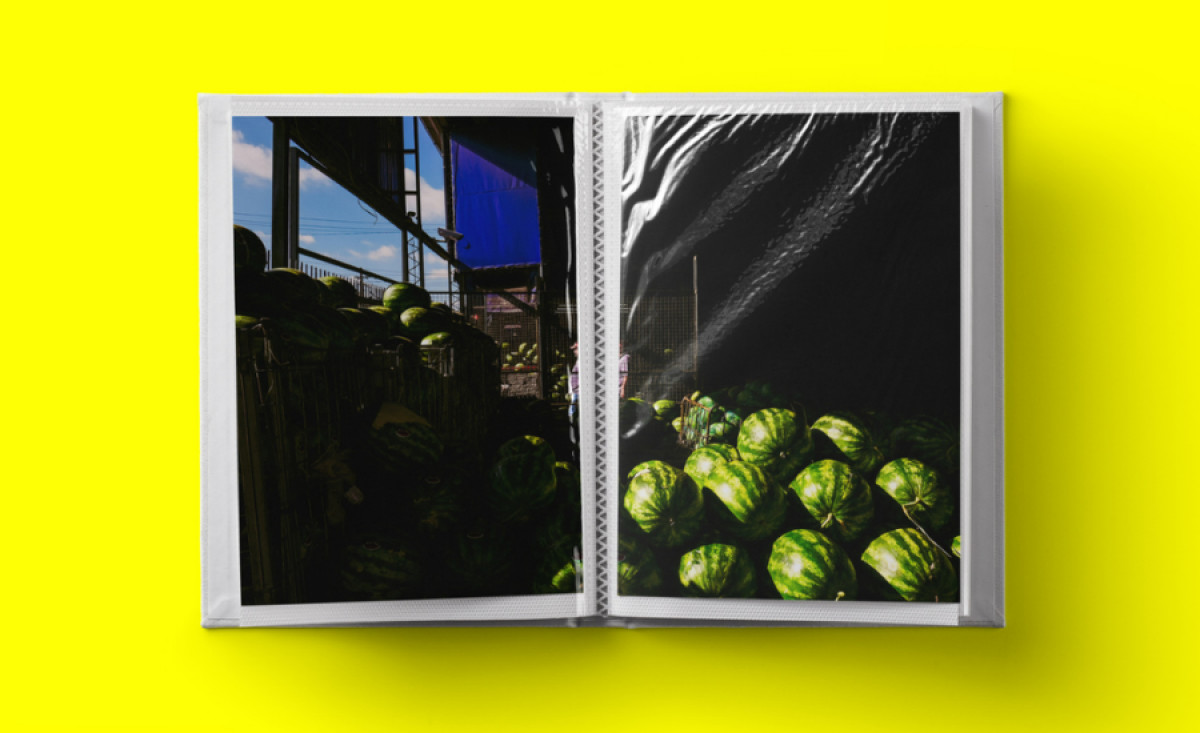
ASA55, a global photography services provider, needed a business card that would communicate its creative edge and professional presence. Through modern typography, striking colors, and a clean layout, Broto’s design embodies ASA55’s innovative approach to photography, leaving a memorable impact on clients and partners alike.
The use of black and bright yellow in the card's design immediately grabs attention. The vivid yellow contrasts effectively with the black elements, creating a strong visual identity that aligns with ASA55’s energetic and fresh brand image. This combination makes the card stand out and highlights essential information.
Minimalism is at the core of the design, with a simple sans-serif font and an uncluttered layout. The focus is on presenting the brand in an elegant and professional manner. This simplicity enhances the card’s effectiveness, allowing recipients to easily absorb the information, while the subtle but impactful logo reinforces ASA55’s brand recognition.
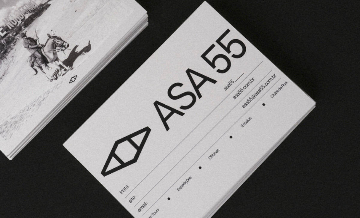
Broto’s design also incorporates elements that reflect ASA55’s focus on creativity and photography. The clean lines and strategic use of space ensure the card feels both modern and sophisticated, mirroring the high-quality photographic experiences ASA55 provides. The design reflects the company’s ability to create striking visual stories.
By blending bold colors, minimalistic design, and a clear brand message, the business card print design offers both aesthetic appeal and practical use. It establishes ASA55’s visual identity while effectively representing their creative photographic expertise in a professional, memorable way.