Standout Features:
- Layered symbolism in the letter “L”
- Geographical cues using geometry and color
- Use of geometric contrast to show visual balance
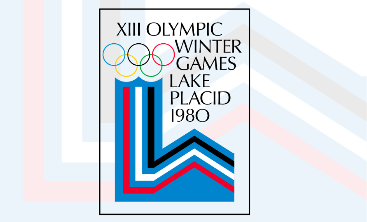
The Lake Placid 1980 Winter Olympics poster remains a standout example of design where form meeting function. Designed with modernist restraint, it transforms the host city’s initials into a multi-layered graphic narrative. This poster communicates winter sports with abstraction and power.
Rather than rely on literal imagery, the Lake Placid 1980 logo distills multiple ideas into a single, rising form. While it functions as the letter “L,” it also evokes a mountain range, a victory podium, and the vertical ascent of a flame, each tied to place, achievement, and Olympic spirit.
The stacked stripes (red, white, black, and blue) reference the American flag without being overt. These colors convey national pride and winter’s chill, grounding the logo in place and purpose. Research shows that such geographical cues enhance memorability and help build stronger emotional and cognitive associations with national brands on the global stage.
Above it all, the five Olympic rings float elegantly, completing the design’s verticality. Their rounded softness contrasts with the angular base, creating balance and maintaining the global Olympic identity. The rings feel almost like a crown, bestowing honor atop the podium-style shape beneath.
Minimal yet multi-meaningful, Lake Placid’s 1980 Olympics poster design proves that great Olympic design can achieve depth and resonance. Its balance of symbolism, structure, and style secures its place among the best works in Olympic history.