Standout Features:
- Clean and professional layout
- Consistent corporate branding
- Effective use of geometric elements
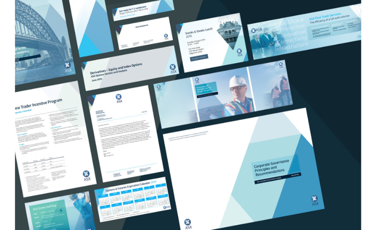
The Australian Stock Exchange (ASX) collaborated with design agency Geeza to develop the company’s print collaterals, such as business reports, cards, newsletters, and more.
The results are stellar examples of professional and cohesive corporate branding. These designs utilize a clean and structured layout, making the materials highly readable and approachable for ASX’s target audience of financial professionals and stakeholders.
The design prominently features geometric elements, such as angular shapes and overlays, conveying precision and modernity. This approach aligns with the ASX's position as a forward-thinking financial institution. Using the brand's signature blue tones and subtle gradients ensures consistency across all materials, reinforcing brand identity.
One of the most effective aspects of this design is the visual hierarchy. Clear typography and organized spacing allow users to navigate the content effortlessly, regardless of the collateral. Each element is designed with purpose, balancing visuals with functional communication.
Geeza also worked on the company’s overall creative direction, utilizing images that enhance the corporate aesthetic. The agency leveraged images of professionals and industrial settings, effectively resonating with ASX’s focus on economic infrastructure, creating a relatable yet aspirational narrative.
Geeza’s work reflects a deep understanding of ASX's audience and industry, demonstrating how print design can elevate corporate materials with strategic branding and polished aesthetics. This design proves that professional services don't have to compromise creativity for clarity.


