_1d63b758f4d8-desktop.jpg)
Neero is an African-owned bank based in Britain that addresses the challenges of cross-border transactions between Britain and Africa. It partnered with Kishi Creative to visually embody its mission through print materials that blend professionalism with cultural expressiveness. This project features a symbolic logo, vibrant colors, dynamic sans-serif typography, and custom heritage-inspired glyphs.
Key Insights for Brands:
- Using vibrant colors energizes the brand and enhances the messaging
- Bold and modern typefaces ensure legibility and instill trust
- Heritage-inspired design elements create a unique and authentic brand identity
The Neero Print Design Reflects the Brand’s Mission to Simplify Cross-Border Banking
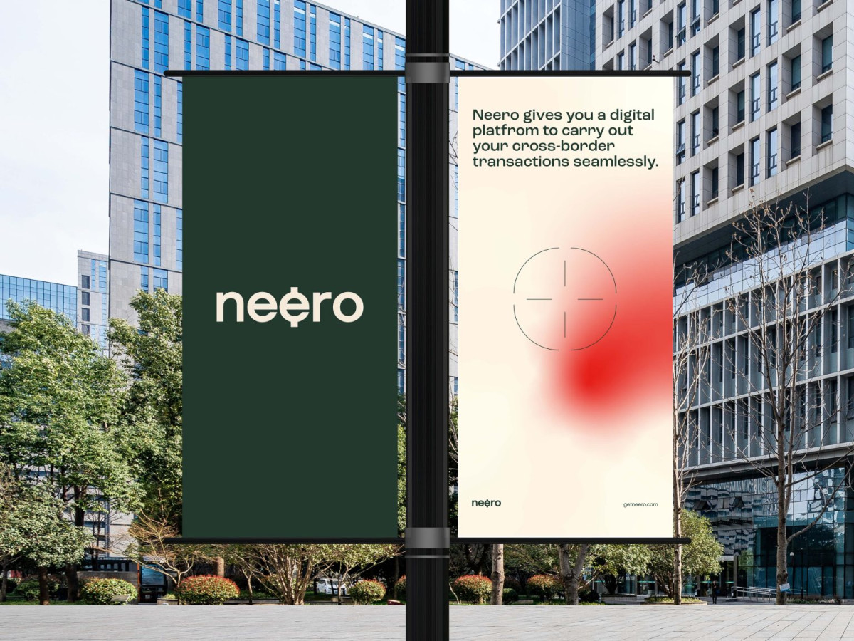
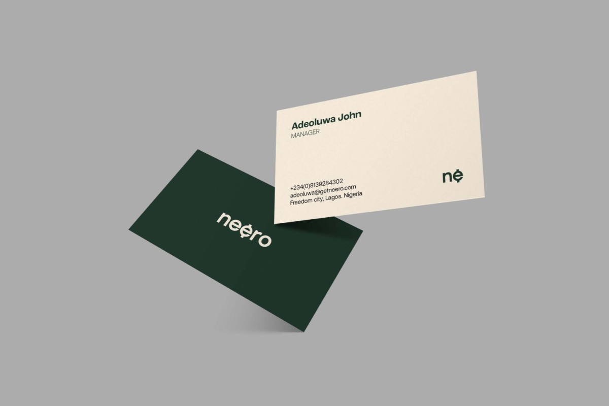
At the heart of the Neero print design is a logo that visually represents the brand’s mission of simplifying cross-border financial transactions. It features a stylized “e,” functioning as a currency symbol, hinting at the company’s financial nature.
The designers at Kishi Creative utilized clean lines and minimalist aesthetics to emphasize professionalism and trust. The simplicity of the overall design enhances its memorability, making it easy to recognize across various mediums, from posters and billboard ads to diverse collaterals and merchandise.
Additionally, the minimalist approach helps Neero stand out in the highly competitive and often conservative financial sector, projecting an approachable image that aligns with the brand’s progressive vision.
The Print Design’s Typography Crafts a Bold and Modern Visual Harmony
Typography plays a critical role in reinforcing the Neero brand identity. To achieve this, Kishi Creative selected Ubuntu Bold and Oxygen sans-serif typefaces, creating a harmonious synergy that communicates strength, clarity, and modernity.
With its robust and commanding style, Ubuntu Bold symbolizes power and reliability, essential traits for a financial institution. It reassures customers of the bank’s dependability in handling financial operations.
On the other hand, Oxygen offers a sleek and contemporary feel that makes the brand friendlier. Its clean lines and airy design are often seen in top-notch print designs, enhancing readability without compromising sophistication.
This blend of typefaces ensures the textual elements of the print materials work in harmony, delivering an authoritative yet inviting message. This typographic strategy elevates Neero’s identity, providing clarity and legibility while leaving a lasting impression with every design.
Vibrant Colors Enhance Neero’s Professional yet Energetic Identity and Messaging
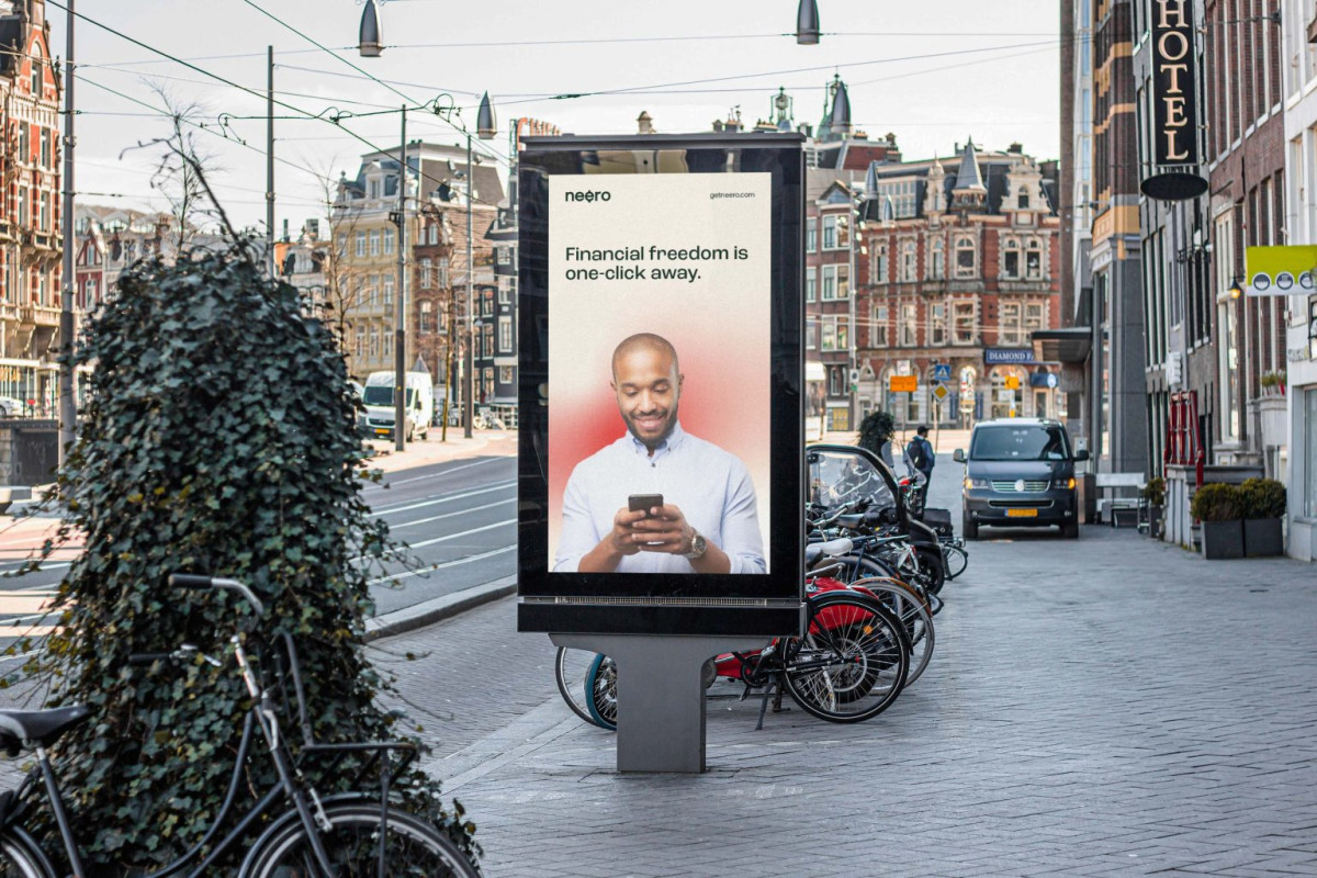
Neero’s carefully curated color palette of deep green, white, and red is visually striking and rich in symbolism. The deep green serves as the foundation, evoking trust, stability, and prosperity — qualities that resonate deeply in the financial world. It reinforces the idea that Neero is a reliable banking partner.
White is strategically used to create contrast, ensuring text and graphic elements remain highly legible. Its clean, crisp nature also reflects simplicity and efficiency, aligning with Neero’s promise to simplify financial transactions.
Following the examples of professional print designers, the agency employed red accents to draw attention to important elements, such as calls to action or key messages. This use of red symbolizes the dynamic nature of Neero’s services, exuding immediacy to motivate action.
Together, these colors create a balanced and professional visual identity that remains energetic and affable, strengthening the brand’s message of making financial freedom accessible and immediate.
The Print Design Conveys the Brand’s Heritage With Custom Glyphs Inspired by Ancient African Symbols
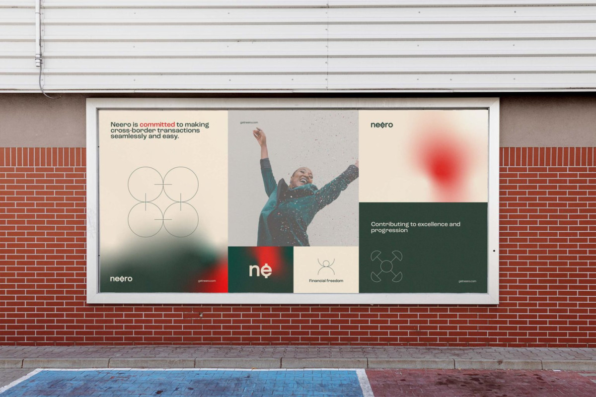
Another standout feature of Neero’s print design is the integration of custom glyphs inspired by ancient African symbols. These glyphs represent the brand’s core values, including trust, innovation, and cultural connection. Each glyph is carefully crafted to honor the bank’s African roots as a visual reminder of its heritage and rich culture.
These trendy graphic design elements bridge the gap between modern financial innovation and traditional African culture, creating a unique and authentic identity. By integrating these elements, Kishi Creative crafted a brand identity that feels deeply rooted in meaning and forward-looking, highlighting Neero’s distinctive positioning in the financial industry.
All in all, Neero’s print design is a masterclass in blending professionalism, cultural expressiveness, and modernity. Every element serves a purpose, from the currency-inspired logo to the bold typography, vibrant colors, and culturally significant glyphs. These features form a cohesive identity that reflects Neero’s mission and positions it as a leader in cross-border banking — making Kishi Creative’s work deserving of this month’s Design Award.


