Team Behind the Design
Agency: HERALDESS
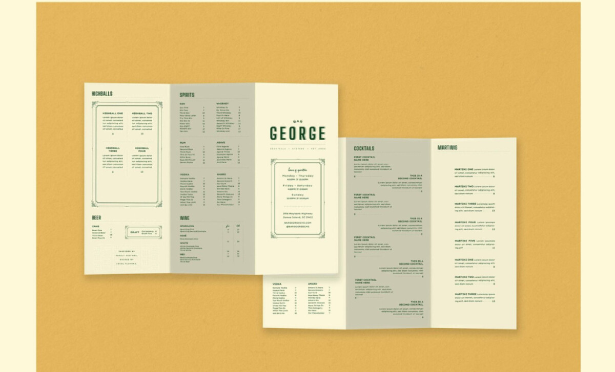
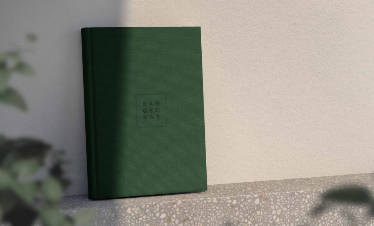
Client: Bar George
Category: Print Design (Hospitality)
Location: South Carolina, United States
Project Brief: Produce print that communicates Bar George’s playful yet nostalgic brand through retro typography, layered layouts, and whimsical details.
Print Design Analysis
Related Articles
When I review hospitality print designs, I often focus on typography, layout, imagery, and production quality.
These elements shape how a brand’s personality carries from concept to tangible customer touchpoints.
- Typography: I like how the bold, retro type instantly grounds the brand in nostalgia. The mix of structured and playful fonts reflects Bar George’s laid-back yet curated atmosphere.
- Layout: The menu layout balances structure and whimsy. Clear sections guide the reader, while hand-drawn elements add personality without disrupting readability.
- Imagery: The subtle illustrations and doodle-like accents echo the fun, spontaneous vibe of the bar. They help make the menu feel approachable and memorable.
- Production Quality: The textured materials and rich green palette enhance the tactile experience. They signal authenticity while keeping the design rooted in hospitality charm.
Get connected with the right print design agency for your project.
GET STARTEDAbout DesignRush Featured Designs
At DesignRush, we review hundreds of agency projects each month. The featured designs are among the most compelling, standing out for their creativity, execution, and relevance.
The best of these go on to be selected as Monthly Design Awards winners, marking them as standout industry achievements.
Looking for more hospitality and print design inspiration? Explore:
- Best Print Designs
- Best Website Designs
- Best App Designs
- Best Logo Designs
- Best Packaging Designs
- Best Video Designs
For a full list of design agencies and related services, see our Agency Directory.
Get a chance to become the next Design Awards winner.
SUBMIT YOUR DESIGN