Standout Features:
- Minimalist design with a chic pink accent
- House outline
- Serif and sans-serif font pairing
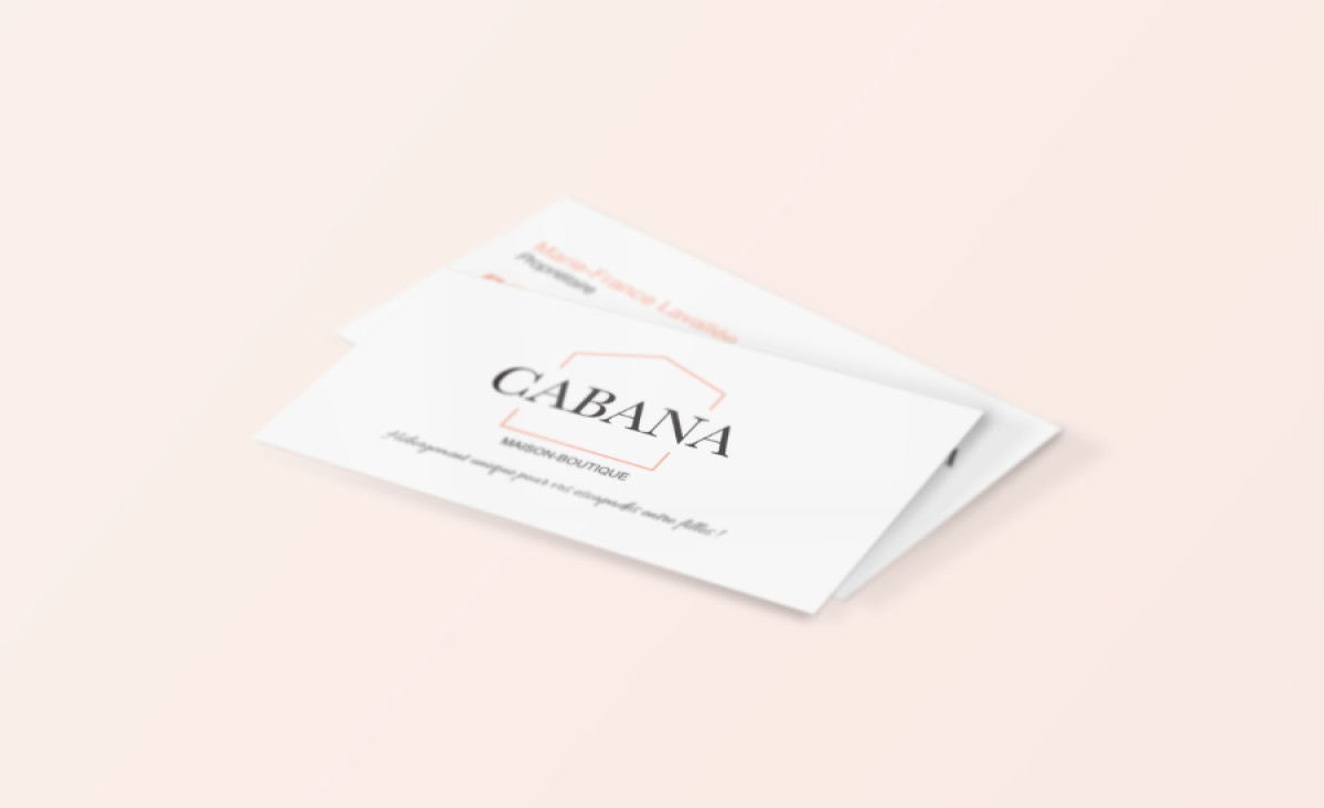
J. Agence Créative designed the visual identity for Cabana, a boutique getaway concept, with the specific goal of being both "strong and feminine." This business card effectively represents that identity, employing a chic minimalism suited to an exclusive yet welcoming retreat experience for friends.
The design leans heavily on minimalist principles, utilizing ample white space for an airy, sophisticated feel. Its restrained color palette features bold black typography contrasted by a single, delicate pale pink in the house outline graphic.
The brand name is integrated within that simple, geometric house-shaped outline as well. This thin, pink line acts as both frame and symbol, connecting "CABANA" directly to the getaway concept and creating a unique, memorable focal point.
This business card design’s sophistication is further enhanced by the typography: The Cabana name is rendered in an elegant, high-contrast serif font, while supporting text like Maison Boutique uses a clean, light sans-serif — a perfect pairing that ensures clarity while upholding the minimalist standards it sets.
J. Agence Créative expertly used restraint — white space, limited color, clean lines — to convey exclusivity. This shows how "less is more" can create impactful minimalist design. A business card often serves as the first tangible piece of a brand experience, and the agency nailed the strength and femininity this brand commands.