Standout Features:
- Interlocking logo symbolizing care and connection
- Split-color front and back card treatment
- Clean, structured contact information layout
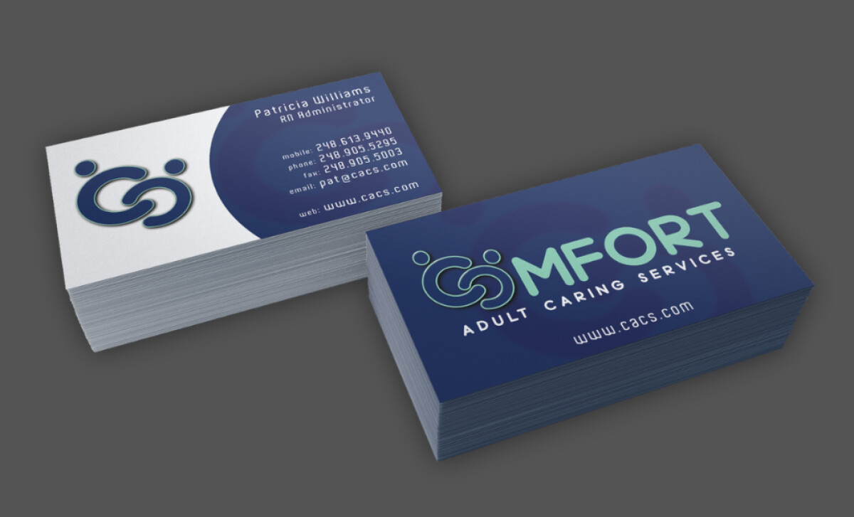
Adult Caring Services (CACS) delivers healthcare and human connection — and its business card design follows suit. Created by DayStar Graphics, this print design communicates trust, support, and warmth at first sight. The card doesn’t try to impress with gloss, it builds confidence with clarity and empathy.
At the center of the card’s visual identity is an abstract, interlocked logo mark that subtly resembles two figures in an embrace. The design visually represents the core mission of CACS, supporting adults with compassion and continuity. This symbol is immediately memorable and adds strong visual branding without needing additional explanation.
The front features a clean white background with strategic placement of logo and contact details, while the back embraces a rich navy base and vibrant cyan for contrast. This dual-tone design increases visual interest without overwhelming the minimalist structure. It also supports brand consistency across other potential collateral, such as folders or uniforms.
CACS’s card doesn’t clutter — each line of contact info is spaced thoughtfully, with generous margins and aligned text that improves readability. The choice of a round sans-serif typeface reinforces a modern and caring tone, enhancing trust while remaining easy to scan at a glance — vital in healthcare communication.
DayStar Graphics has delivered a compact brand ambassador for CACS. The design demonstrates how structure, symbolism, and strategy can unite to create professional materials that feel human.
-preview.jpg)
