Standout Features:
- Elevated bilingual typography
- Structured grid with clear hierarchy
- Rustic yet modern presentation
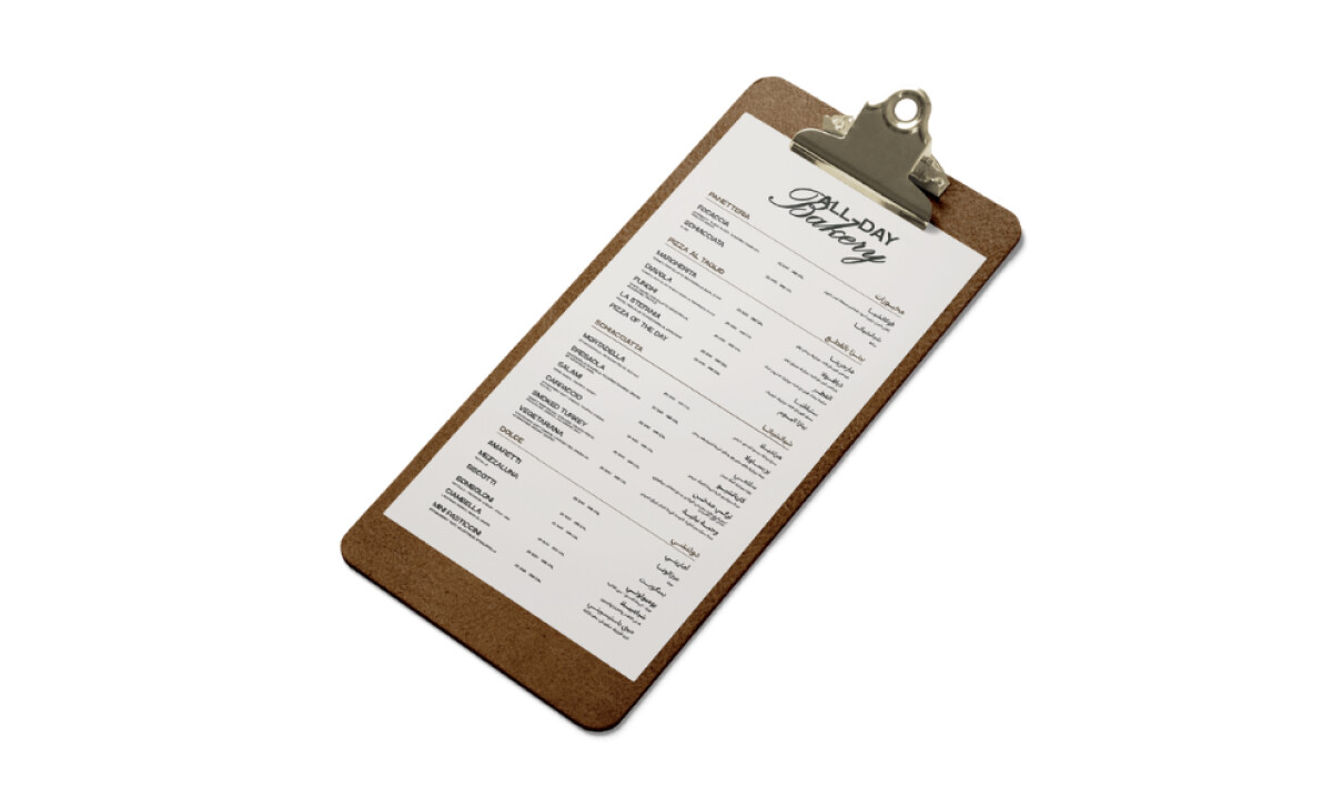
Made for a high-end Italian restaurant in Saudi Arabia, the Il Granaio design is a beautiful example of one of the best restaurant menus. It's luxurious yet simple, classic yet welcoming — making it accessible to a diverse clientele.
The menu uses a minimalist serif font for English headings, which is paired beautifully with a refined Arabic script.
This preserves legibility and elegance in both languages, and the choice of a serif font is key to the luxurious feel, as research shows it creates a significantly higher perception of brand refinement and authority.
Let’s look at the details within the grid. By bolding the dish names, the design helps you quickly find what you're looking for. This simple typographic choice makes a big difference in how scannable and user-friendly the menu feels.
The menu is presented on a wooden clipboard with a silver clip. This mount evokes the feeling of a rustic, countryside Italian trattoria. It's a simple touch that adds a lot of warmth and character to the presentation of the menu.
LOUD Creative Firm’s design is a fantastic example of how to make a brand feel elegant, honest, and deliciously Roman. It proves that great print design still holds a key place in creating an exceptional and memorable meal for every guest.
The design of your menu is a chance to show guests exactly who you are, blending your restaurant's unique heritage with a welcoming feel.
That's why brands turn to expert partners, and our team has ranked the best agencies worldwide to make finding them simple.
Visit our Agency Directory for the Top Print Design Companies, as well as:
Our design experts also recognize the most innovative design projects across the globe. Visit our Awards section to see the best & latest in print design.