Standout Features:
- Well-structured layout with clear information hierarchy
- Bold typography
- Thoughtful use of color
To enhance Campus News’ readability and visual appeal, Nora Mohr crafted a dynamic magazine design that balances structured organization with engaging aesthetics. This design ensures accessibility and captures the energy of student journalism through strategic typography, colors, and layout composition.
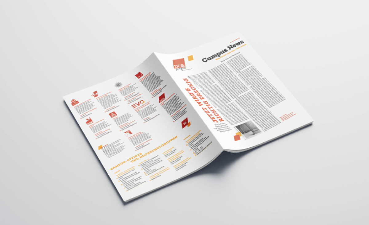
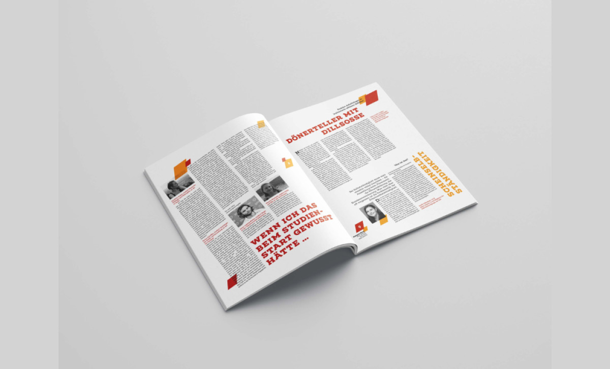
The structured layout is one of the design’s strongest elements, allowing the dense content to remain digestible. Articles are arranged in a grid system with clear sections that guide the reader’s eye effortlessly. The mix of columns, headlines, and visual breaks ensures that the information is presented in a way that is organized yet engaging.
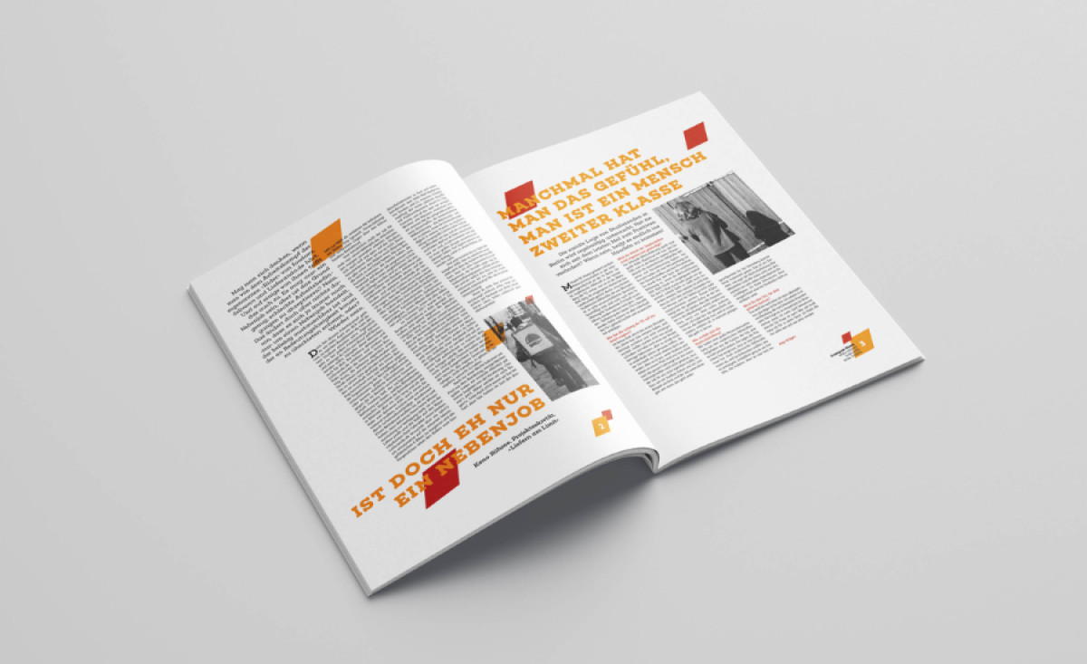
Larger, capitalized headers in warm red and orange hues contrast with the body text, drawing attention to key statements and section breaks. This dynamic textual hierarchy enhances readability and reinforces the magazine’s energetic, student-focused tone. The occasional diagonal text placement adds a modern, youthful edge to the design.
Color is used with precision to maintain clarity while adding vibrancy. The combination of red, orange, and yellow elements against a clean white background delivers a beautiful contrast that doesn’t overwhelm. These colors are strategically applied to highlight quotes, section headers, and graphical accents, adding a sense of warmth and liveliness.
Through a well-balanced mix of editorial structure, bold typography, and a refined color palette, Nora Mohr has created a visually compelling and highly readable magazine design. This layout not only enhances the student experience but also transforms Campus News into a publication that is both informative and visually engaging.