Standout Features:
- Unapologetically bold visual imagery
- Modular color system
- Custom iconography as protest language
''Chile Necesita ESI" is a bold public awareness campaign for Comprehensive Sexuality Education in Chile. Created by Estudio EDE, the design confronts the topic with striking visuals, a progressive color system, and symbolic gestures that demand to be seen and discussed.
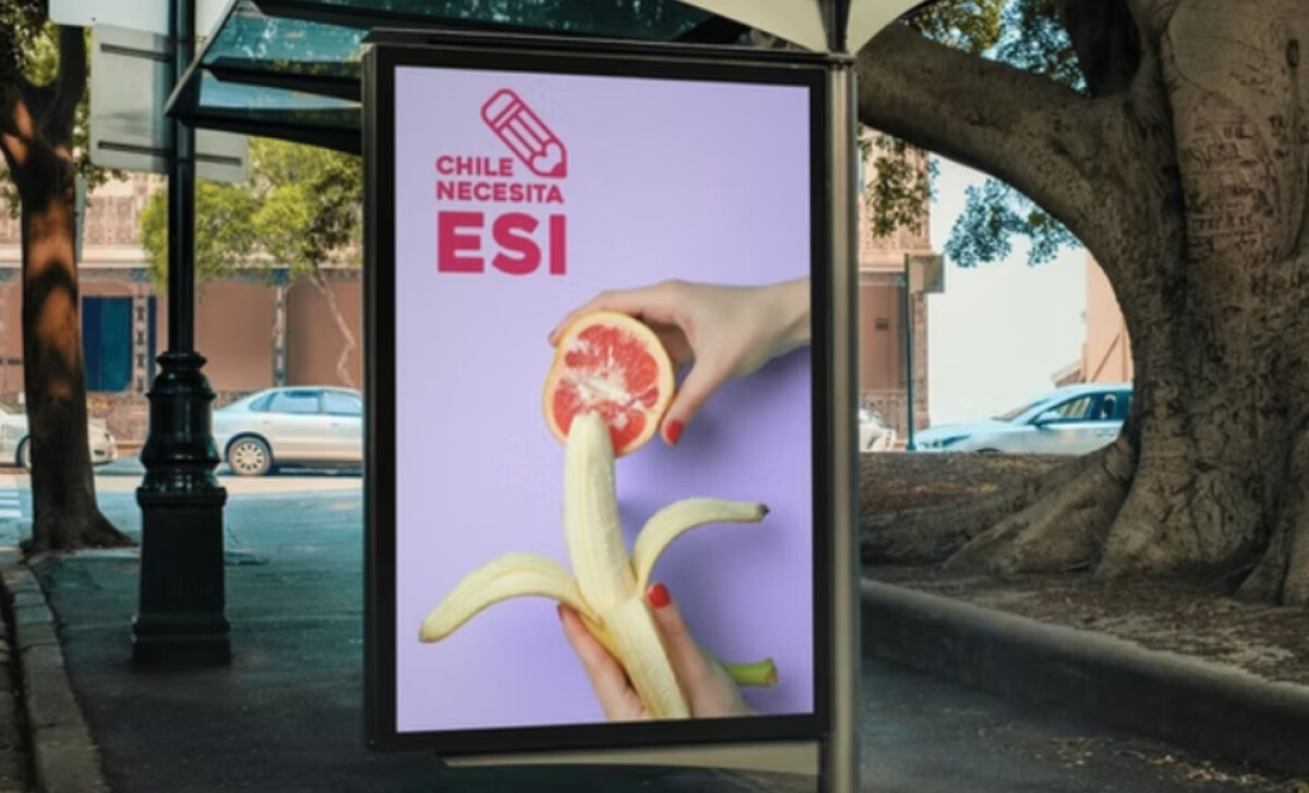
The campaign’s most memorable visual is a peeled banana held below a grapefruit being split. This is an unambiguous metaphor for sexual anatomy. It is executed through a playfully suggestive still life against a flat pastel purple background.
This approach is both confrontational and very clever. By using familiar food imagery, the campaign bypasses censorship while still being explicit. It’s a great strategy that uses innuendo as activism and art direction as a political tool.
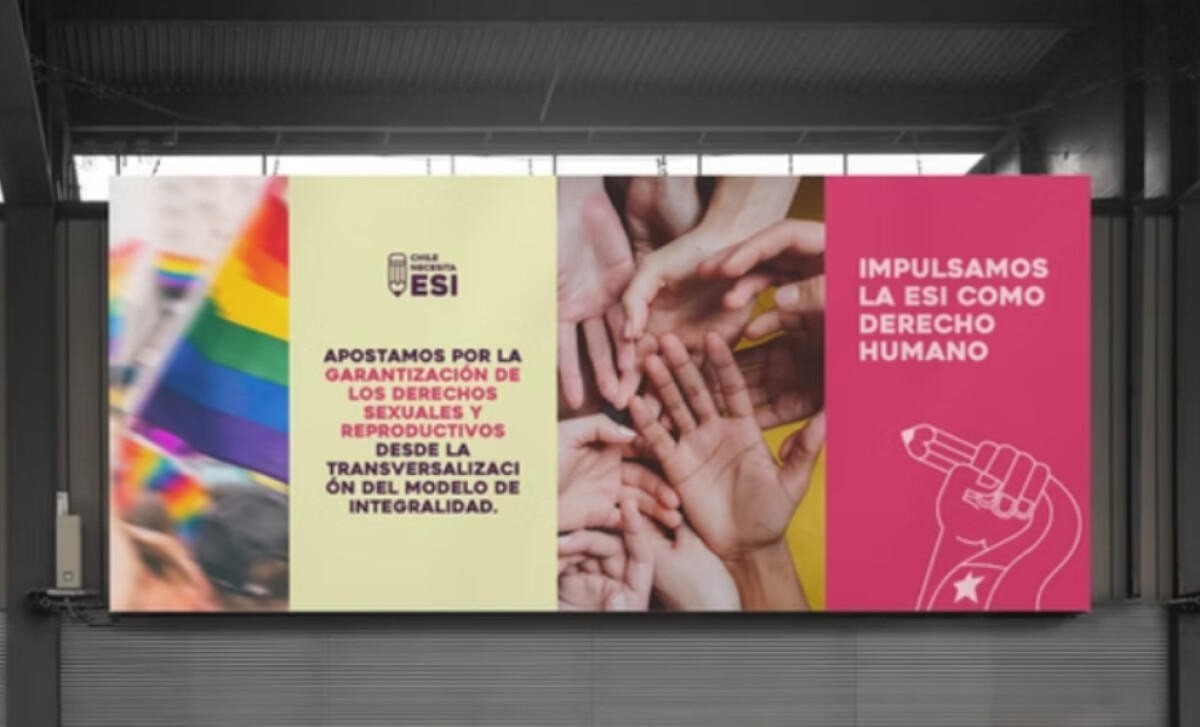
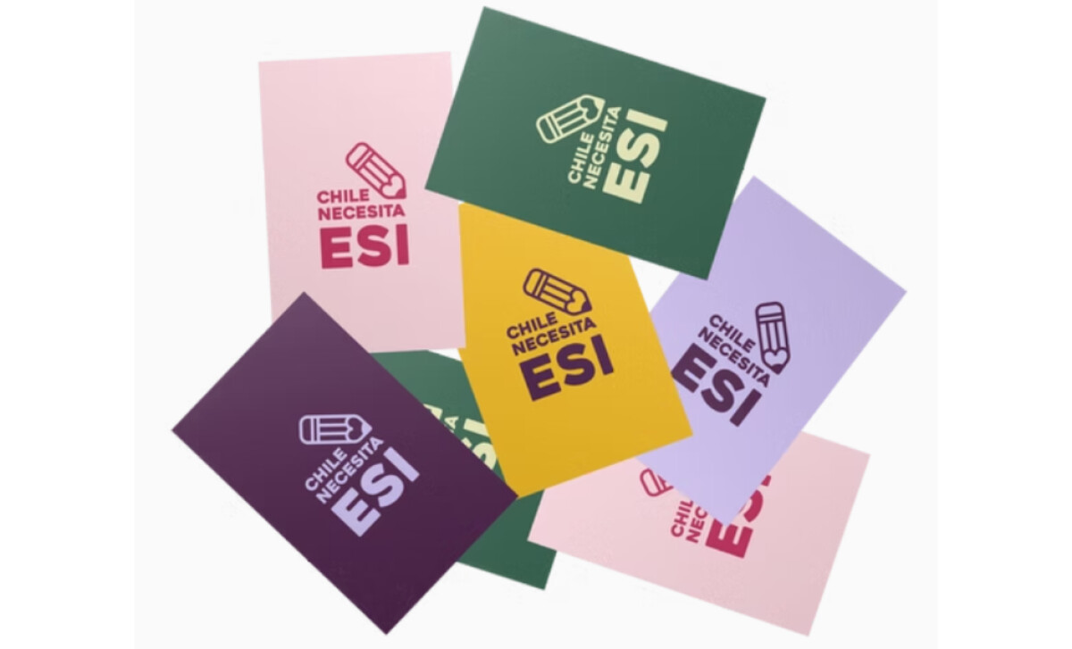
You'll notice that the campaign employs a wide range of saturated colors. The palette includes a mix of lilac, yellow, red, and green. These hues are used modularly, so the message can travel across different media without losing cohesion.
The color system is a key part of the campaign's success. It allows the brand to feel both inviting and assertive. According to a 2024 study, by understanding the psychological and cultural associations of colors, organizations can create more effective advertising.
The contemporary palette is also suggestive of a Gen Z, digital-native aesthetic, which is perfect for a youth-focused campaign.
A custom icon of a clenched fist gripping a pencil serves as the campaign’s primary symbol, almost as if a hand were holding male genitalia. The campaign also uses a bold, uppercase sans-serif typography.
This is a great example of an icon that merges education and resistance into a single symbol. The pencil-as-protest-fist is a powerful, cross-cultural icon. It echoes past civil rights visual traditions but is recontextualized for reproductive rights.
The work for this non-profit print campaign is a reminder that the best designs are often the ones with a clear and powerful purpose. This is a design that is not just well-executed; it is also deeply meaningful and culturally relevant.
A design for a public awareness campaign needs to do more than just look good; it has to be bold enough to start a conversation.
That's why brands turn to expert partners, and our team has ranked the best agencies worldwide to make finding them simple.
Visit our Agency Directory for the Top Print Design Companies, as well as:
Our design experts also recognize the most innovative design projects across the globe. Visit our Awards section to see the best & latest in print design.