Standout Features:
- Bold and structured typography
- Geometric, real estate-inspired visuals
- Clear and compelling messaging
Credos, a property management tool, simplifies operations for property owners by offering data-driven insights and pricing optimization. To communicate its value, Better Today created a print design that blends bold aesthetics with structured clarity. The result is an eye-catching and informative identity that resonates with real estate professionals.
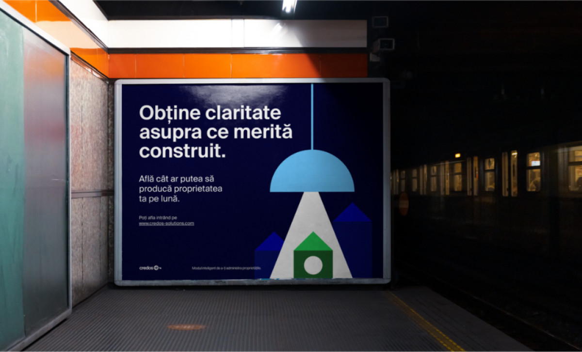
Large, sans-serif fonts are used for headlines, making key information stand out at a glance. The clean typographic hierarchy ensures readability, allowing viewers to absorb essential details quickly. This approach aligns with Credos’ goal of providing clear and efficient property management solutions.
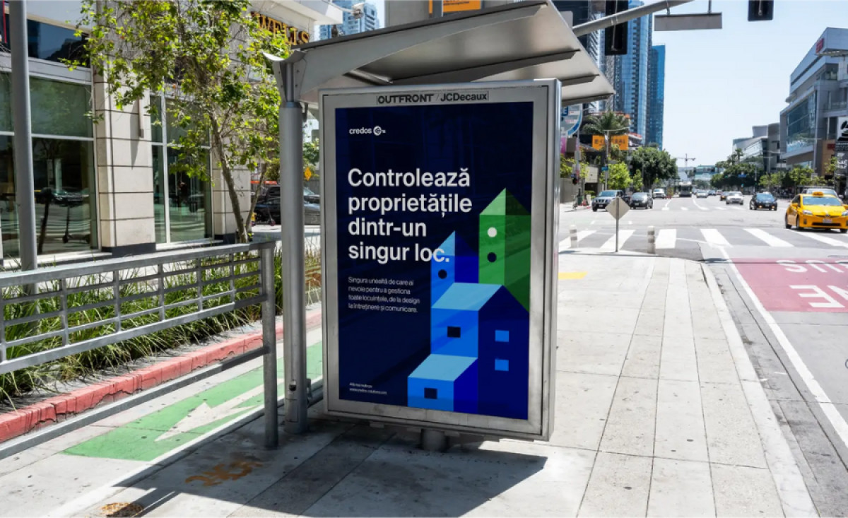
A defining feature is its geometric, real estate-inspired visuals. Abstract building shapes in shades of blue and green create a dynamic yet structured look that connects directly to the real estate industry. These graphics provide a sense of modernity and reliability, visually reinforcing the brand’s core mission.
The clear and compelling messaging makes the print materials highly effective. Short, direct copy highlights Credos' benefits, ensuring potential users understand its value instantly. Phrases like “Control all your properties from one place” are strategically placed for maximum impact. This clarity, combined with a well-organized layout, strengthens the brand’s communication strategy.
Credos’ print materials set a high standard for real estate print design, balancing strong branding with functionality. The combination of bold typography, structured visuals, and concise messaging ensures the design captures attention while delivering essential information efficiently.