- Agency: Reform Studio LLC
- Client: David Volz Landscape Architects
- Category: Print Design — Professional Services
- Location: Santa Ana, California, United States
- Project Brief: Develop a cohesive print and visual identity system for David Volz Landscape Architects that reflects their roots in parks and play while supporting a wide range of project scales.
Most professional services firms default to sterile corporate norms, but Reform Studio LLC chooses a more structural path.
The print design for David Volz Landscape Architects succeeds by translating architectural massing into bold typographic experiments that emphasize stability and the tactile nature of public play spaces.
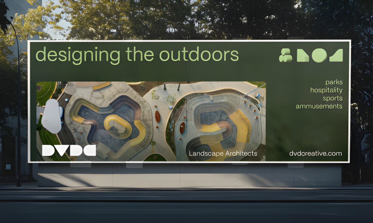
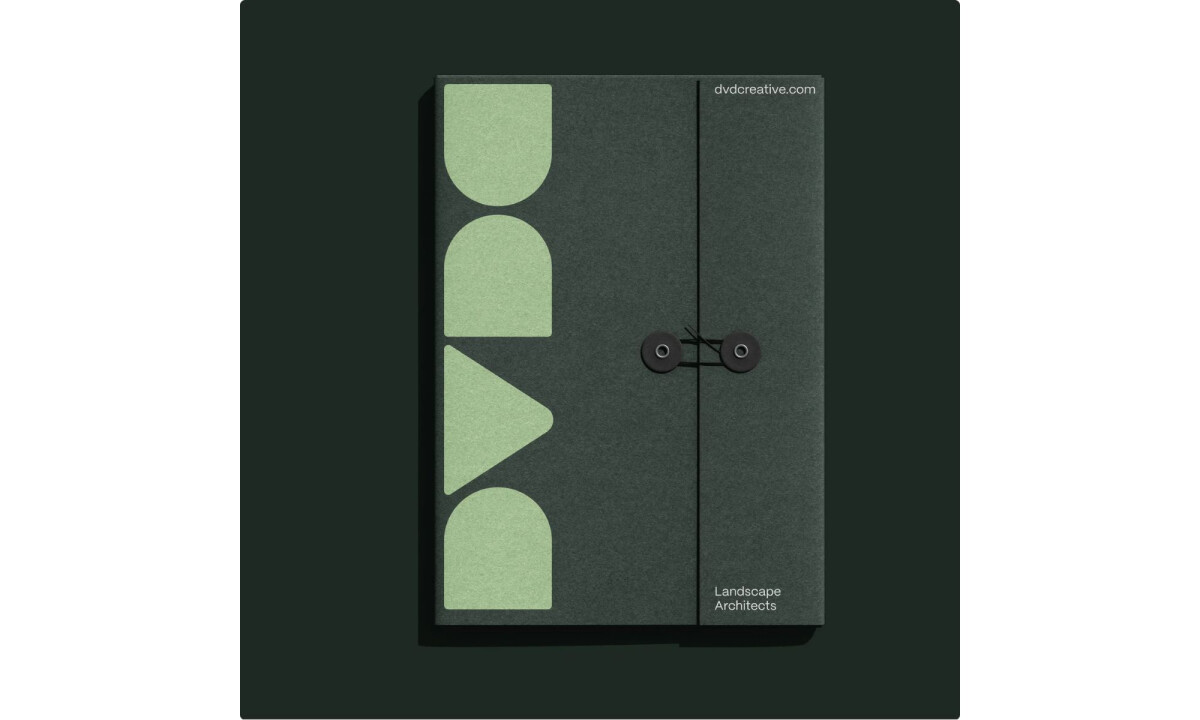
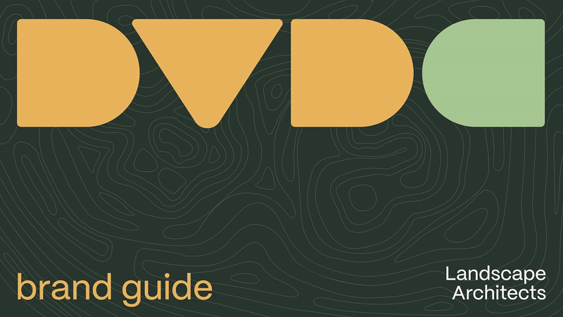
- Monolithic Typography: Oversized, chunky logomarks create a strong visual foundation that mirrors architectural massing. I find this approach effective for communicating stability while providing a consistent anchor across all physical print materials.
- Iconography of Play: Simplified 3D icons reference playground blocks to reinforce the firm’s connection to human-centered design. I think these elements add personality to the brand without sacrificing the sophistication expected by municipal clients.
- Topographic Visuals: Topographic maps and aerial imagery anchor the system in real-world landscapes. I believe these visuals successfully bridge the gap between abstract design theory and tangible, site-specific work.
- Signage Logic: Visual cues drawn from park signage provide a modular layout that makes the print materials feel intuitive and navigable. I appreciate how this directional logic creates a natural transition between handheld media and physical environmental installations.
Word from the Agency
"We developed a visual language based around monolithic, chunky type for their logomark and unique, simplified 3D iconography, each representing the pillars of their business. These shapes are inspired by toy blocks and other ephemera found on a playground. Another part of their visual language draws from signage systems at parks, often the main graphics visitors interact with. We incorporated this style into the UI and other digital elements."
— Reform Studio LLC
What Brands & Designers Can Learn from David Volz Landscape Architects
1. Translate Discipline into Form, Not Decoration
Monolithic typography mirrors architectural massing and communicates stability at a glance. When form reflects practice, branding feels inherent rather than applied.
2. Introduce Personality Through Conceptual Iconography
Playground-inspired 3D icons reference the firm’s human-centered focus without undermining credibility. Abstracted symbols can add warmth while remaining appropriate for institutional audiences.
3. Design Systems That Bridge Print and Environment
Topographic visuals and signage-inspired layouts create continuity between printed materials and physical spaces. When branding logic aligns with real-world wayfinding, it strengthens both usability and authenticity.