Team Behind the Design
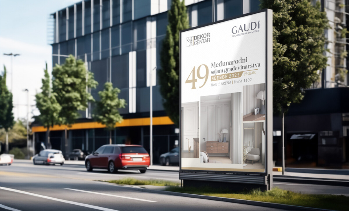
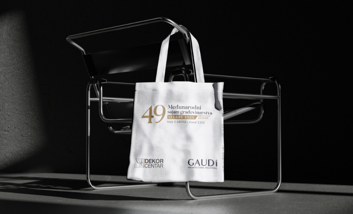
At SEEBBE 2025 in Belgrade, one of the region’s most prestigious trade fairs, Dekor Centar Bijeljina needed a visual presence that matched its reputation for contemporary interior design.
MicroMedia took on the challenge of translating that reputation into a complete visual experience — from concept and booth design to promotional and digital materials.
Print Design Analysis
The creative direction focused on three defining qualities: elegance, minimalism, and modern architectural form.
Dekor Centar’s SEEBBE 2025 presentation was shaped to reflect the brand’s refined aesthetic while creating a lasting impression on visitors.
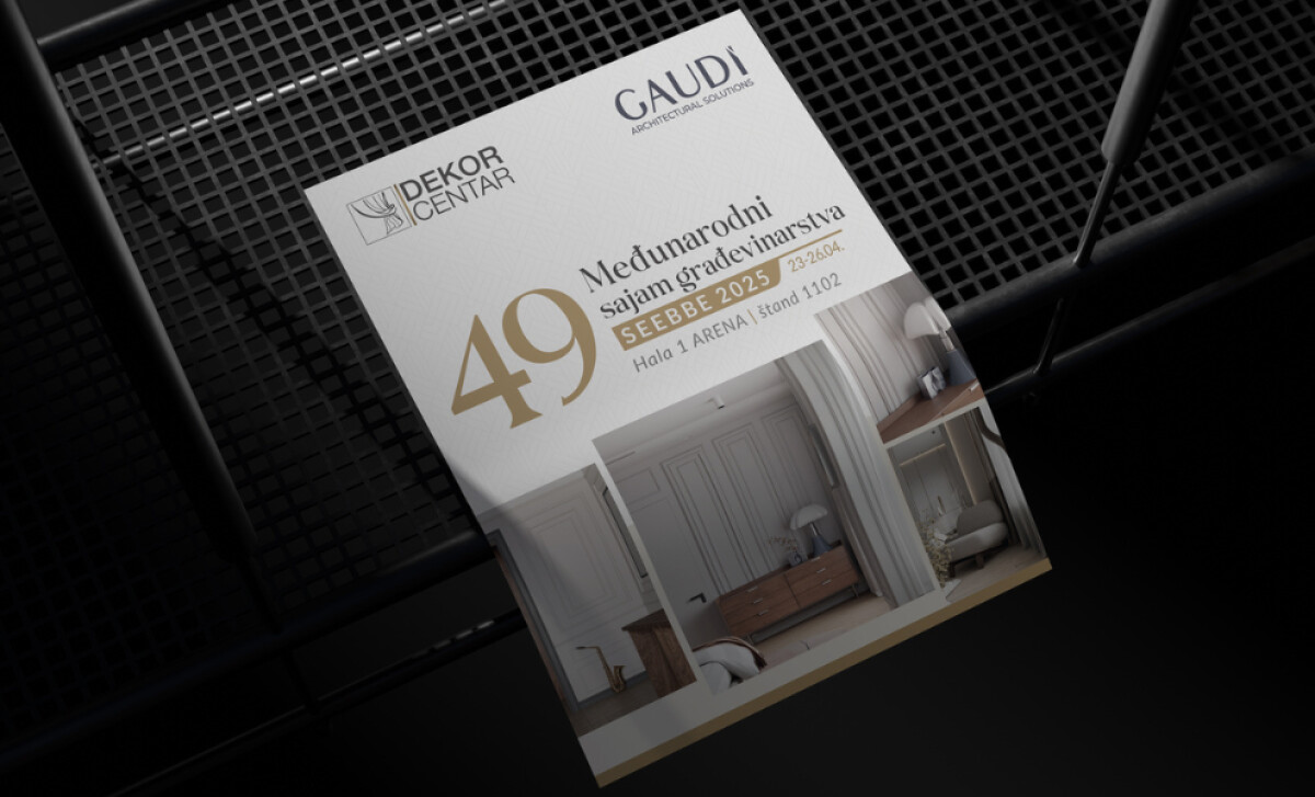
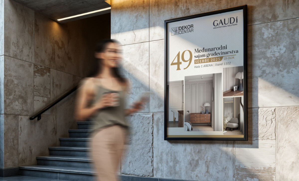
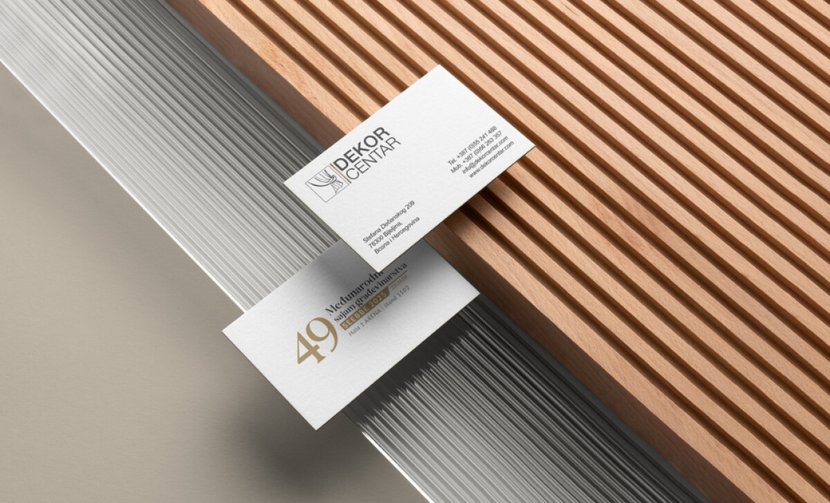
- Refined Architectural Minimalism: The composition feels calm and deliberate, letting proportion and space set the rhythm. Each piece, from posters to business cards, feels intentional, like a scaled model of the booth. I like how the restraint adds quiet strength and gives the visuals a sense of control.
- Luxurious Color Palette: The mix of white, graphite, and gold feels balanced and refined. White opens the space, graphite adds depth, and gold introduces warmth. It’s a limited palette that, in my view, speaks with confidence without relying on excess.
- Typographic Elegance and Hierarchy: The pairing of serif and sans-serif fonts feels architectural and purposeful. The gold “49” anchors the composition like a sculptural element, guiding the eye naturally through the layout. The hierarchy feels measured and thoughtful.
- Cross-Media Consistency: Across printed and outdoor materials, the identity stays perfectly aligned. Margins, grids, and color relationships follow one consistent logic. I find that level of discipline builds trust and makes the brand instantly recognizable.
Impact & Recognition
Dekor Centar’s SEEBBE 2025 booth became one of the fair’s visual highlights.
- Visitors praised the stand as “modern, calm, and perfectly designed.”
- The cohesive branding strengthened recognition across print, digital, and spatial formats.
- The identity positioned the brand as a regional leader in design excellence and craftsmanship.
Collaborator Input
For an inside look at the project, here are takeaways from the brand.
Word from the Agency:
''Starting from the core idea of “elegance through simplicity”, we developed a visual concept that aligns perfectly with Dekor Centar’s philosophy.''
— MicroMedia Design Team
What Brands & Agencies Can Learn
This project shows how structure and restraint can shape an entire brand experience. It applies architectural thinking to communication design with clarity and intent.
1. Let Simplicity Speak Loudly
MicroMedia proves that minimalist design, when backed by strong concept and craftsmanship, draws attention through focus instead of noise. Intentional simplicity communicates assurance and care.
2. Unify Print and Space
Exhibition branding works best when the visual identity becomes part of the physical environment. Layout, materials, and lighting should feel connected, forming one continuous visual language rather than separate pieces.
3. Use Color and Typography as Architecture
A limited palette and a clear typographic grid can give structure to a brand the way geometry shapes a building. Designing with balance instead of decoration creates order that feels both modern and timeless.
About DesignRush Featured Designs
At DesignRush, we review hundreds of creative projects each month across print, spatial, and branding categories. The featured designs stand out for concept strength, execution, and emotional impact.
Only the most exceptional projects advance to become Monthly Design Awards winners, representing excellence in global design.
Explore standout print design projects and related categories:
- Best Print Designs
- Best Website Designs
- Best App Designs
- Best Logo Designs
- Best Packaging Designs
- Best Video Designs
For a full list of design agencies and related services, see our Agency Directory.