Unique texture and understated simplicity combine in a creative twist on corporate stationary.
Design agency mohi.to created a catalog for Spectra Lighting, an architectural lighting agency, that has plenty of unexpected elements -- notably, its dimpled copper casing.
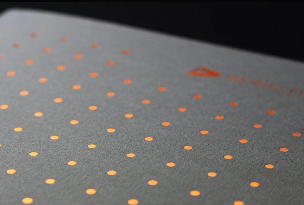
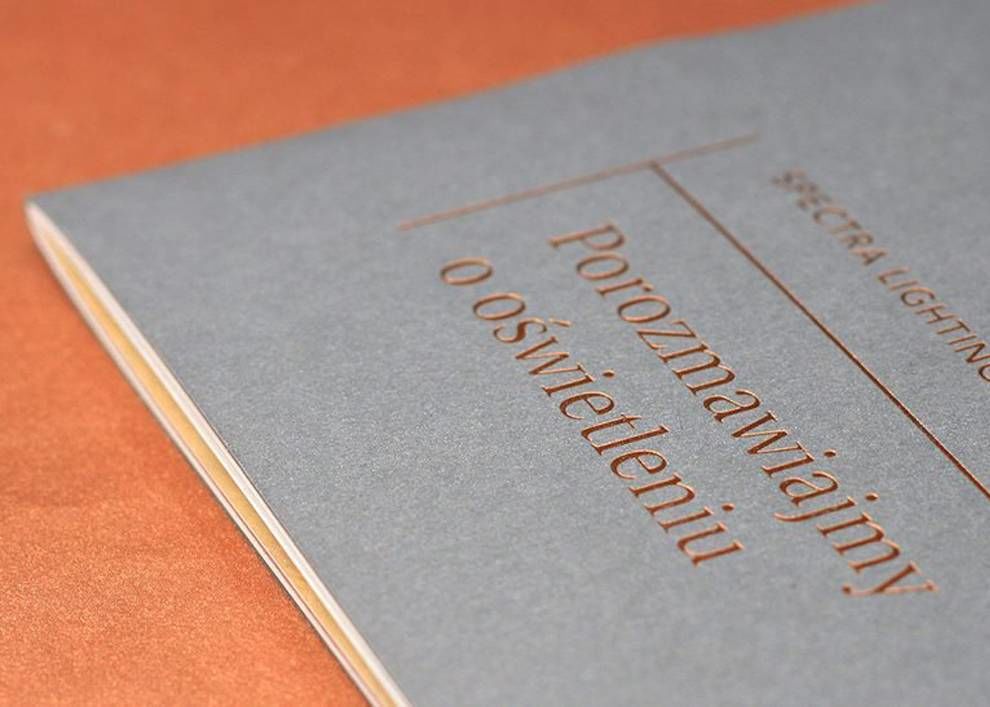
The print design as a whole is unified with matte black negative space and copper metallic accents. It maintains a minimal and symmetrical aesthetic throughout.

But don't think the copper accents are just for judging this book by its cover! Instead, it's subtly implemented throughout the entire catalog.
For example, this minimal-style guide for lighting options inside the catalog utilizes a copper font. Although it's less shiny and in-your-face, the hue is still extremely uniform.
Although the book is a thin catalog, it maintains the vibe of a high-end book, making it even more desirable for consumers.
Spectra Lighting's catalog uses thick, high-quality paper to ground the entire design. (Honestly, it reminds us of an important British scroll from the 1500s.) This choice gives the catalog strength, imploring consumers to trust Spectra Lighting for their home design needs.
As a whole, the design is stunning in its simplicity. By implemented just a few trendy elements -- texture and metallics -- and going the route of "less is more," mohi.to was able to captivate users upon first glance, then hold that attention throughout the entire product.
Spectra Lighting Catalog is a minimal print design in the architecture and professional services industries.