Standout Features:
- Playful, fun design
- Bold typography and color scheme
- Friendly, approachable style
The branding for Fork & Friends by About U Studio captures the essence of dining that’s both fun and communal. Drawing inspiration from the idea of "fun times with friends," it appeals to a broad audience looking to enjoy great food in a social setting.
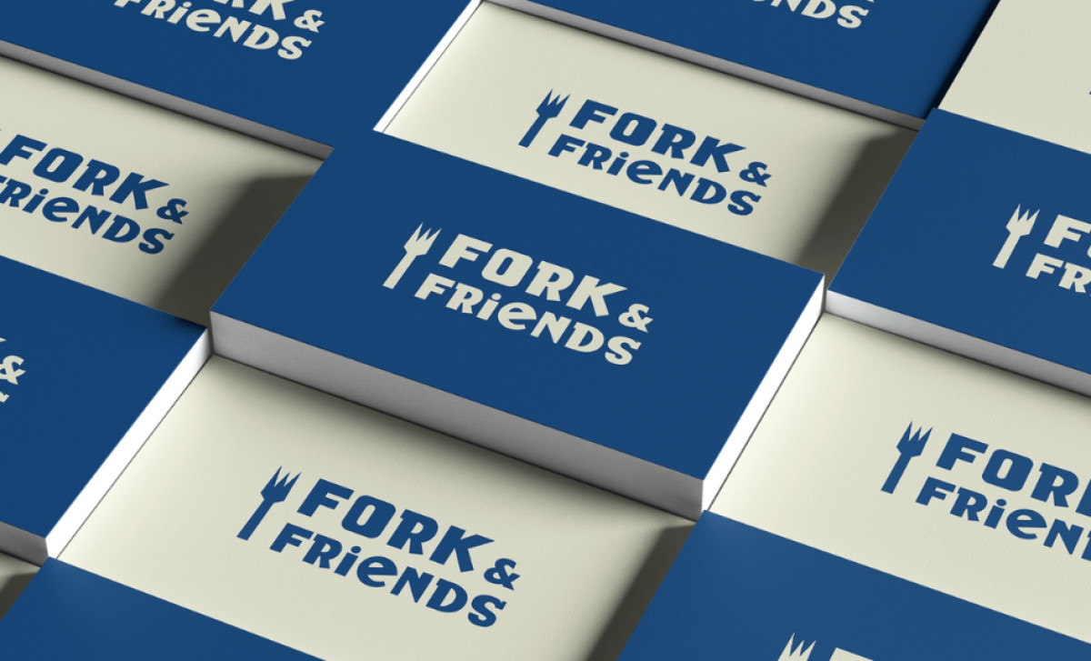
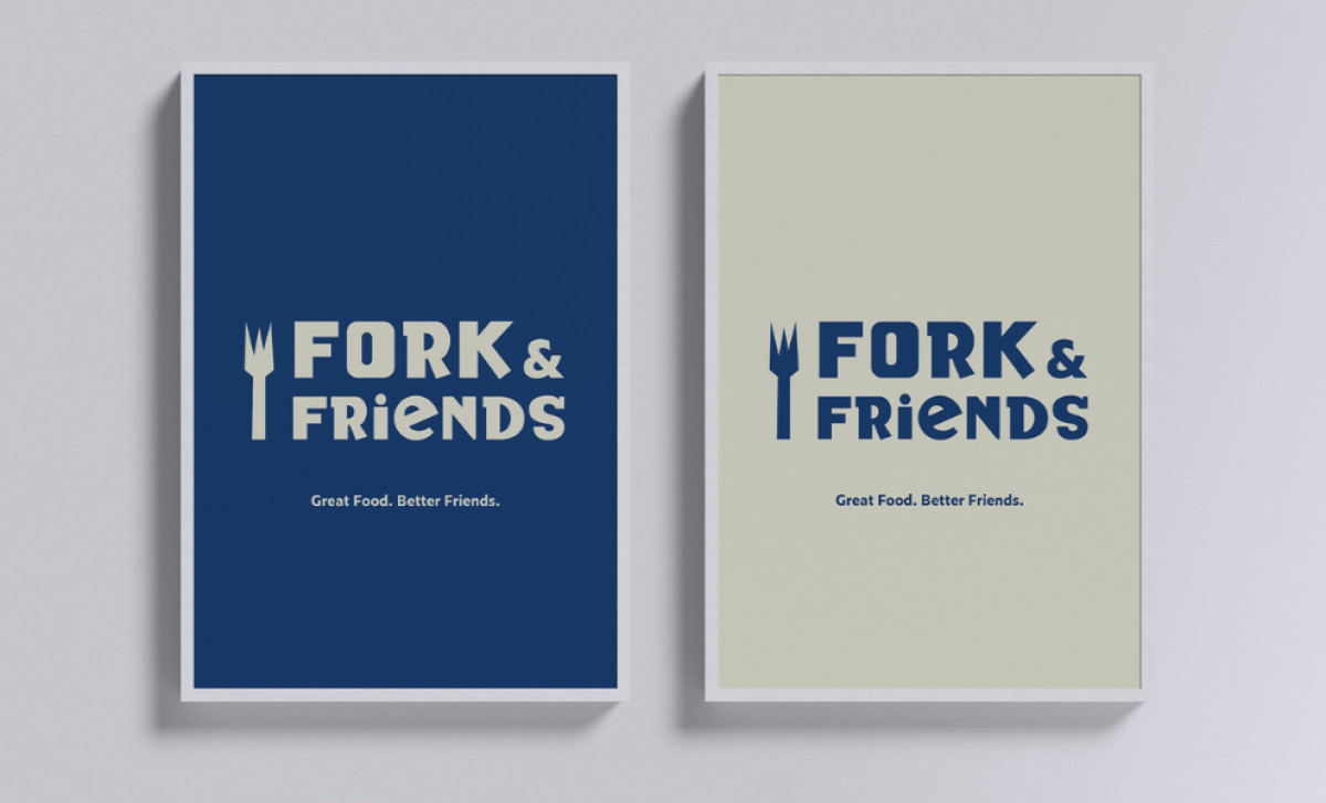
The typography is expressively bold, with the word “FORK” standing out in large, thick letters. This is balanced by the slightly more delicate “& Friends” that contrasts nicely, maintaining a youthful vibe. Additionally, the use of bright blue and warm cream tones creates a sense of friendliness and approachability.
The combination of a strong, modern font with playful proportions grabs attention immediately, yet still feels balanced. The use of blue and cream provides contrast and ensures its readable while maintaining an upbeat tone. The color palette also reflects the brand’s personality — bright, yet not overbearing.
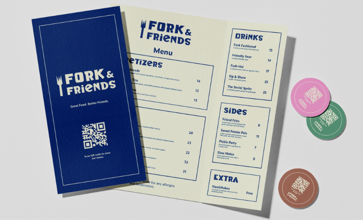
Fork & Friends also embraces playful elements across different materials, like menus, business cards, and signage. For example, the use of circular icons and quirky QR codes adds an interactive touch to the user experience. This creates a cohesiveness across all materials, helping to drive the message that dining here is all about enjoyment and great times.
In conclusion, Fork & Friends’ food and beverage print design successfully combines playful design with professional quality. It’s a strong design that balances fun and sophistication, making it ideal for its target audience.