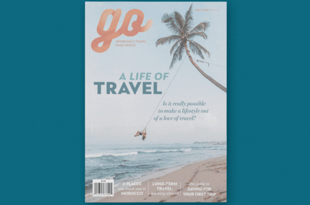
Standout Features:
- Engaging travel photographs
- Balanced text and image layout
- Clear text blocks against visuals
The Go Magazine print design by Shannon Kirkpatrick is a masterclass in capturing the wanderlust spirit. It features an inviting beach scene that promises relaxation and discovery, encapsulating the thrill of travel.
The magazine’s design perfectly balances captivating imagery and readable text. The white background for the text sections enhances readability. The rich content and stunning photography complement each other beautifully.
The layout harmonizes visual and textual content with text boxes contrasted against vivid backgrounds. It directs the reader through an exploratory journey within the magazine. Carefully curated image blocks intersperse the narrative, offering visual breaks that enrich the reading experience and ignite the imagination!