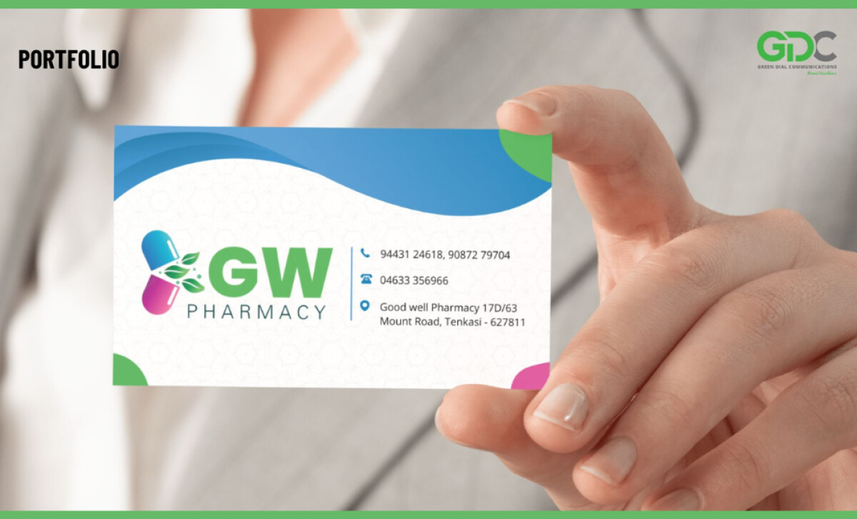
Standout Features:
- Capsule icon integrating leaf motifs
- Bright, health-centric color palette
- Clean grid layout for contact information
GW Pharmacy’s business card takes a direct approach to healthcare branding — clean, confident, and colorfully distinct. Designed by Green Dial Communications, this piece uses clarity and color to stand out in the typically sterile pharmacy space. The result is accessible yet branded professionalism at a glance.
The visual anchor is a stylized capsule split into two halves, one hot pink, one blue, joined by green leaves. This symbol captures GW Pharmacy’s dual mission: medicinal excellence and natural wellness. It’s a logo that feels both clinical and holistic, immediately conveying relevance and trust to health-conscious customers.
The palette includes blue (reliability), green (health), and pink (compassion)—a trio that adds energy and emotion without overwhelming the viewer. Rounded corner shapes in these same tones frame the card edges subtly, adding personality and brand cohesion throughout.
On the right side of the card, contact details are displayed with icon-enhanced precision. The use of space, line alignment, and legible sans-serif fonts ensure quick access to essential information. This structure respects the busy reality of pharmacy operations—no fluff, just function.
GW Pharmacy’s business card succeeds because it speaks fluently in both brand and business. Green Dial Communications shows how design can lift pharmacy branding from generic to genuinely memorable.