- Designer: Flávia Jackeline
- Client: Lugre Haus
- Category: Print Design — Professional Services
- Location: Curitiba, Brazil
- Project Brief: Develop a refined print-based brand identity for Lugre Haus that communicates the studio’s philosophy of renovation.
A well-executed professional services print design strengthens how a brand communicates its expertise. Lugre Haus uses carefully balanced typography, warm terracotta hues, and architectural motifs to represent renovation as a thoughtful process of transformation.
“I appreciated the varied use of uppercase and lowercase typography, the open space, and the design's breathability.”
— Brett Jefferson Stott, DesignRush Juror
Why This Is A Winning Design
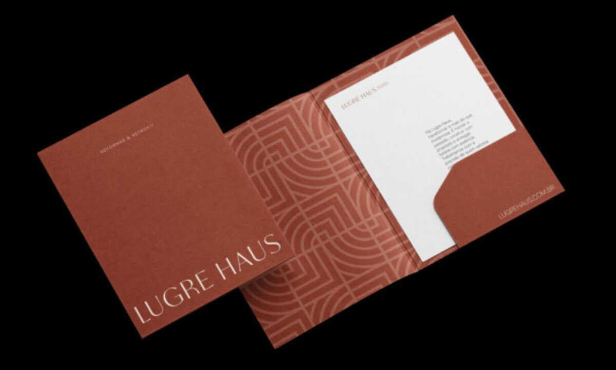
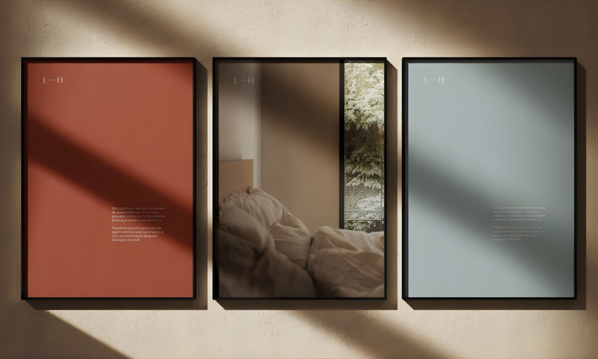
- Color Palette: Terracotta tones paired with soft neutrals create warmth and authenticity. Inspired by natural materials and architectural surfaces, the colors communicate craftsmanship, trust, and grounded design values.
- Typography: Refined typography balances elegance with clarity. The minimalist letterforms feel contemporary while maintaining a timeless quality suitable for architecture and renovation services.
- Layout: Geometric compositions and curved shapes reference architectural forms. These visual structures create rhythm and balance while echoing spatial planning and construction principles.
- Imagery: Photography highlights interiors, materials, and textures connected to renovation work. The visuals emphasize calm, lived-in environments rather than overly polished construction scenes.
- Brand Expression: The design communicates Lugre Haus’s philosophy of renovation as thoughtful transformation. Every element supports the idea of preserving memory while creating new spaces built on care and trust.
“Beautiful color palette with deep, rich choices exemplifies the understated elegance and immersive experience.”
— Andrea Owsinek-Brucker, DesignRush Juror