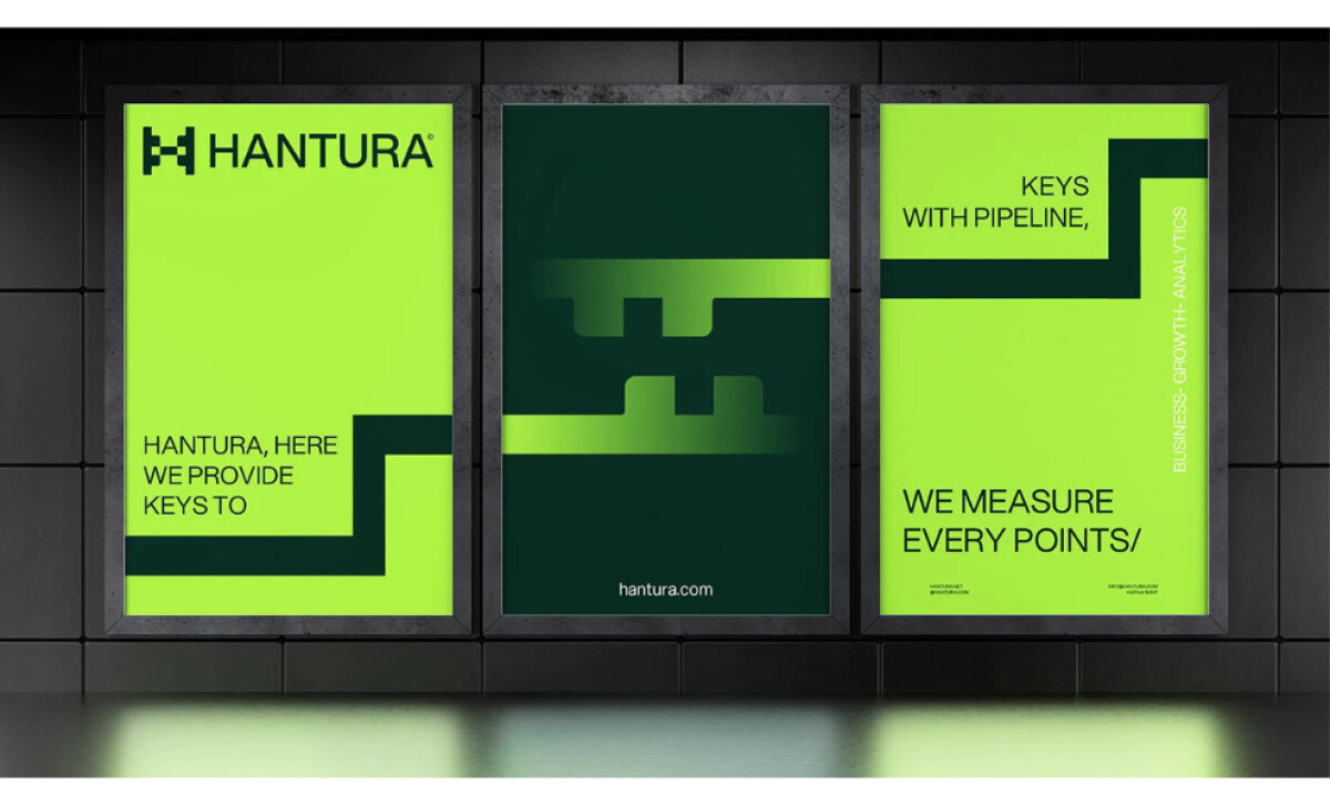
Hantura is a consulting and analytics partner focused on driving business growth. Stavrty's print desgin centers on a bold H symbol with a distinct twisting form that represents agility, momentum, and progress.
The visual system uses strong contrasts, clean layouts, and a vibrant green palette to reflect Hantura’s energy and problem-solving drive. Designed for both digital and print, the identity stays consistent, scalable, and unmistakably modern.
Receive proposals from top print design agencies. It’s free.
GET PROPOSALSStavrty is a Toronto, Canada-based design team known for crafting high-quality visual identities rooted in collaboration and clarity. They work closely with founders to create striking, cohesive brand systems that elevate businesses and bring ambitious ideas to life.
Get a chance to become the next Design Awards winner.
SUBMIT YOUR DESIGN