_7b94b15e0256-desktop.jpg)
Team Behind the Design
Print Design Analysis
_da354399467e-desktop.jpg)
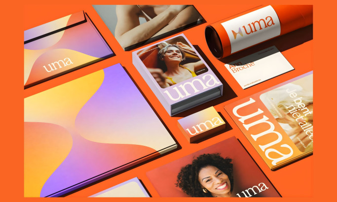
Health and wellness print design relies on a balance of typography, layout, imagery, and production quality.
In its work for the High Performance Centre, Tive achieves this balance with technical precision and a visual rhythm that conveys energy and movement, even in moments of stillness.
_36694c96ce0d-desktop.jpg)
- Color & Motion: I think the electric blue gradient motif is a strong choice that gives every print piece a feeling of life and continuity.
- Typography: The geometric sans-serif typeface feels sharp and assertive. Its angular cuts and italic touches imply forward movement, which aligns with the brand’s message.
- Composition: A modular grid is used to introduce order. Each element feels calibrated. This reflects the analytical mindset of sports science.
- Print Quality: The combination of matte stock and gloss finishes adds a tactile sophistication. This makes the final product feel confident and engineered.
_4666fcc92110-desktop.jpg)
What Brands & Agencies Can Learn from High Performance Centre
_98ea27a65fa5-desktop.jpg)
This project offers a strong blueprint for any brand that needs to balance technical precision with dynamic energy.
1. Use a Gradient as a Unifying Motif
A gradient can be more than just a background. It can be a flexible visual element used across all your materials. This creates a strong sense of continuity and brand recognition.
2. Let Your Layout Reflect Your Philosophy
A clean, structured grid system is an effective way to communicate a brand ethos of precision, order, and scientific discipline without using any words.
3. Add Value with a Tactile Finish
The physical feel of a print piece can reinforce your message. A selective gloss finish on a matte stock, for example, adds a layer of premium quality and sophistication.
About DesignRush Featured Designs
At DesignRush, we review hundreds of agency projects each month. The featured designs represent some of the most innovative and well-executed examples in visual communication.
The top-performing projects advance to become Monthly Design Awards winners, recognized for their creativity, craft, and strategic excellence.
Explore standout print design projects and related categories:
- Best Print Designs
- Best Website Designs
- Best App Designs
- Best Logo Designs
- Best Packaging Designs
- Best Video Designs
For a full list of design agencies and related services, see our Agency Directory.

-preview.jpg)