Standout Features:
- Bold, impactful messaging
- Clean, geometric design elements
- Strategic use of color
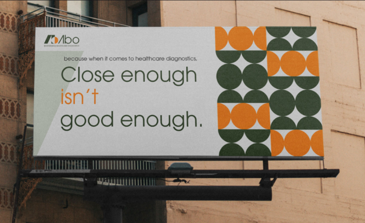
Abo Biosystems and Healthcare Diagnostics is a rising force in the blood testing industry and is seeking to make a bold statement with its brand identity. They partnered with Jamoora Studio to design a compelling billboard campaign that artfully reinforces Abo's commitment to precision and accuracy.
The billboard's focal point is its central message, "Close enough isn't good enough," rendered in bold, sans-serif typeface that demands attention.
This tagline underscores the brand's commitment to precision. Additionally, careful choice of words emphasizes the importance of accuracy, which is crucial for establishing trust with medical professionals and patients alike.
The striking pattern of overlapping circles forms a subtle yet powerful visual metaphor. The repetitive layout can be likened to cells or microscopic views, perfectly aligning with the brand.
Lastly, green and orange are aesthetically pleasing and strategically chosen to evoke emotions of trust, innovation, and vitality. These contrasting colors ensure eye-catching prints while reinforcing the brand's vision of providing reliable and speedy diagnostics.