
HKSC’s 10-Year Reunion Print Designs Compel You To Meet Up With Old Classmates
Hong Kong-based graphic designer Mak Kaihang was tasked with creating a print design for an HKSC Open Day 10 year reunion, and the resulting materials are visually stunning, emotion-evoking works of art.
Reunions are tough — they’re nostalgic and exciting, but also unnerving and ominous. You’ll see all of your old friends, but also all of your enemies and rivals. You might be happy to show off all you’ve achieved, or you could dread the successes of others that will be thrown in your face.
But regardless of how you feel about reunions, in particular, these print designs definitely change your mind and make you think differently.
Kaihang’s designs are seductive and alluring. They turn the idea of a school reunion on its head, creating an experience in your mind that compels you to get dressed up and head to the event with your head held high.
These designs work to break down the walls that might keep you from going. They change your perception of what a reunion is all about. They enlighten and inspire and change your mind. They get the job done.
If every reunion had print materials like these, you’d actually be excited for the next milestone to come your way.

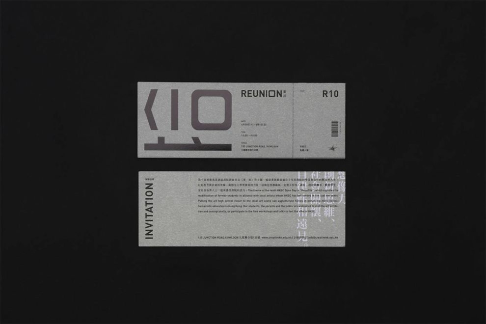
HKSC’s Powerful Prints Play With Typography In An Engaging And Interactive Way
The creative mind behind these print designs took tradition reunion materials and turned them on their head.
Instead of boring, unoriginal invitations, these playful designs turn heads — quite literally — through the use of typography. Words are written out in big, large, block font. In some places, Os are replaced with 0s giving a very edgy and techy vibe.
These designs reference the number 10 — relating to the number of years since graduation — everywhere. These numbers make up the majority of the design in most cases, adding a layer to the design that is immediately eye-catching.
These words are written out in matte coloring, adding a texture to the overall design as well. But the colors are different across the designs. In some instances, they are black, while others are bright red or vivid blue.
In every case, though, they certainly stand out.
And the orientation of these words is also interactive. Sometimes they are written right side up. Other times they are written on their side. This gets the reader involved instantly, forcing them to twist and turn their head in order to read further.
This choice was a deliberate one and one that adds an engaging and playful quality to these designs that keeps people reading and learning more.
The writing containing the more pertinent details about the event is in small, simple typography that almost fades into the background. It can be read, but it’s not really the star of the show. It exists only in addition to the rest of the design.

HKSC’s Print Designs Use Texture And Imagery To Elicit Emotion
The array of print materials within this design is expansive, and each contains a subtly different design element to make them pop. Some rely on typography, while others rely on bright colors and vivid imagery.
All designs, however, make use of texture and shape in some way to elicit an emotion and strengthen the emotional connection readers have with the materials.
Some of these designs are made up of etchings and drawings — which makes sense considering this is a reunion for a design school. They are minimal in nature but impactful in their ability to affect their intended audiences. They make you nostalgic for the good old days.
Other designs include additional etchings and drawings that add depth, dimension, and mystery to these designs that make you want to learn more and get involved.
Texture is another element to this design that elevates it. Matt coloring and cardstock choice add an additional, palpable layer. There’s a roughness that keeps you engaged and hits you on an entirely new level.
These images, the bright color choices and the added textural element all make for a design that causes you to feel something.
HKSC’s Print Designs Create A Visual Masterpiece That Encourages You To Get Social
These invitations, posters, and pamphlets are true works of art, taking the stigma out of school reunions. They are bright, exciting and mysterious. Through the use of color, texture, and typography, these designs stand out from the crowd and elicit a deep emotion within you.
These aren’t your typical reunion invitations and materials. These are not the generic, mass-produced designs that normally accompany a high school or college reunion. They are innovative and engaging. They are seductive and powerful.
They get you involved.
Vivid imagery, bold colors and intricate attention to detail are just a few of the elements that make these print designs winners. And the fact that such a boring and lifeless task was elevated in such a way is truly a testament to the power design can have on us as people and our emotions.
These print designs are ones you aren’t likely to soon forget.
-preview.jpg)


