Alicon is one of the largest integrated aluminium casting manufacturing groups in India and they are also pioneers of the unique ‘Pie’ system for low pressure die casting - a system which enhances productivity with minimum utilization of resources like machines, space and manpower.
Lemon Design were tasked with two brand projects from Alicon: an identity and corporate stationery design plus an exhibition design for an auto expo. The purpose was to help create a brand identity around the rapid company growth and ambitious targets set for 2020-21.
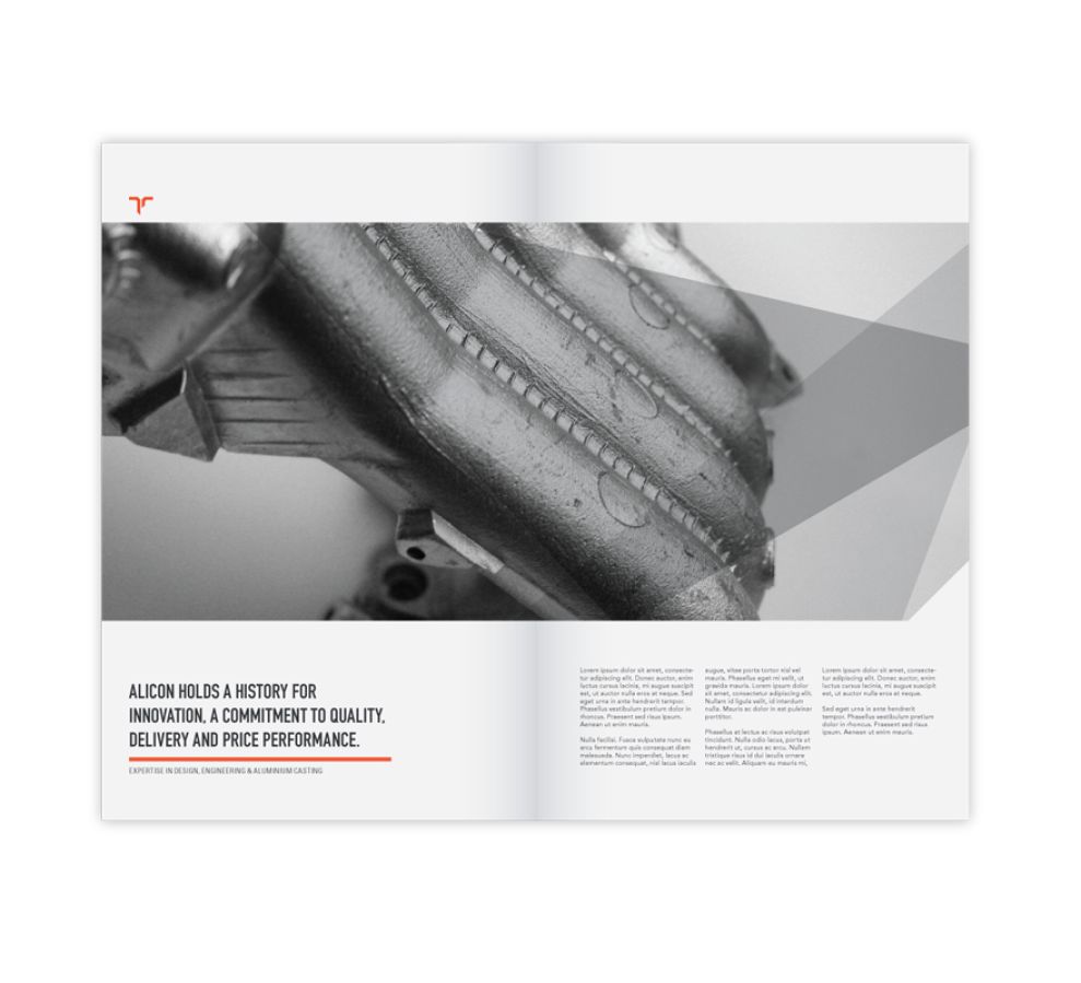
The design of the print materials is nicely balanced. The predominant themes of gray and white are contrasted perfectly by the striking red/orange that is sparingly used. That said, the placement of the red/orange seems to reflect just enough power and focus - as well as mimicking the color used in the actual logo.
The varying shades of gray that are used evoke an aura of stability and control, whilst also reflecting the industrial nature of the company.
The overall composition of the printed designs is solid, with a clear hierarchy in place thanks to the appropriate use of headings, photography, and spacing. The simplicity of the graphics which accompany the printed materials means that they are not lost in the background, rather they just add to the depth of the design.

The subtle overlays used to enhance the background photography add some further creativity to what would have been a fairly plain image on it’s own. Headings are consistently capitalized and stick to a sans serif font with varying weight. The width of the headings also adds some well time thickness to the design.
The overall designs do a great job of effectively combining colors and mechanical shapes to enhance the sensation that you generally associate with a garage or industrial warehouse.
Alicon-Enkei Alloys is a corporate print design in the Automotive, Engineering and Manufacturing industries.